Skwxwú7mesh Úxwumixw brand development
Location
Skwxwú7mesh Úxwumixw
The Skwxwú7mesh Úxwumixw (Squamish Nation) is a vibrant and dynamic Coast Salish Nation, with a strong culture, rich history, and bright future. They are descendants of the Coast Salish Aboriginal Peoples, who have lived in present-day Greater Vancouver, Gibson’s landing, and the Squamish River watershed since time immemorial.
Their vision is for long-term self-sufficiency and a high quality of life for every community member. Organized and sophisticated, they are a leader in First Nations economic development.
In 2019, hcma worked with the Nation to develop a new brand vision. One that honours tradition, while looking forward to the future.
Disciplines
Areas of impact
The challenge
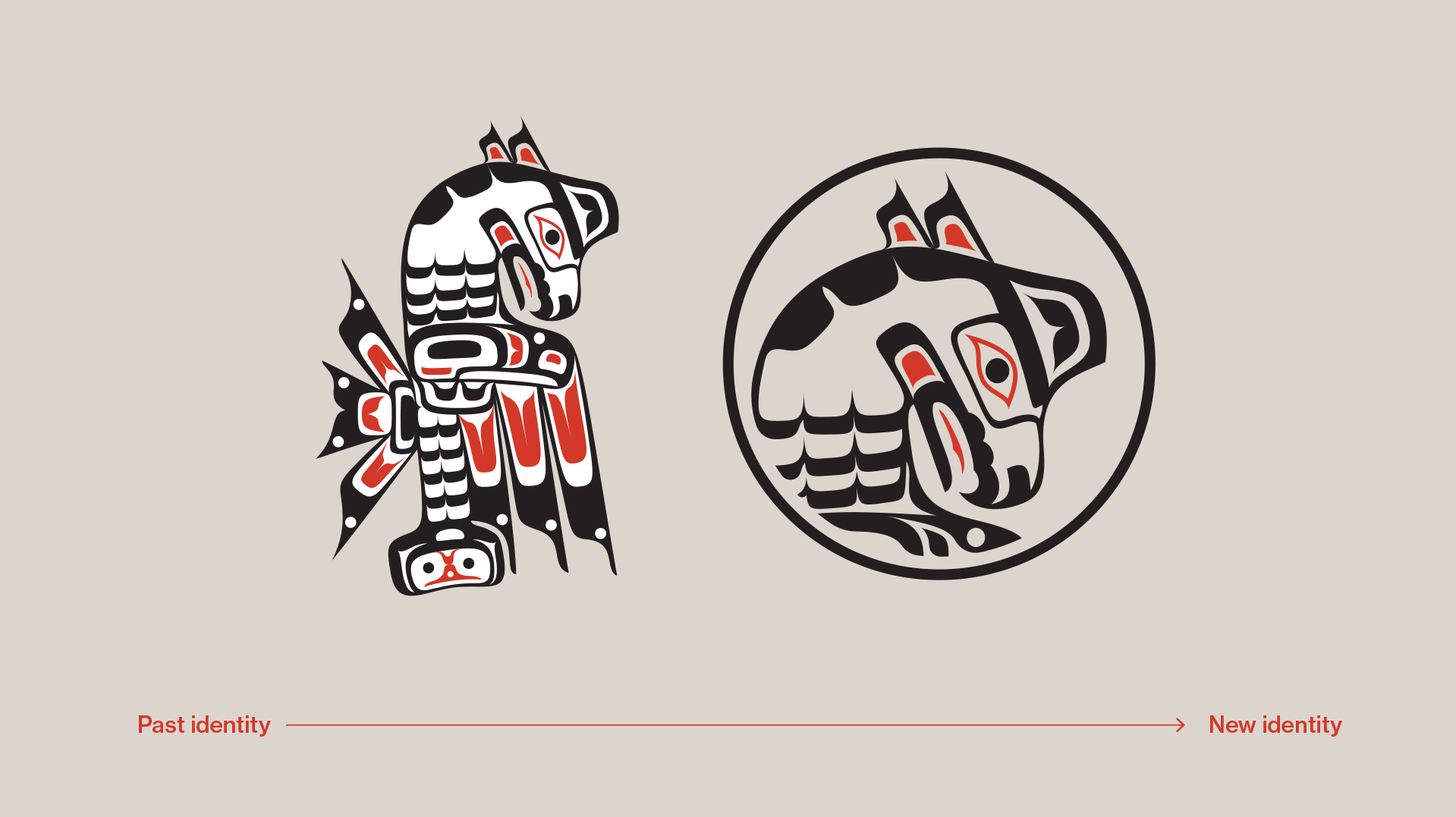
For more than 45 years, the Nation had been operating without a cohesive visual identity. They’d adopted the Thunderbird emblem in 1973, but it was originally commissioned for the Education Department and contained elements of formline design that isn’t characteristic of Coast Salish design. Without a formal style guide, there were also inconsistencies in how their brand was being applied.
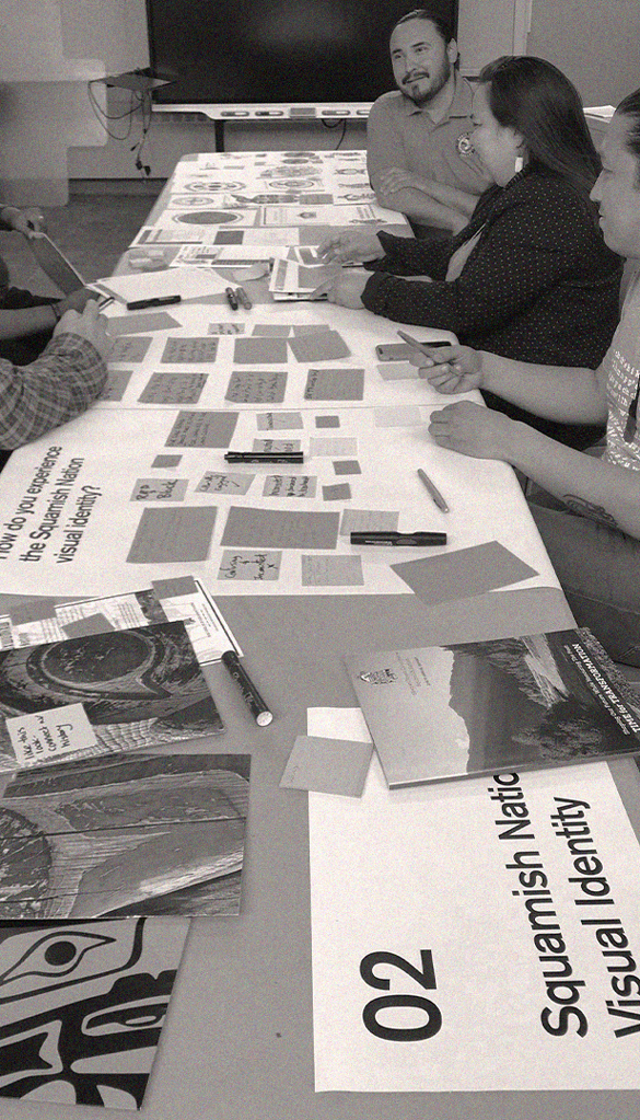
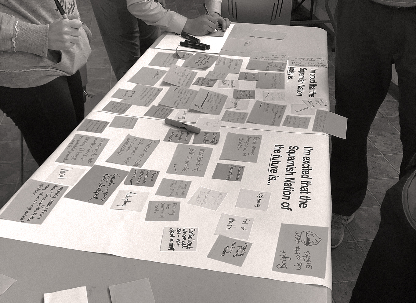
The engagement process
First, we needed to understand the Nation’s aspirations. We hosted a brand visioning workshop with around 25 staff members, who told us that their biggest challenges were around applying the logo and using design templates.
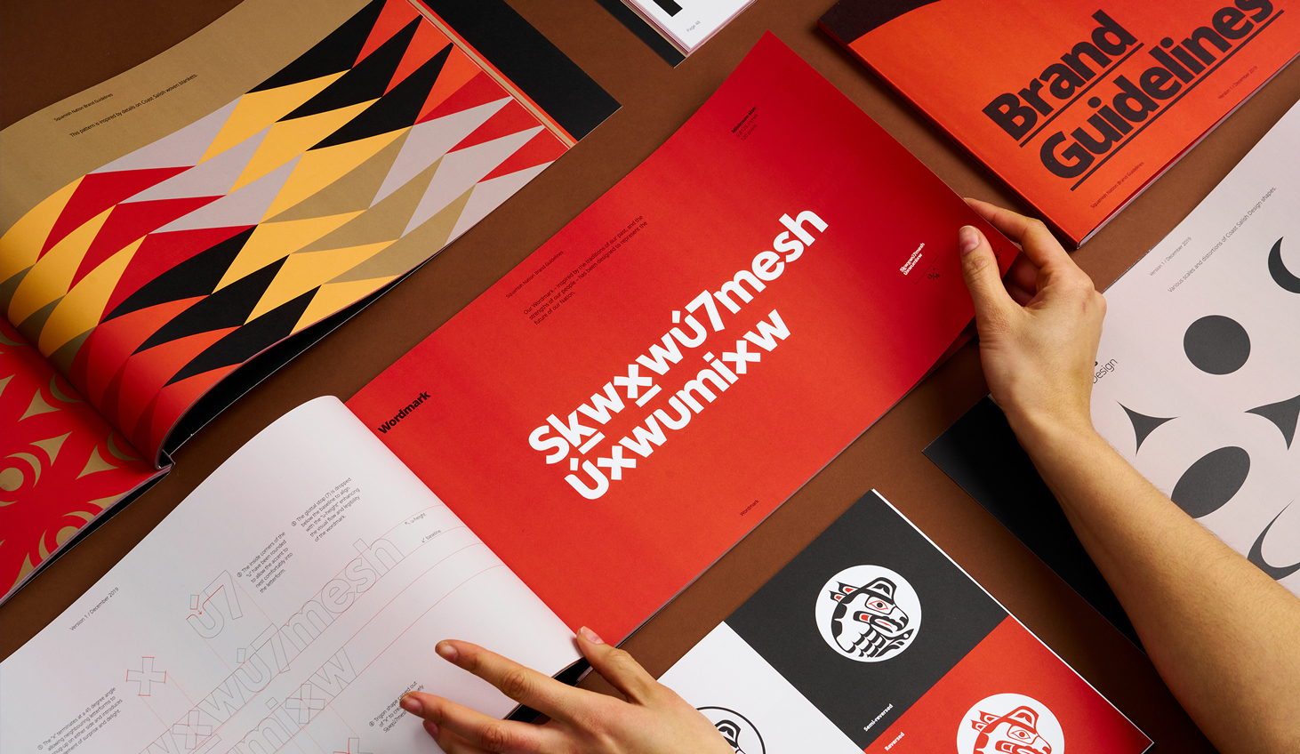
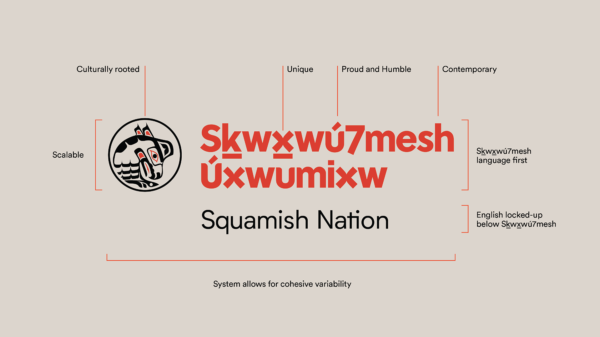
Without a formal wordmark, it wasn’t clear whether English should be placed above or below the Squamish language, and when scaled down, details within the Thunderbird were lost, making it difficult to reproduce.
The brand also needed to work across modern mediums, in a format that works for all departments and represents them equally.
Understanding Coast Salish art forms
To design for a Nation so culturally rooted in Coast Salish design, we also needed to understand their art forms.
Storytellers had an immense role in preserving the Nation’s history and would use carvings, painting, jewellery, and weaving to pass on messages. Sadly, so much of their work has been lost or destroyed, as this quote from the Nation’s website suggests:
“When it comes to traditional art it is almost new to us because we lost it. We’re doing a Kwakwaka’wakw style, taught by Ellen Neal, who also taught several Coast Salish people.” Xwalacktun (Rick Harry), a well-known and highly skilled Squamish Nation artist.
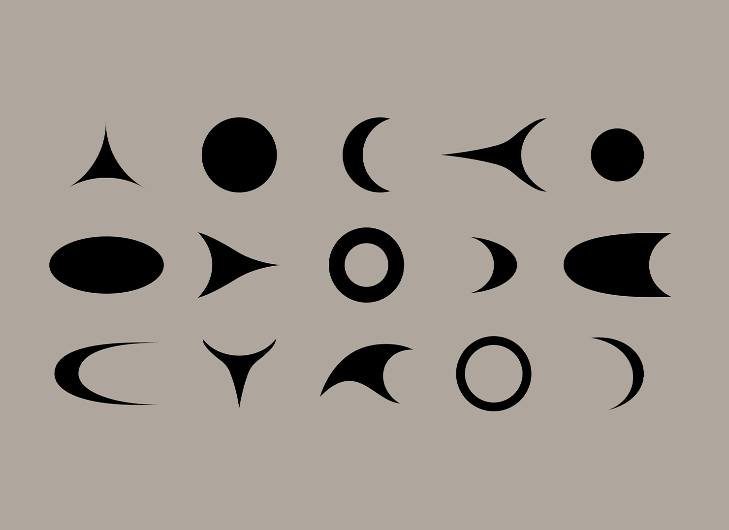
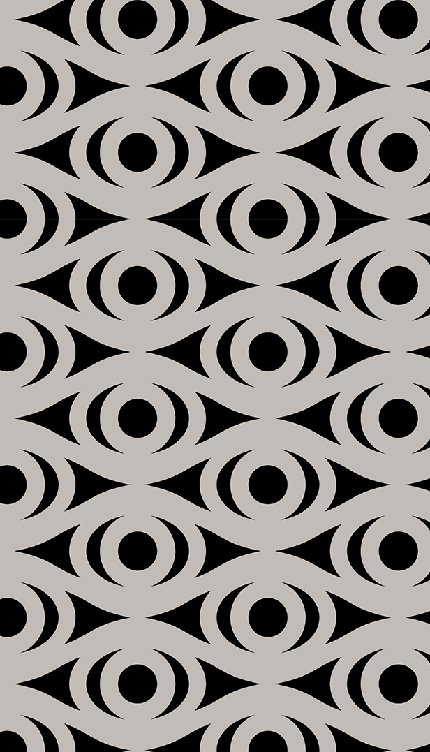
To reflect authentic Coast Salish design, we researched the elements within it. Spindle whorl carvings, for example, often portray human and animal lifeforms through geometric designs, while trigons, crescents, and ovals are prominent graphic forms. You can see the crescent used in the Salish Eye (the eye of the creator), which connects us to the past, present, and future.
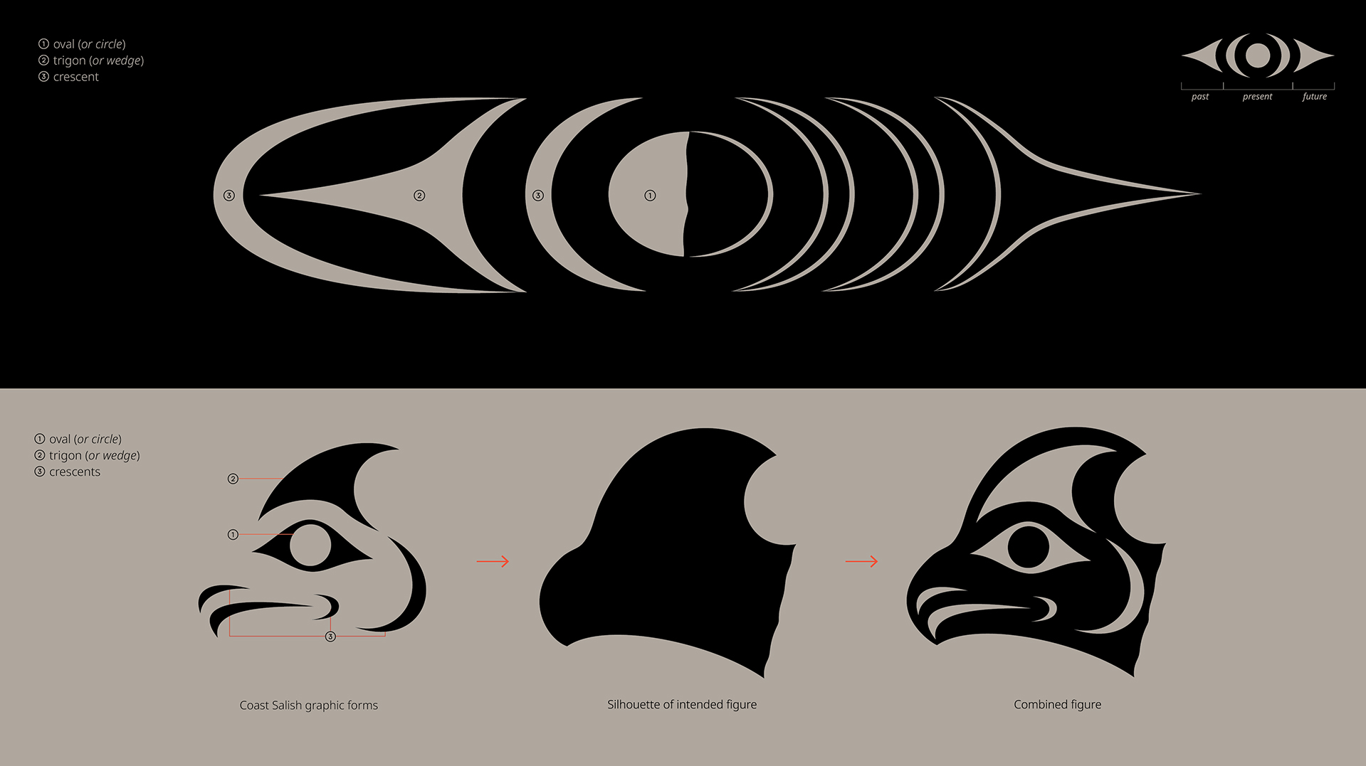
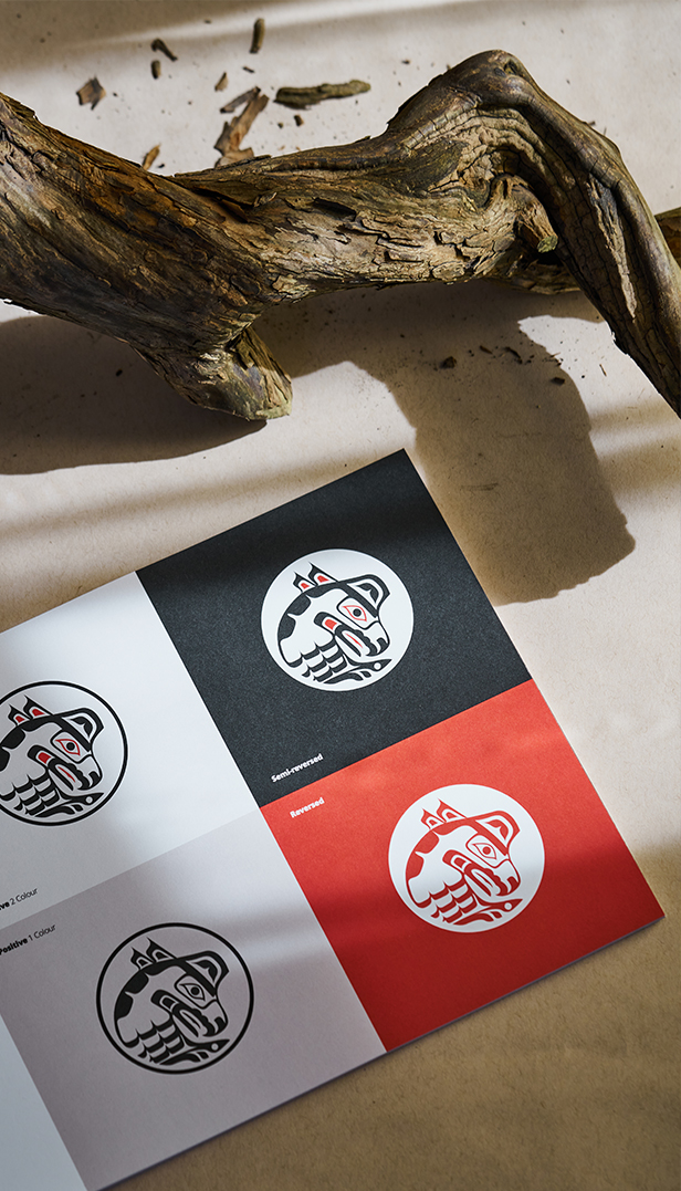
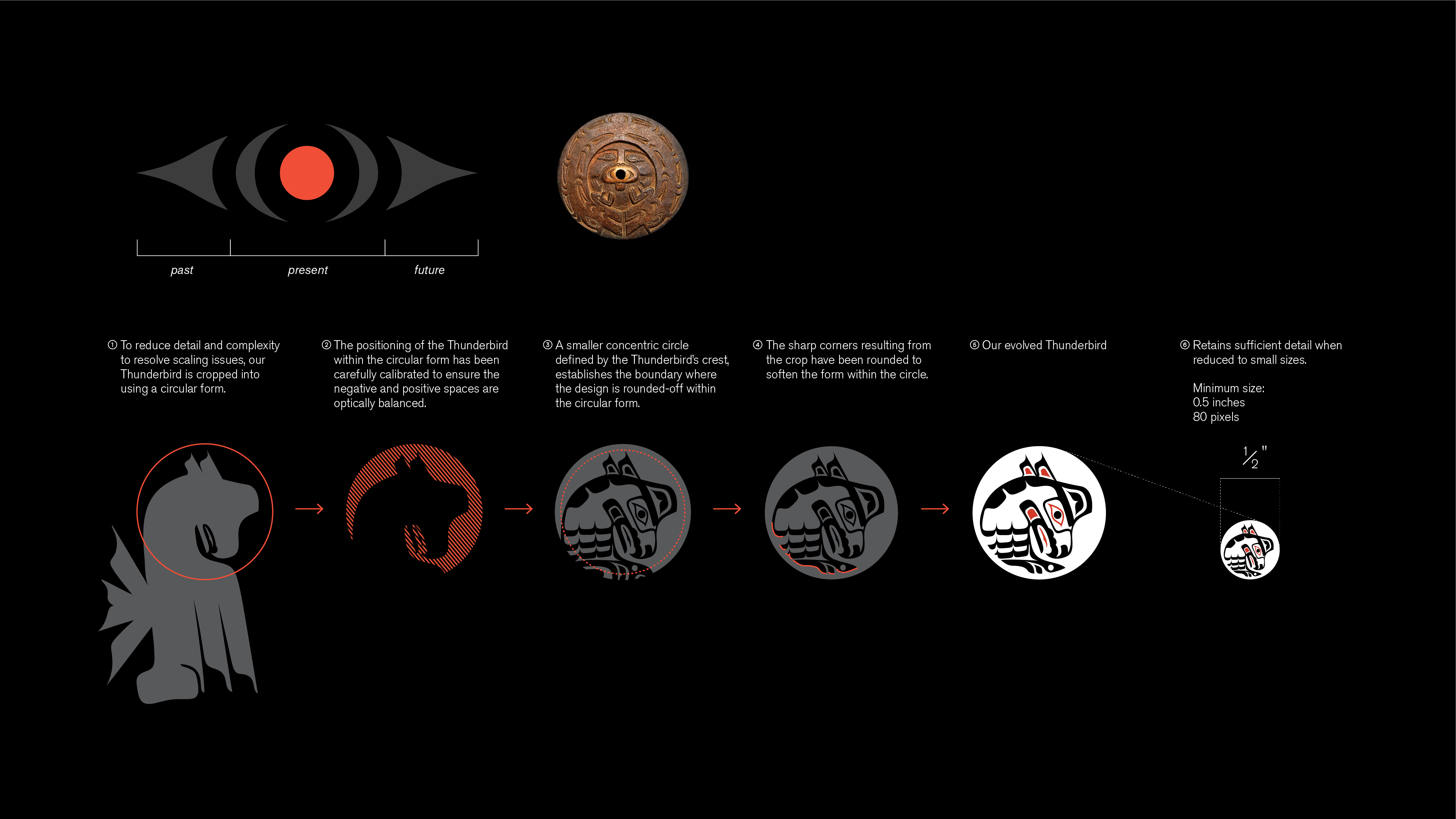
A simplified thunderbird
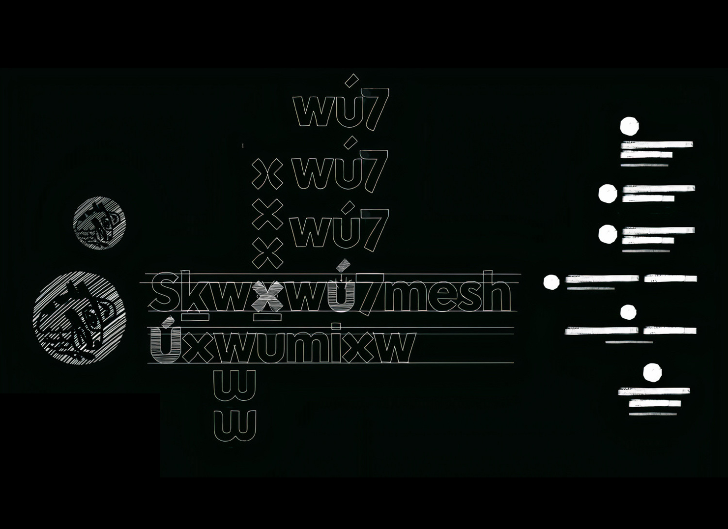
To overcome the scale and legibility issues of the Thunderbird, we used the circular form to crop around the head and used the negative space for optical balance. Within the outer circle, a smaller concentric circle acts as a guide for rounding off the design.
Cropping into the emblem allows it to be less burdened by detail (such as the formline design from before). The result is a contemporary logomark with its roots in the past. It can be applied across mediums, in a variety of colours, and now works for each department.
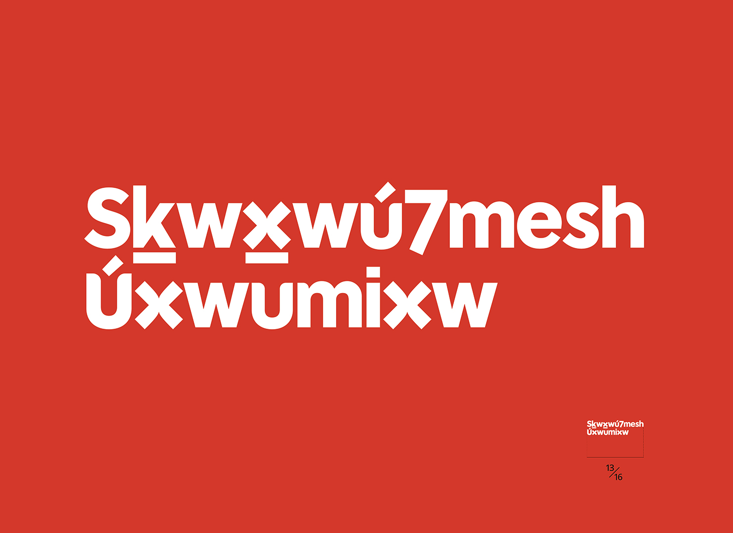
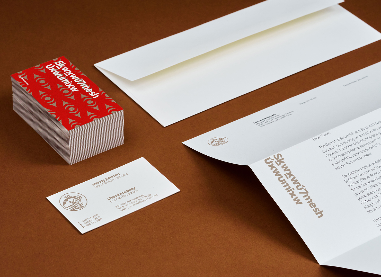
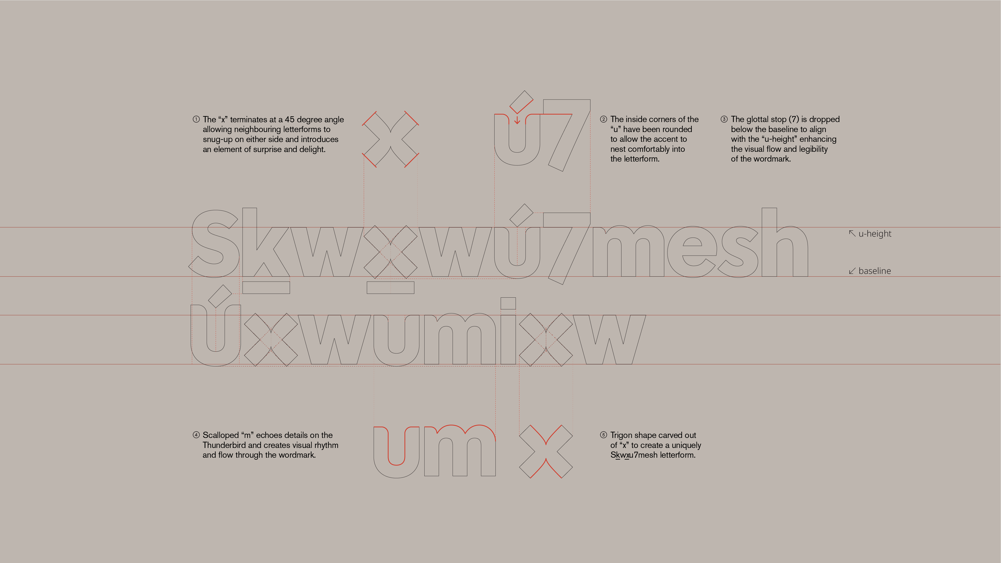
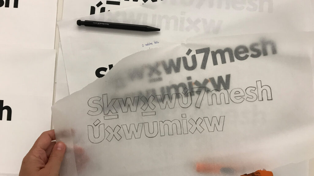
A prominent wordmark
Skwxwú7mesh Snichim (the Squamish language) is a critically endangered, but vital part of Nation’s culture, allowing them to trace ancient connections through place names and shared ceremonies. With efforts being made to increase the language’s prominence within the Nation, we designed the wordmark to form a central part of the brand identity.
After studying how certain characters represent sounds, our aim was to create a friendly and approachable wordmark that’s embedded with cultural nuance.
An evolved colour palette
The Nation’s existing colour palette was a bold black and red. For more warmth and vibrancy, we introduced secondary colours inspired by the surrounding landscape and Coast Salish traditions, and a series of patterns to complement the visual language.
When brought together with the emblem, wordmark, and colours, each element contributes to the strength and the feeling of a cohesive visual identity, while offering the opportunity for additional creative applications.

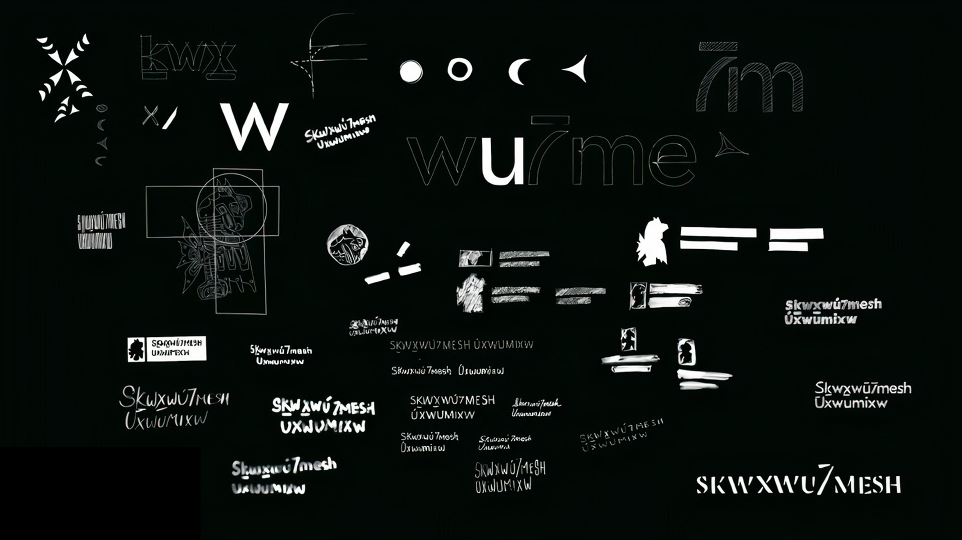
Design Process
Other Projects
-
Naikoon brand identity
Read more -
Passive House Canada brand identity
Read more -
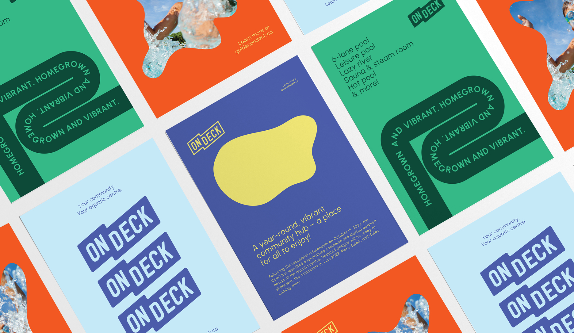
On Deck branded engagement
Read more -
Who Is This For
Read more -
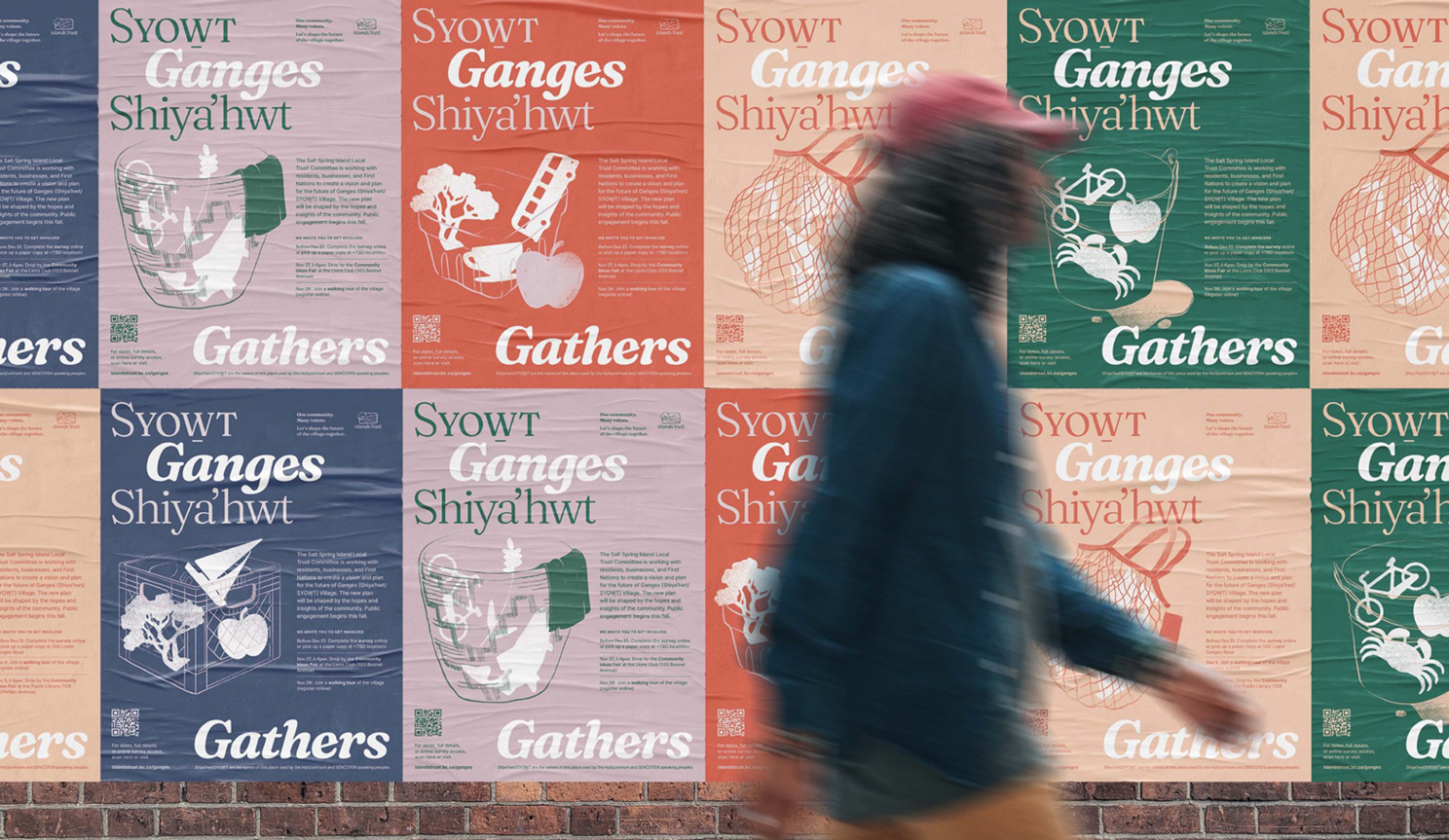
Ganges Gathers brand identity
Read more -
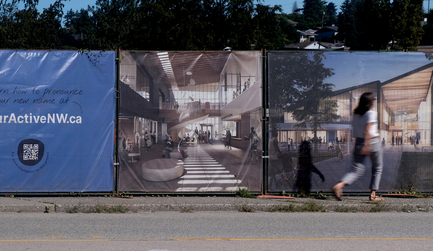
təməsew̓txʷ Aquatic and Community Centre brand identity
Read more -
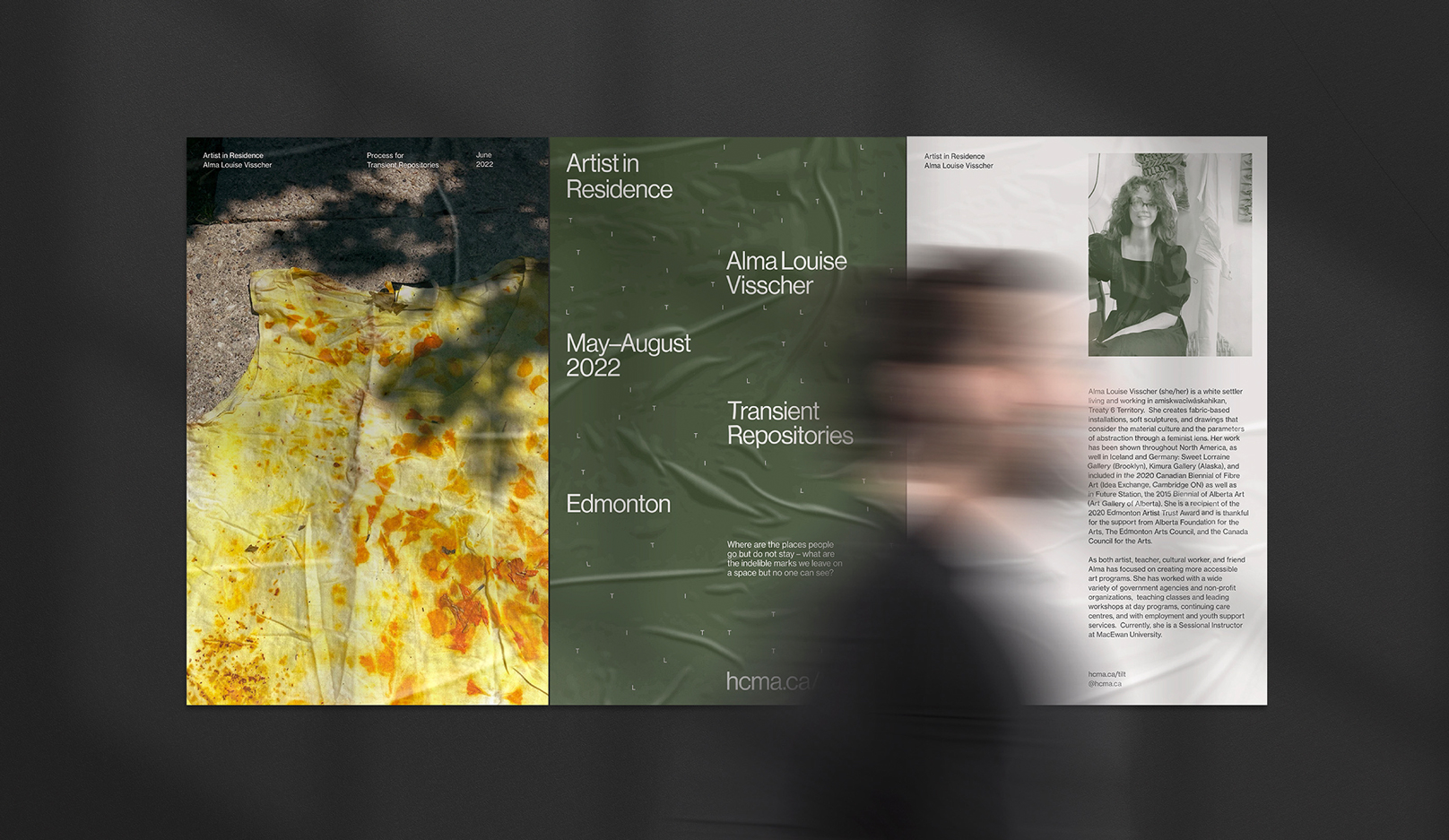
Tilt brand identity
Read more -
hcma rebrand
Read more -
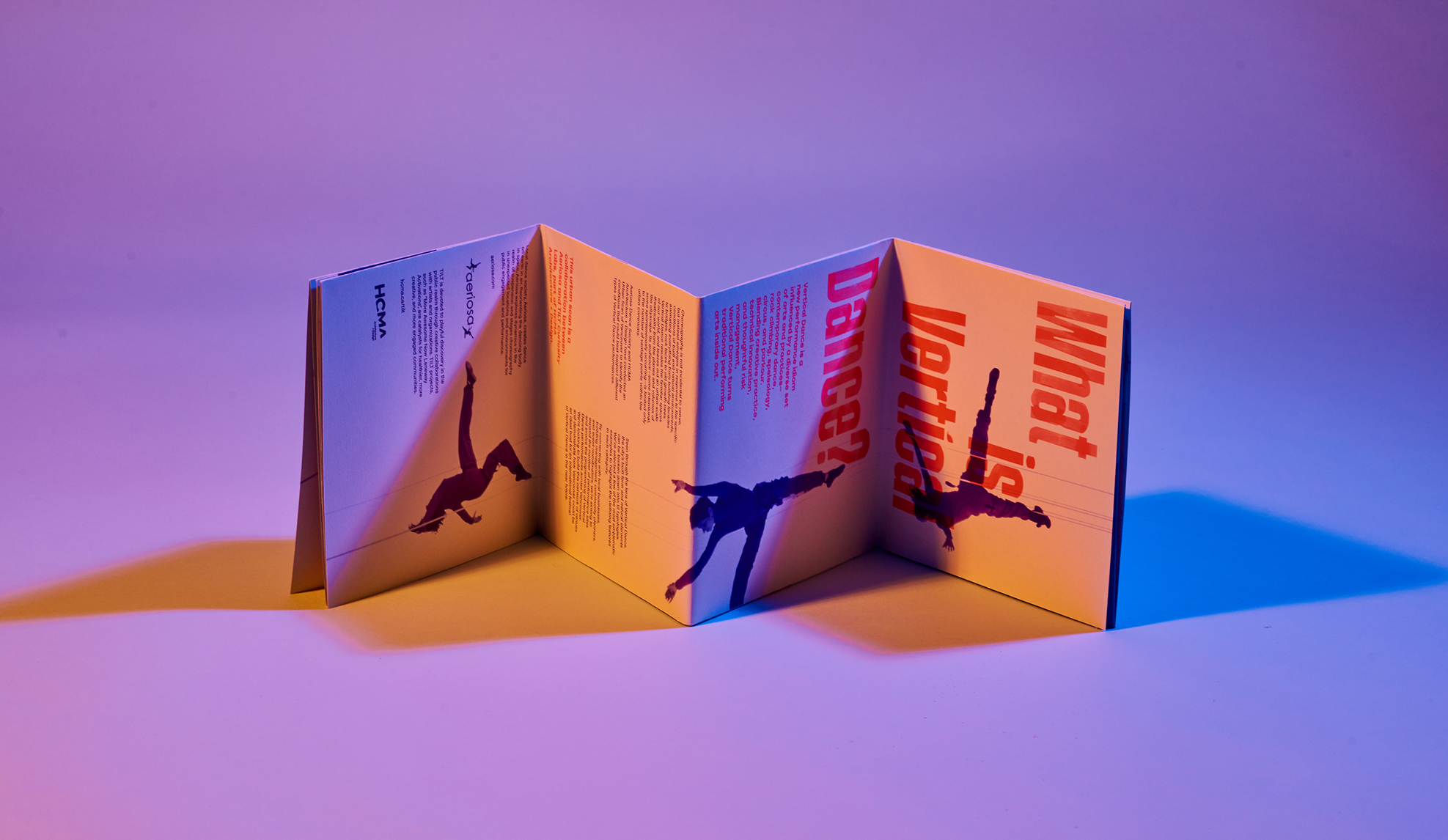
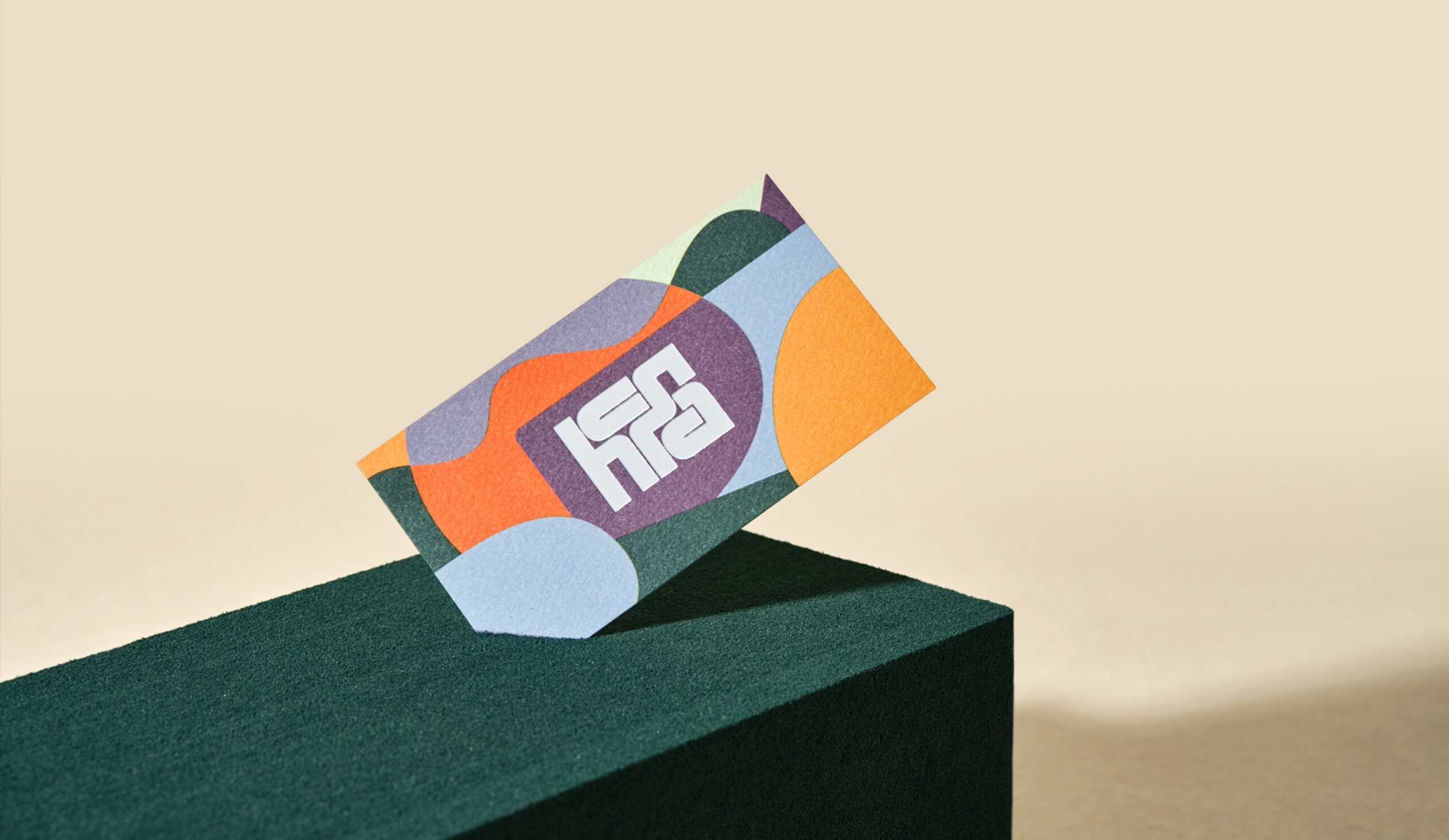
Aeriosa Dance Society
Read more -
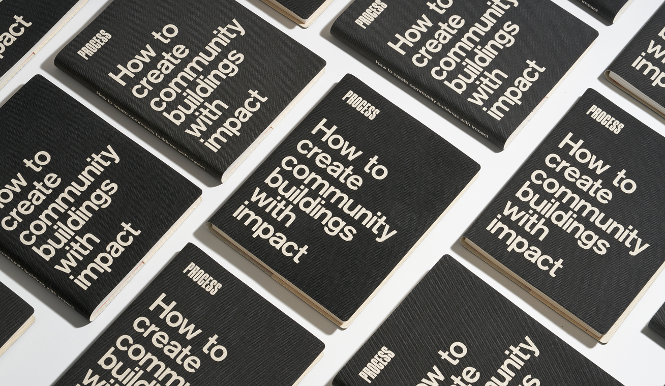
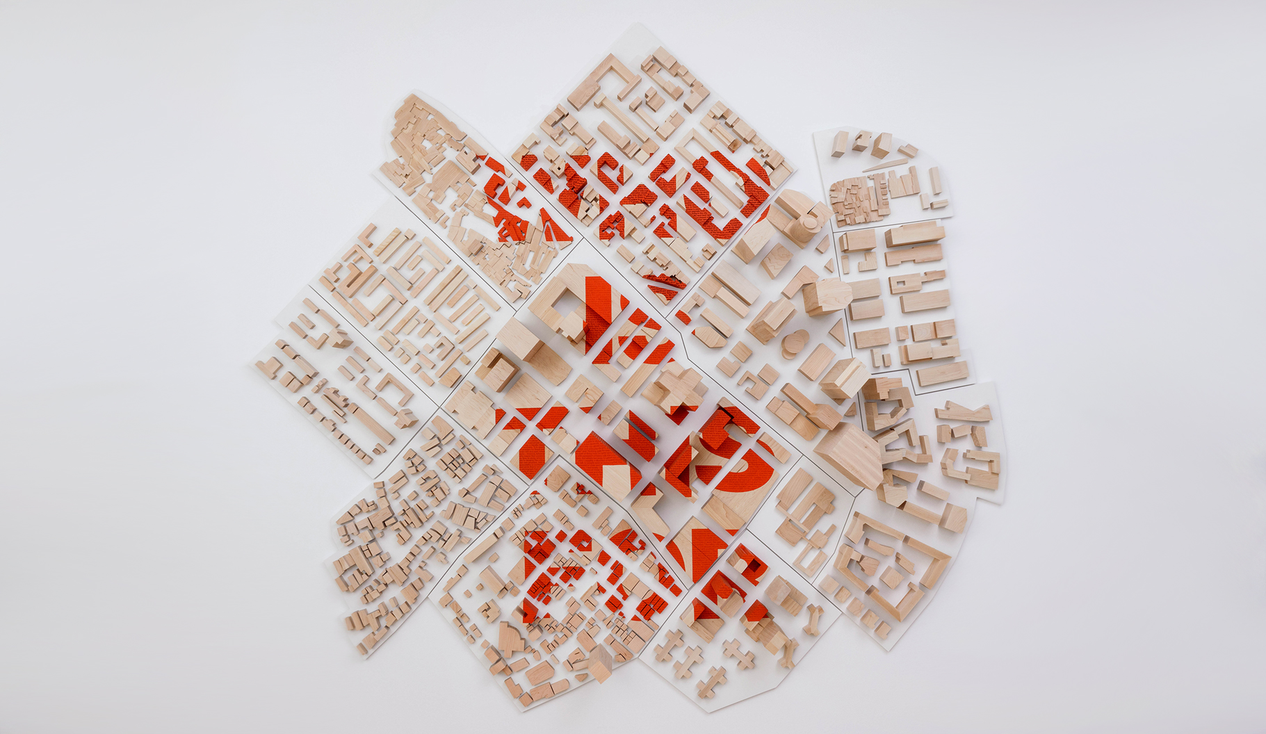
Process: How to Create Community Buildings with Impact
Read more -
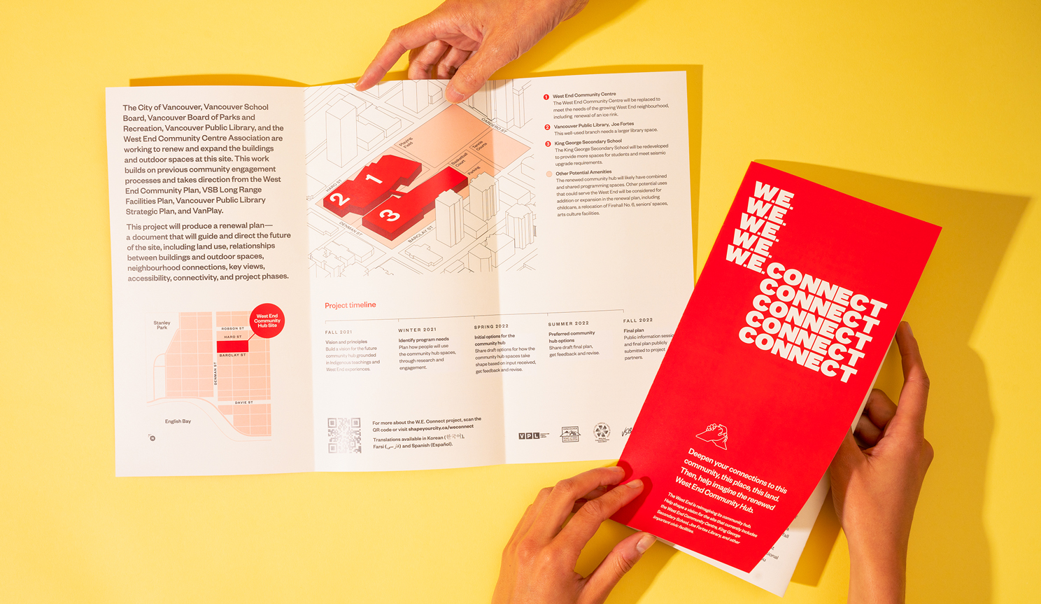
W.E. Connect brand identity
Read more