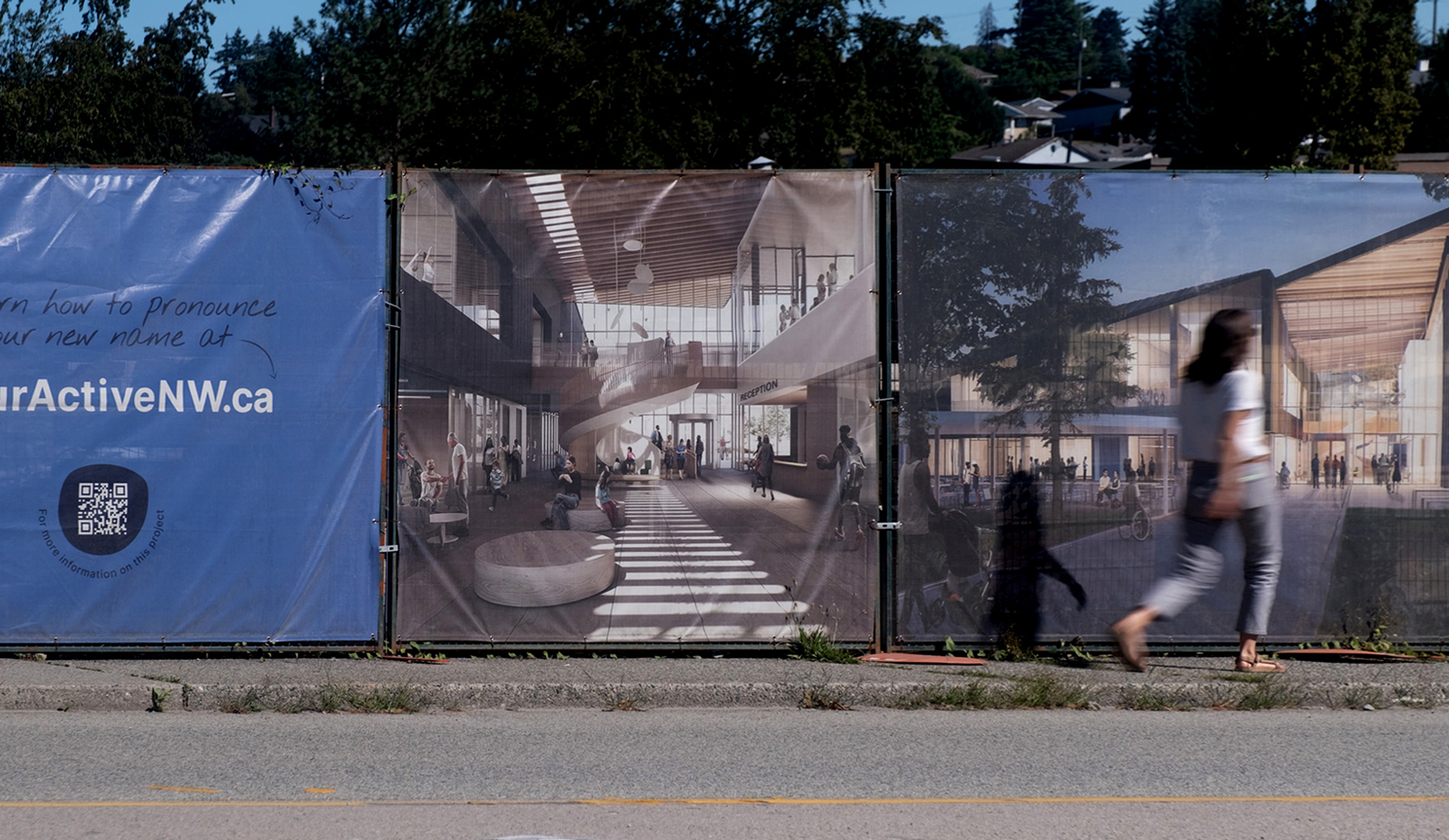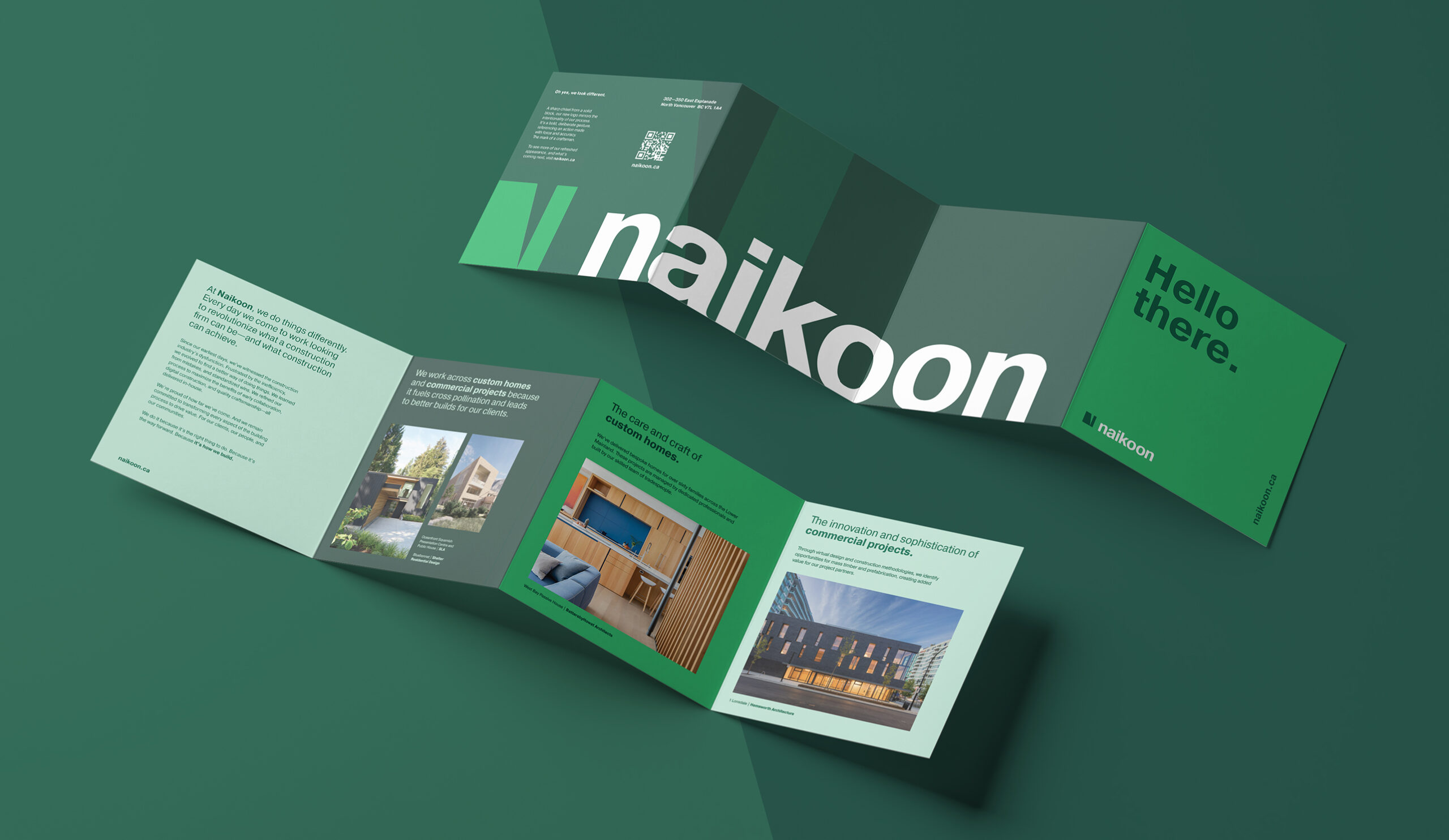
Naikoon brand identity
Location
Vancouver, BC
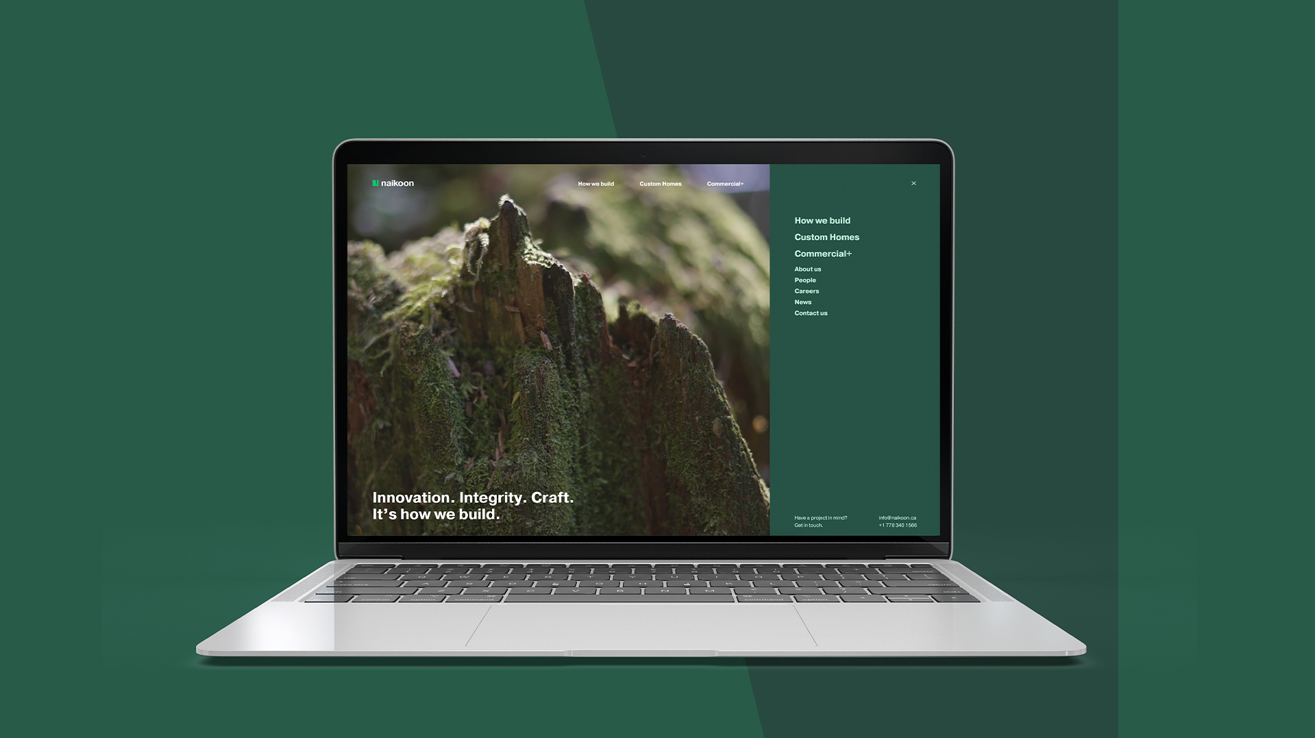
For over a decade, Naikoon has been quietly revolutionizing what a construction firm can be - and what construction can achieve. Now, hcma’s rebrand of Naikoon is bringing this work to light, with a new look, narrative, and website all designed to elevate their story and extend their impact in a sector ripe for change.
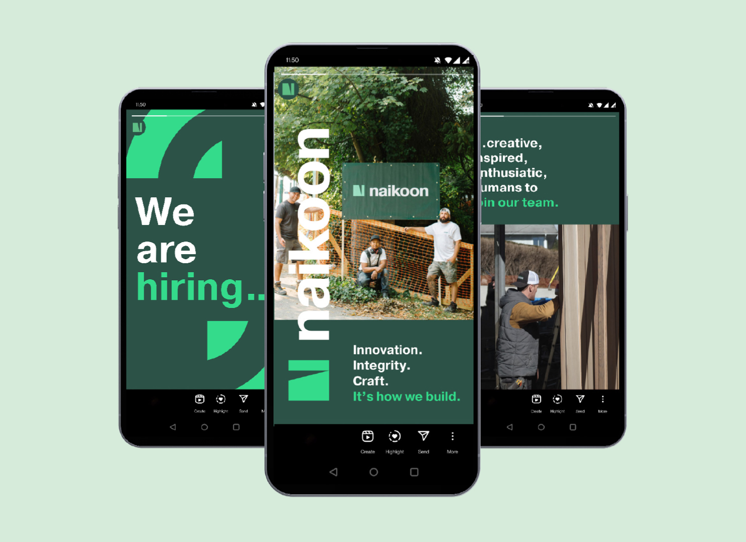
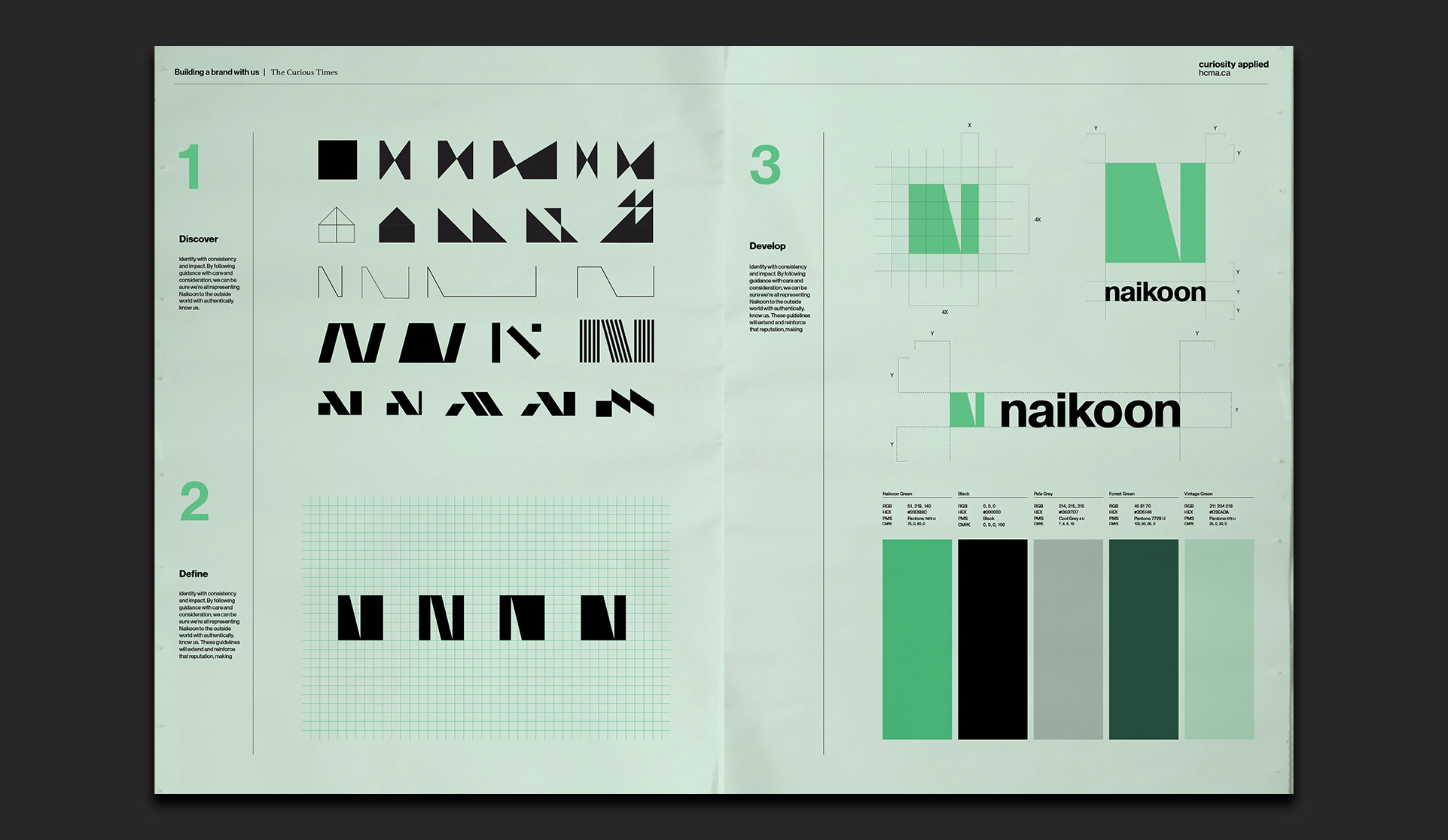
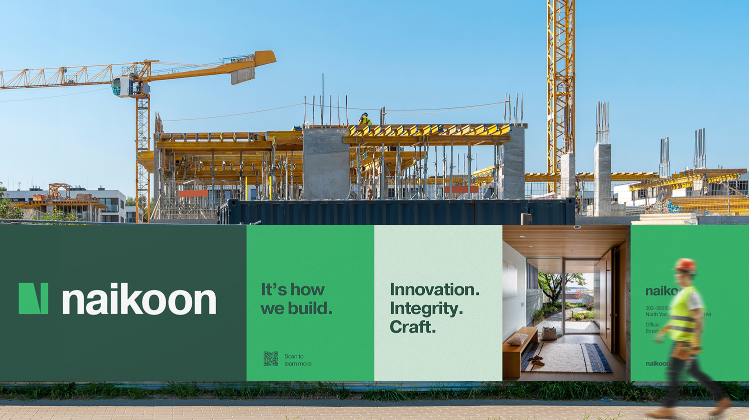
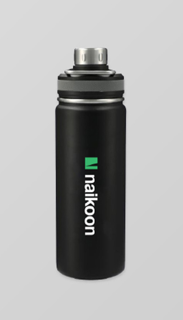
Naikoon’s new brand reflects its personality and culture, demonstrating a posture of honest leadership that is dedicated to advancing technology and creating change. The logo, a sharp chisel from a solid block, is a deliberate gesture suggesting an action made with force and accuracy. As the chisel bites into the material, it uncovers layers of potential—a nod to Naikoon’s dedication to build the future of construction.
Disciplines
Naikoon has become a trusted leader in the construction industry through its experience, dedication, and commitment to leading in an evolving industry landscape. Embodying this leadership, the new brand is approachable and professional, carrying a simple confidence that holds its own on job sites and in the market. The visual language is forward-thinking, unique, and memorable, while retaining the sense of fun that's integral to who they are.
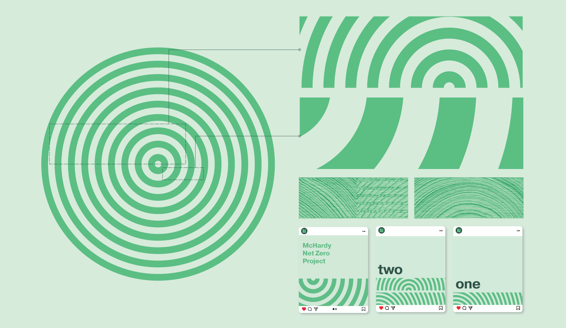
With an eye to the future, the Naikoon identity is rooted in the company's rich history, integrity, and craftsmanship as the foundation to their revolutionary ambition. Grounded in market research and stakeholder consultation, the timeless new brand system reinforces the reputation they've built and positions the firm for success across both commercial projects and custom homes.

A force for change in the industry, Naikoon will continue to set the bar for high performance projects, transform the building process, and have fun doing it. Their new brand identity is a recommitment to that mission.
