hcma rebrand
Location
Vancouver, BC
In 2021, our communication design team created our new brand identity to reflect the changing role of buildings, brands, and shared experiences in society. Our ambition? To reinforce our commitment to using design to strengthen community bonds, through a process that welcomes people in.
The goal was to move away from the stark, traditional visual conventions of the architectural world in favour of a warmer, more approachable look and feel that’s rooted in moments of connection.
Disciplines
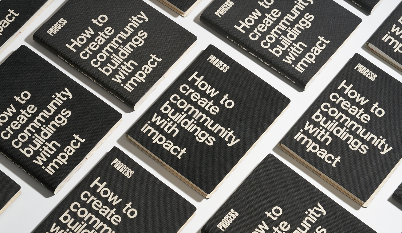
Substance in the style
So much of the design process focuses on the tangible, but the intangible is just as important. The moments of curiosity, the sparks of imagination, and the magic that happens when people from different backgrounds work together to solve a problem.
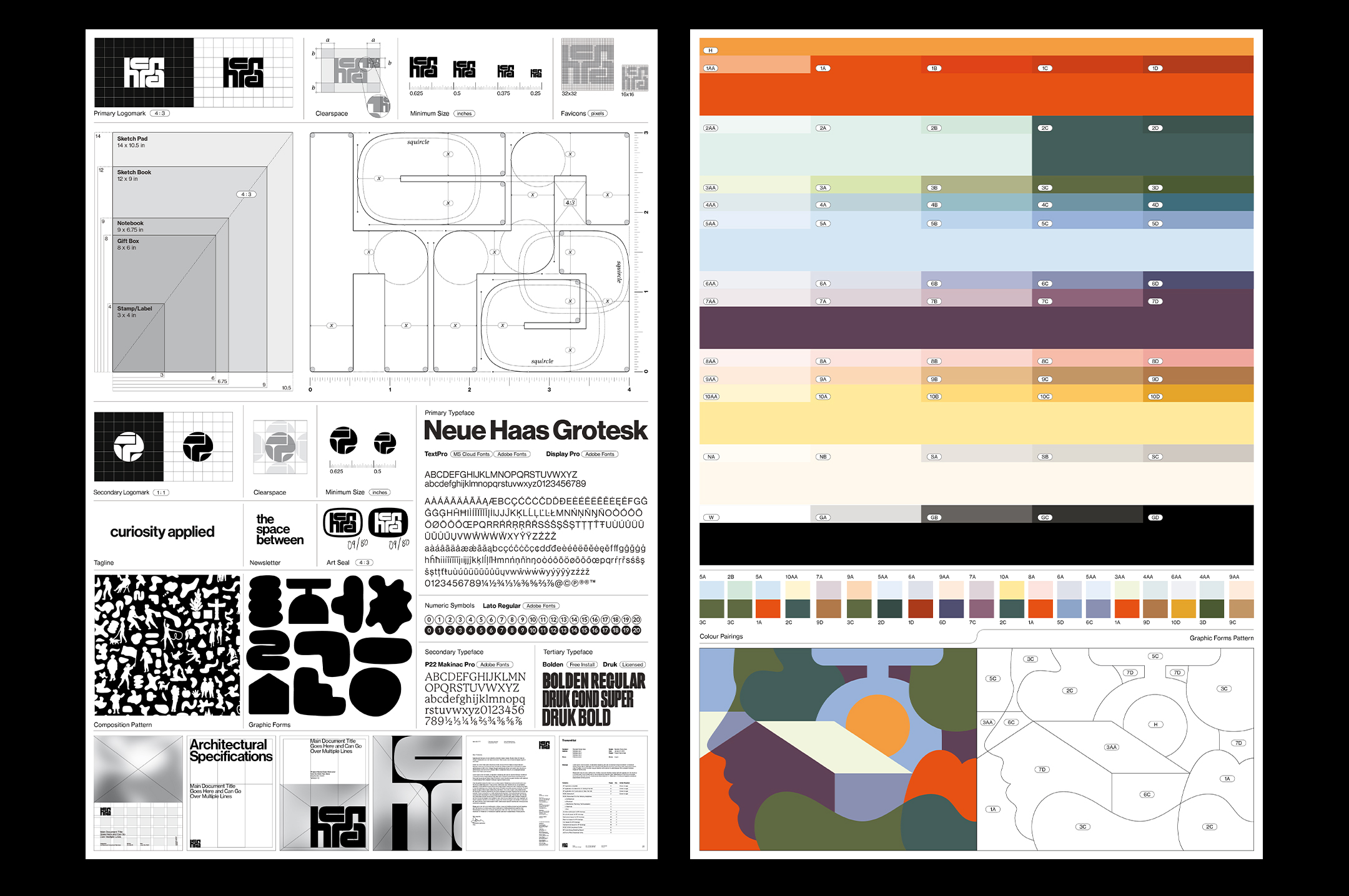
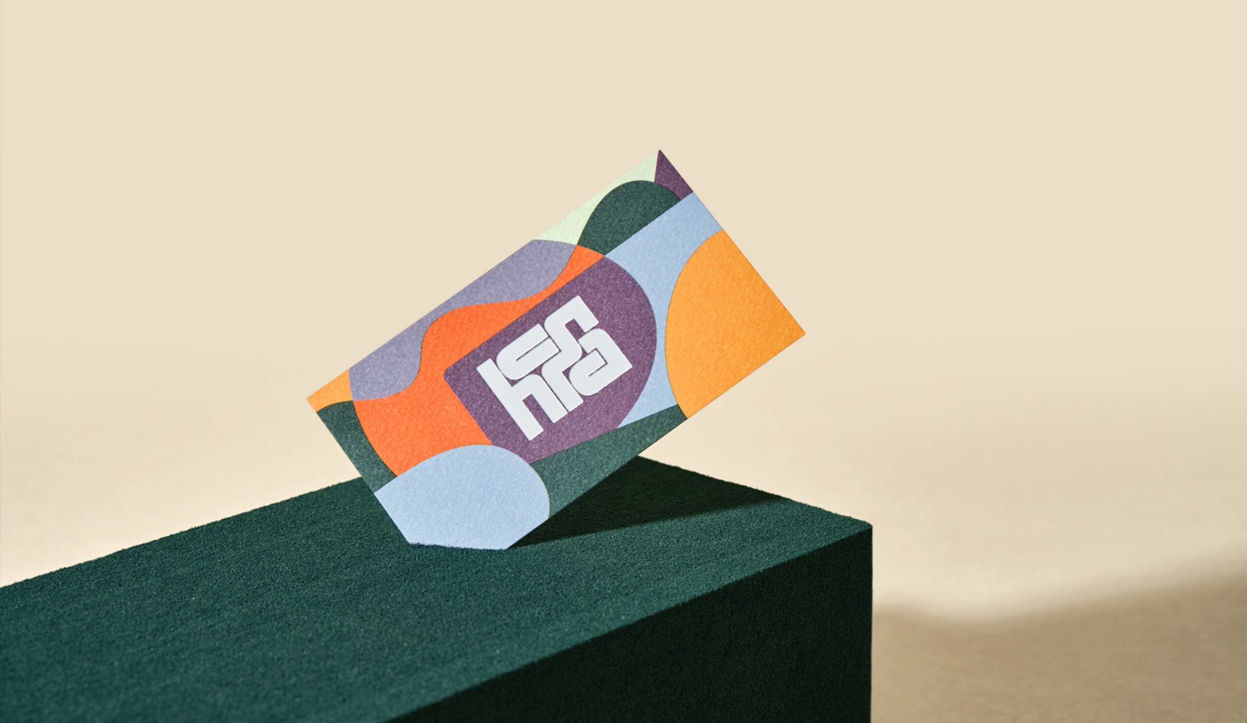
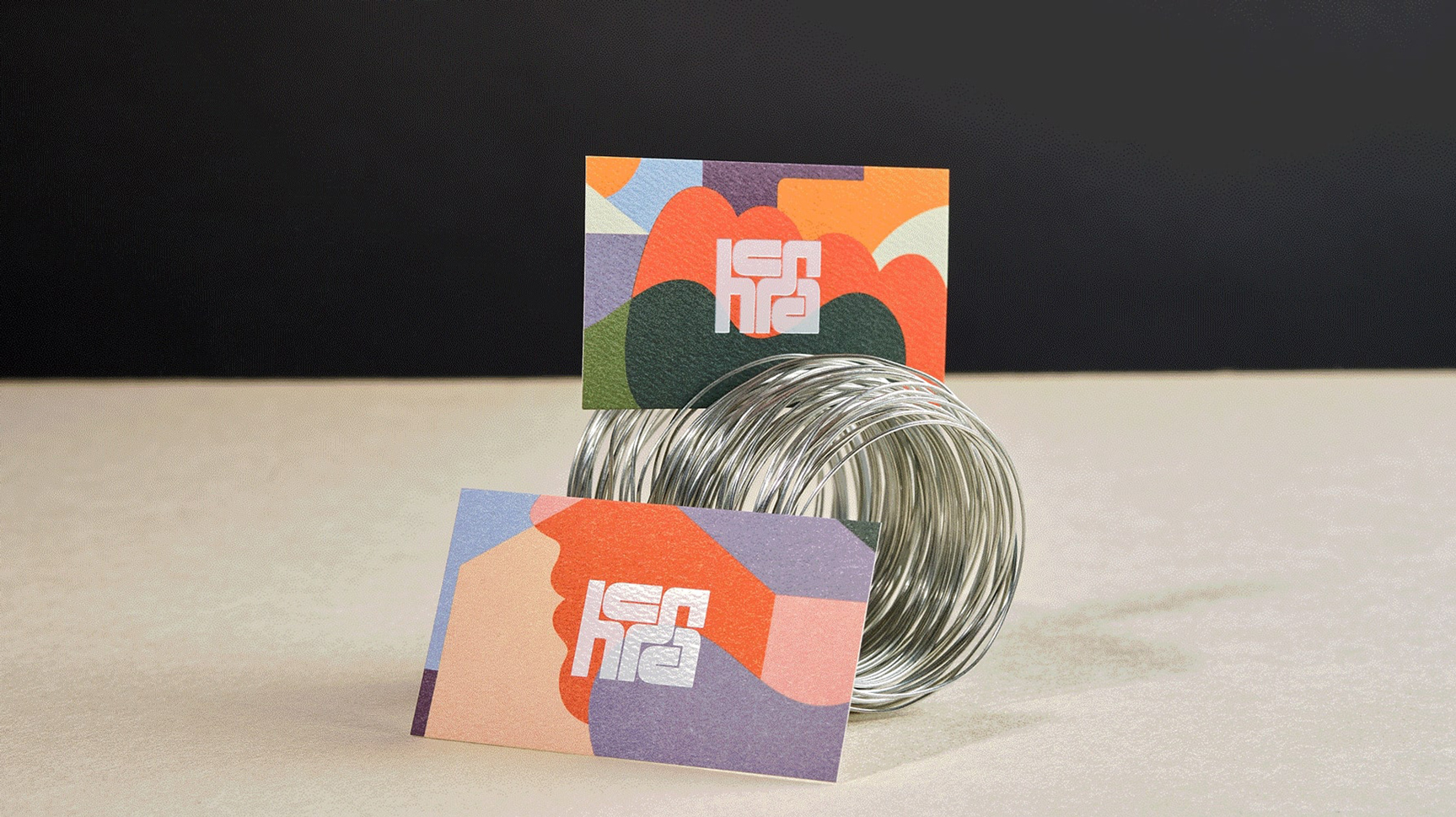
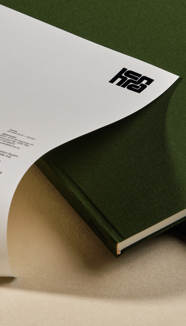
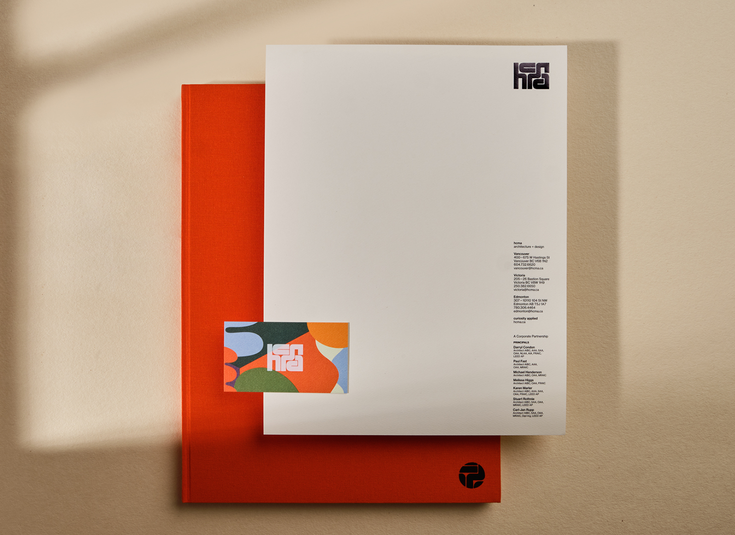
The new logo took its starting point from this story. The dominant strong outer rectangle is formed through disparate, unique letterforms, each playing its own key role in establishing balance and flow. Together, they form an analogy of hcma: a collective of unique individuals, with our own strengths and curiosities, that create a total greater than the sum of its parts.
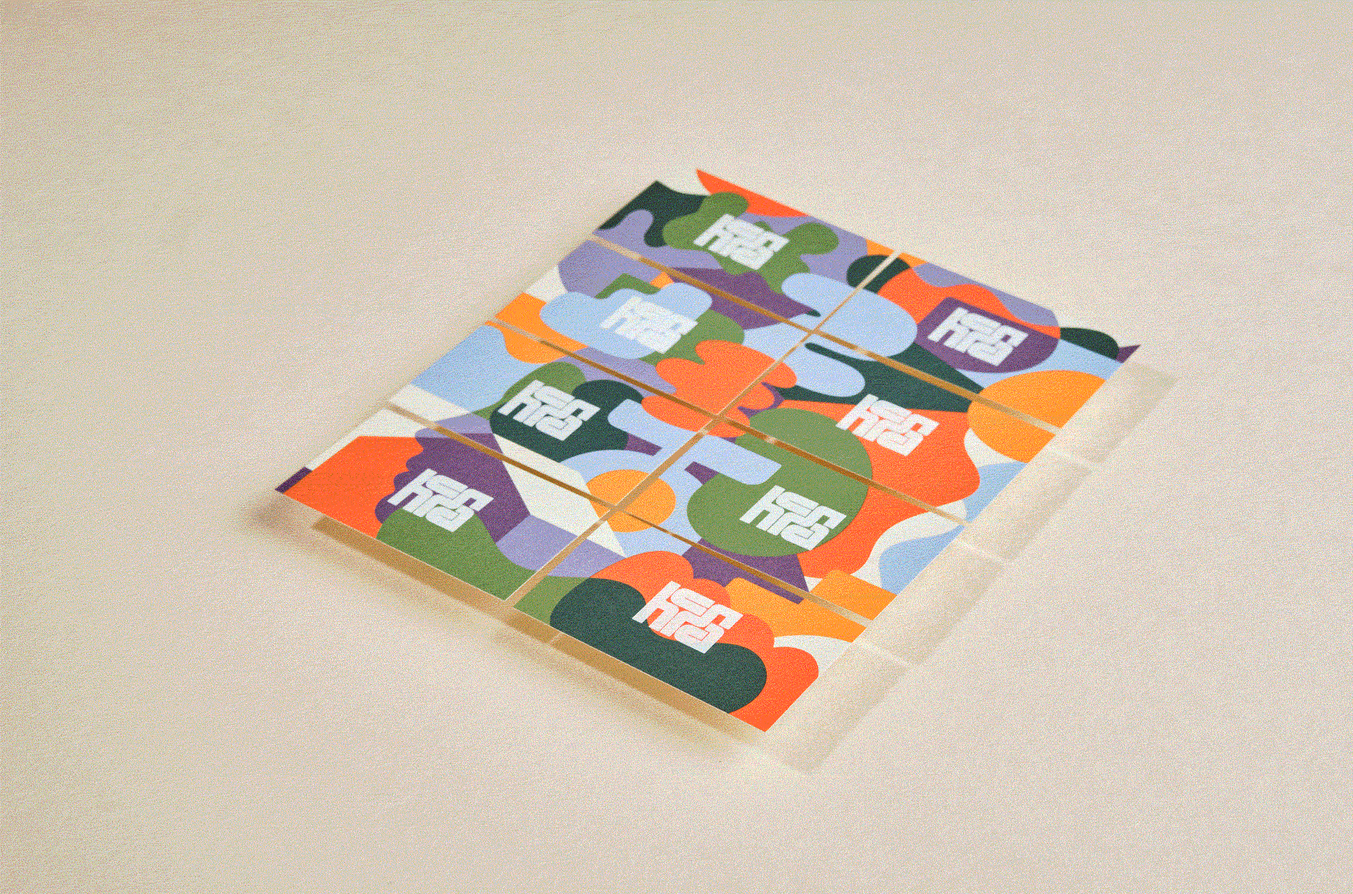
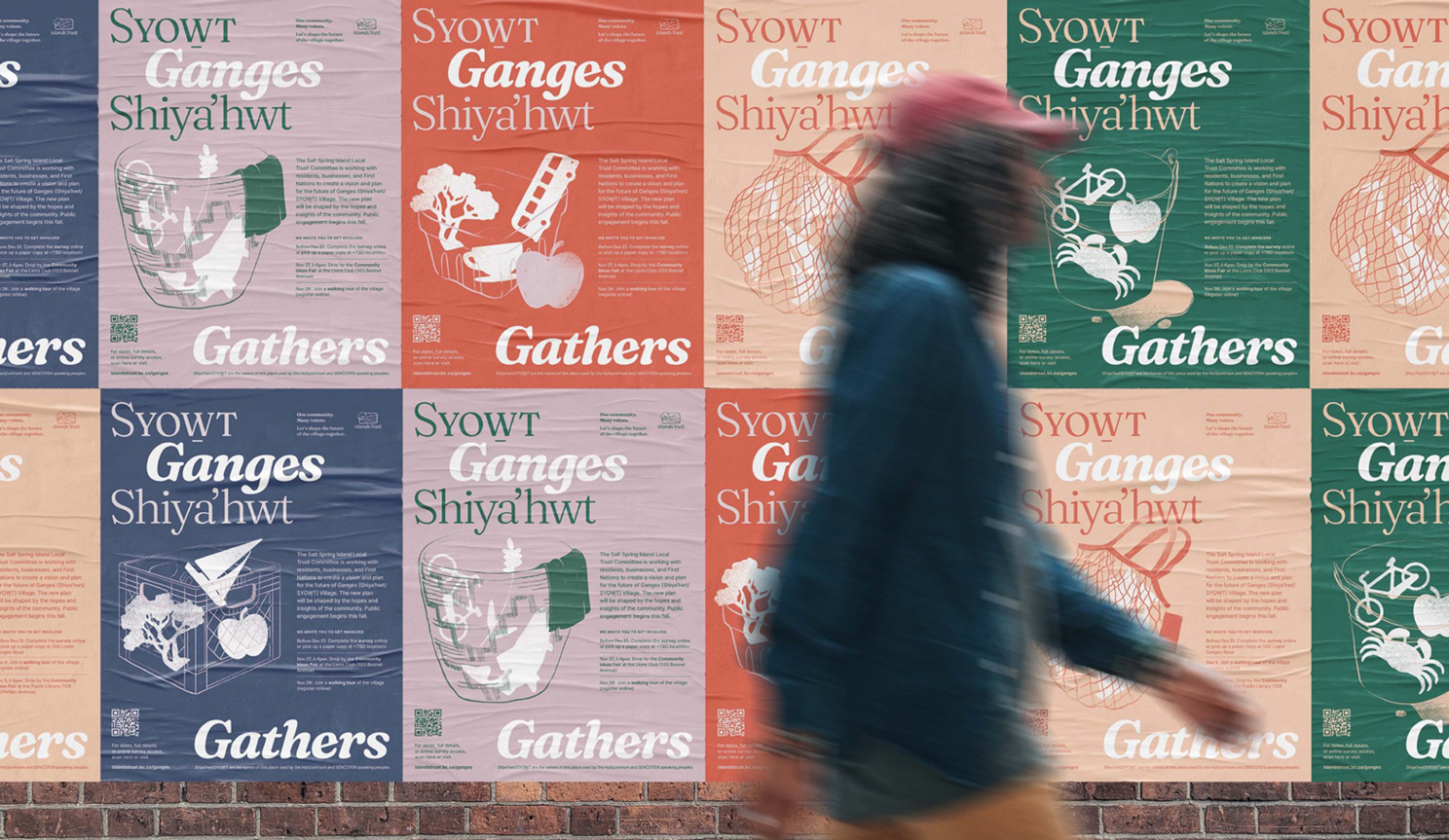
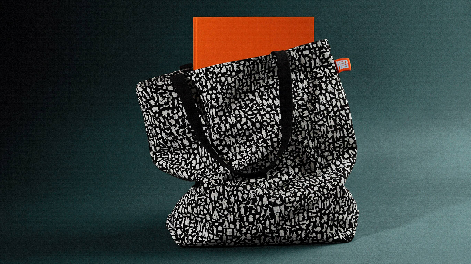
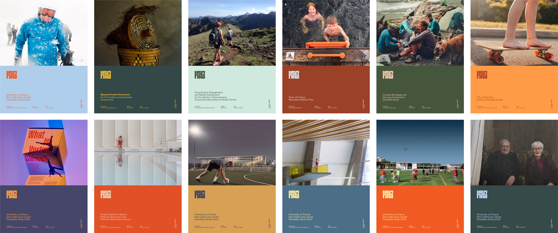
A core neutral colour palette pairs harmonious hues, tints and shades, and highlight colours, while a composition pattern of silhouettes – humans, objects, nature – symbolizes the overlaps between projects, learning cycles, and disciplines.
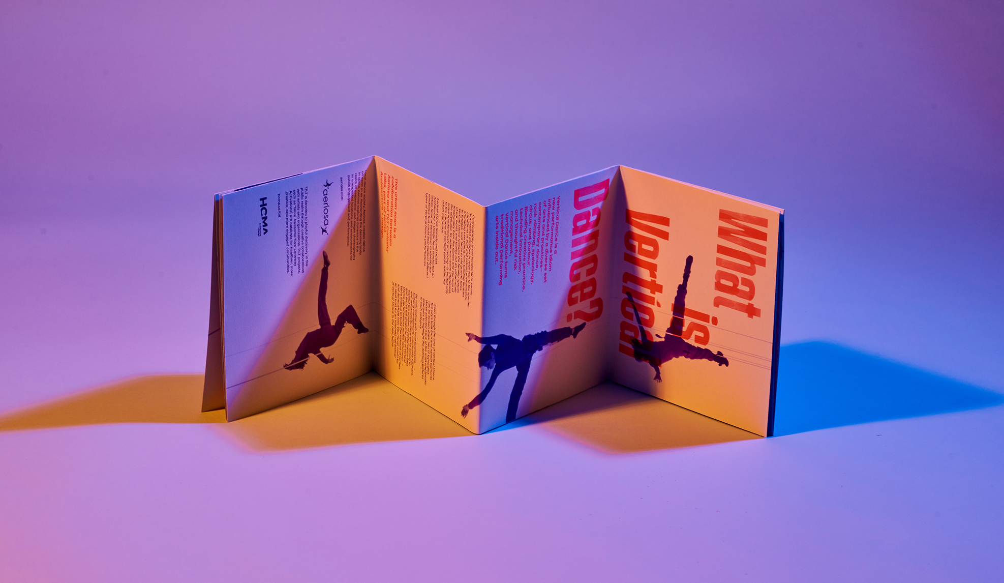
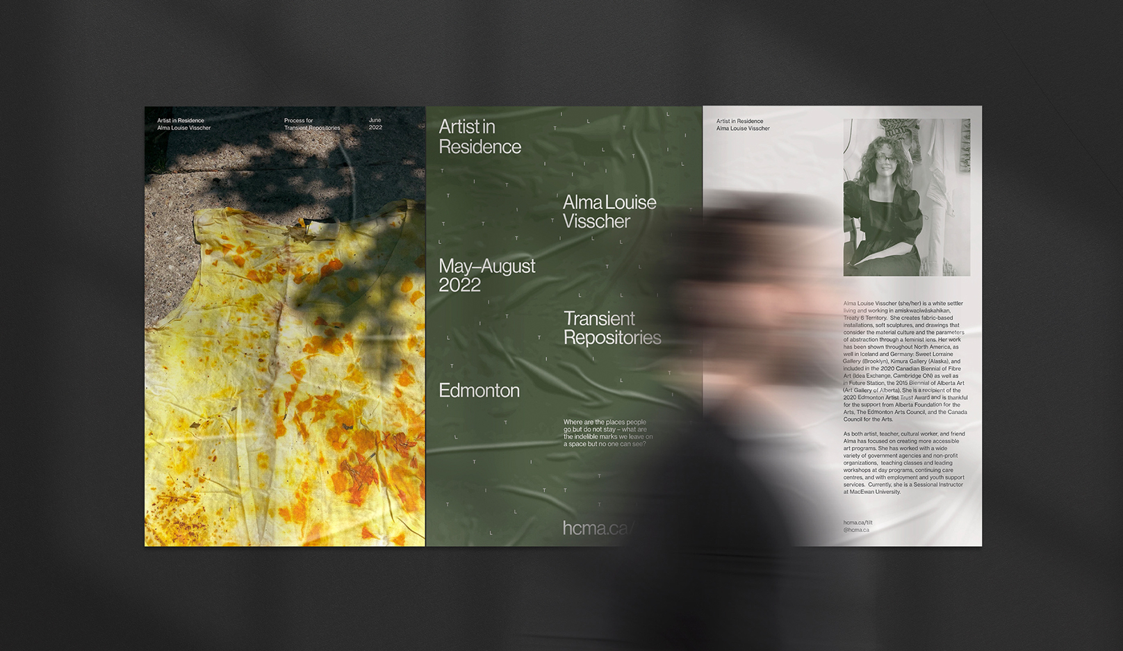
A journalistic photography style shows the moments of real life that happen in and around the spaces hcma creates, telling a richer story of both the people we design for, and our own team.
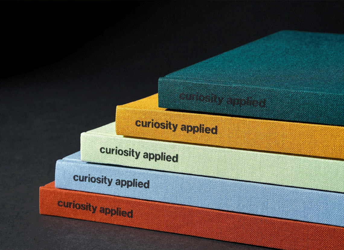
Ideas, action, impact
We believe the key to unlocking better solutions is to encourage a sense of wonder, and then to pull at whatever interesting threads could unravel the answer. That’s our approach for creating impact, and the inspiration for our new tagline, ‘curiosity applied’.
As Darryl, our Managing Partner, says:
“Our evolution reflects the need for architecture to look beyond itself for answers to the rapidly changing needs of people and spaces. Our communities are facing all sorts of challenges, each of them complex, but also interdependent. We’re working towards a future where diverse people and institutions come together to help solve them.”