W.E. Connect brand identity
Location
Vancouver, BC, Canada
W.E. Connect is a welcoming, distinctive engagement campaign designed to get people excited around Vancouver’s West End Community Hub (WECH) Renewal Plan.
Inspired by pairing the character of the West End with Musqueam, Squamish, and Tsleil-Waututh knowledge, art, and culture—W.E. Connect invites people to share personal stories of the area, and what they hope it could be in the future.
Anchored with feeling
Vancouver’s West End is a vibrant, high-density area with beaches, parks, and stunning mountain views accompanying an abundance of bars, restaurants, and shops. It’s home to an eclectic mix of over 65’s, a large LGBTQ+ community, young families, and weekend visitors from across the city.
We kicked off our design approach by visiting the West End where we found inspiration in the visual language of its architecture and streetscapes, as well as its unique position between downtown Vancouver and the wilderness of Stanley Park. We then defined the feelings associated with the West End—“warm”, “welcoming”, “authentic”, “quietly confident”, and “distinctive”. These became the key principles to anchor the identity and led us toward the naming: “W.E. Connect”, a play on “West End” with a human twist to represent a united local community.
Disciplines
Areas of impact
Combining loud and quiet
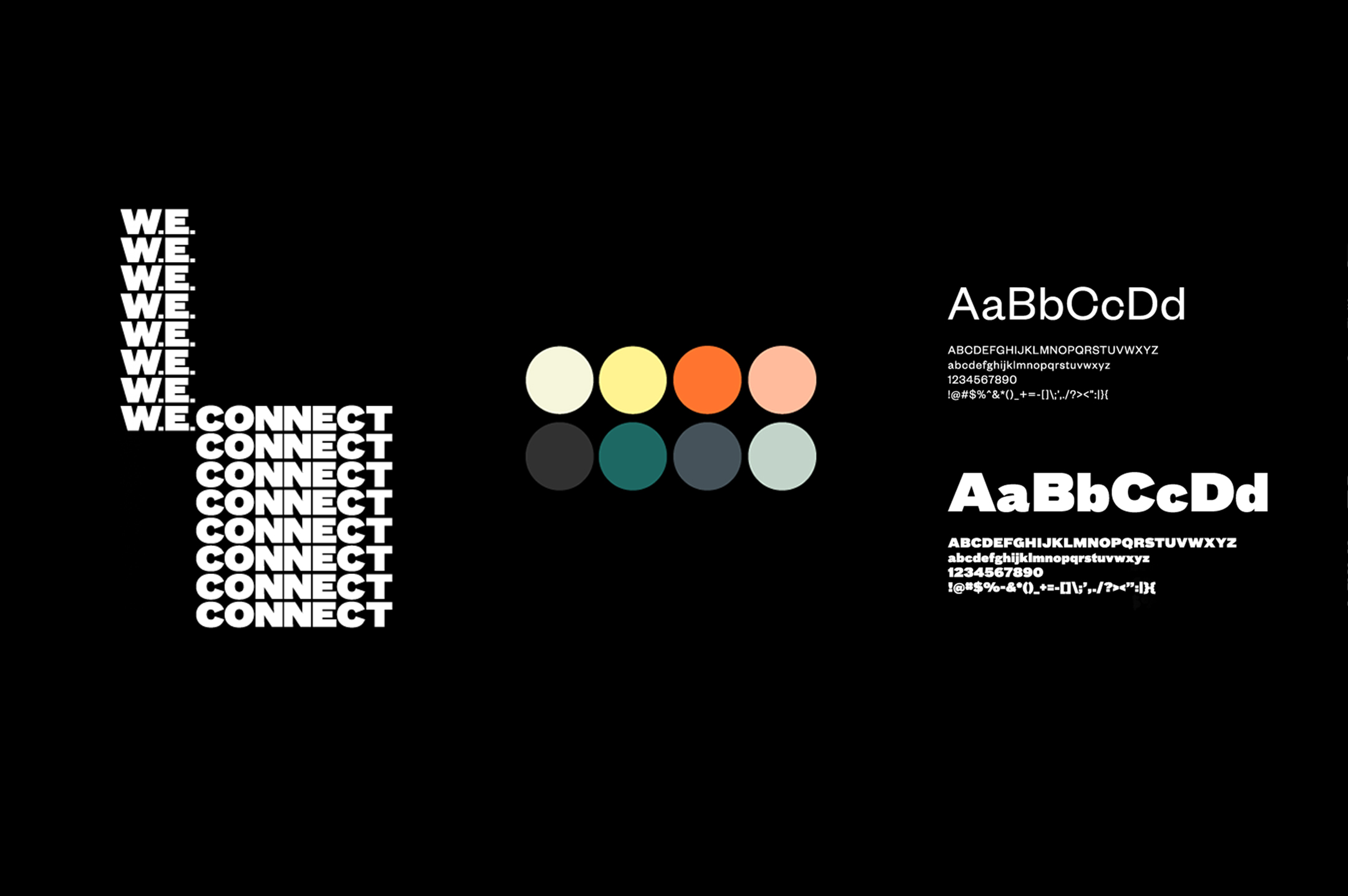
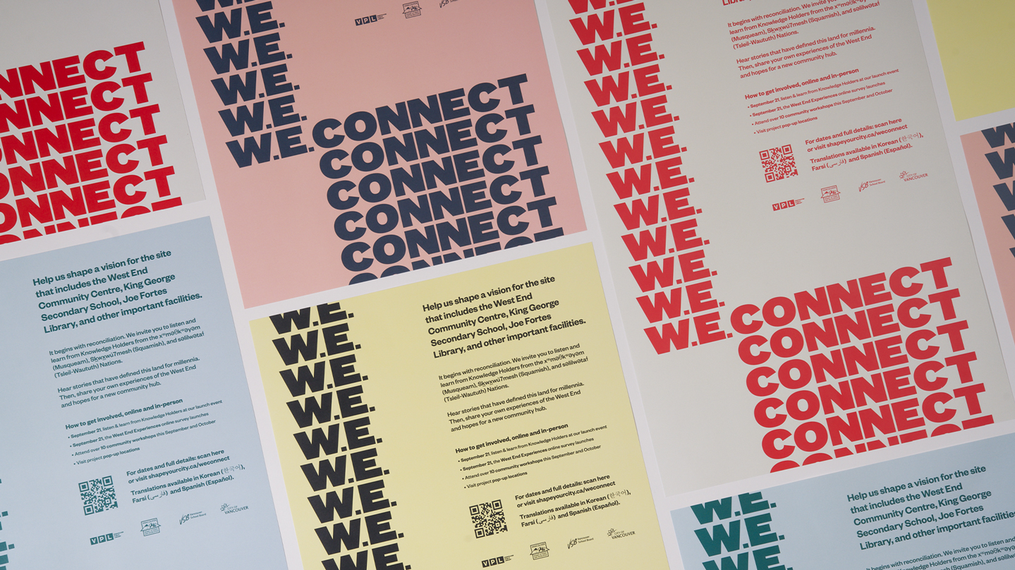
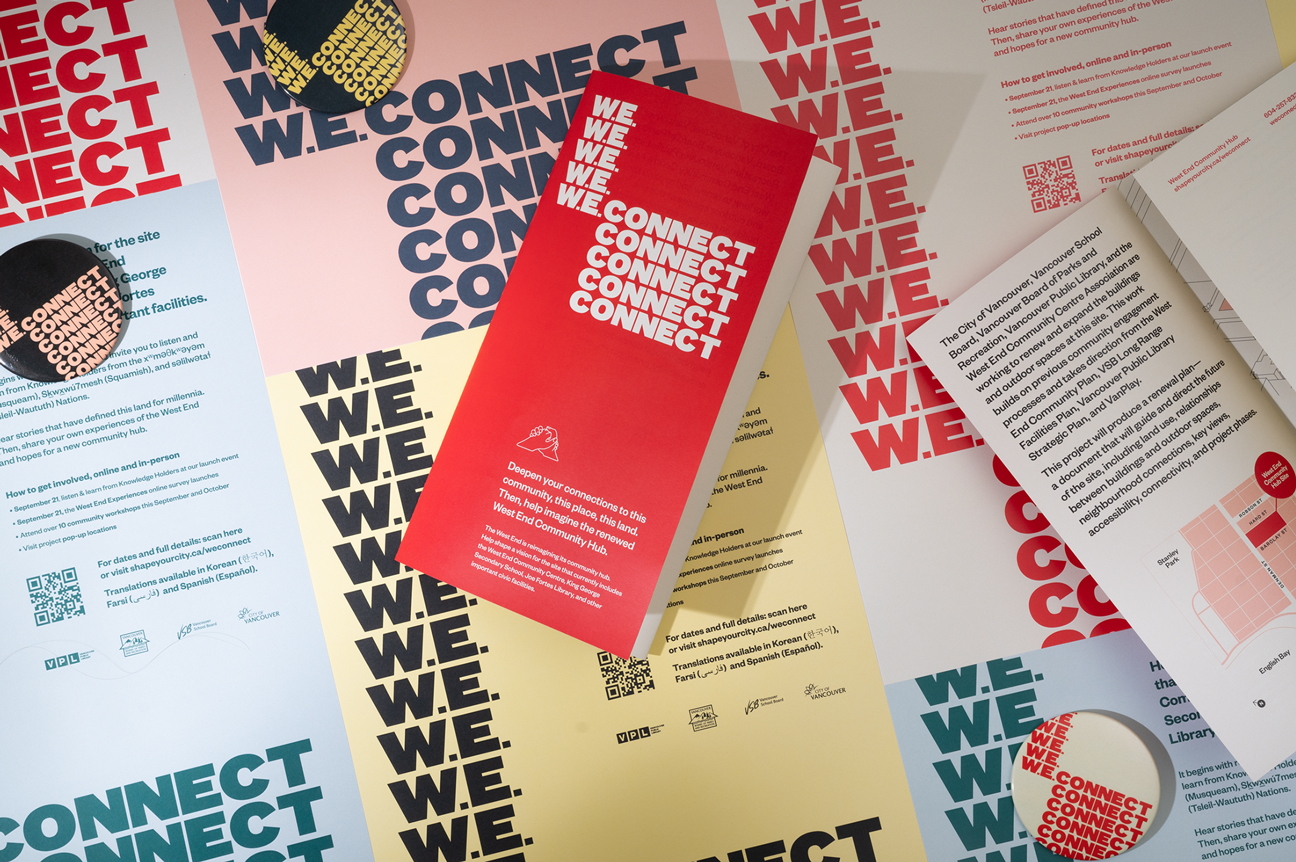
To grab attention—both online and in busy, physical locations—we created a bold but inviting wordmark. By applying a repetitive treatment, it visualises the sweet spot between people and places coming together.
Rather than pairing the loud wordmark with loud colours—which risked feeling brash and overpowering—we chose pared-back pastels for balance and warmth. These take cues from the West End’s natural colour palette—the sunrises and sunsets, the sand, trees, and ocean—and its human forms; the LGBTQ+ rainbow crosswalks, distinctive architecture, and vibrant shopfront signage.
Space to inform, space to play
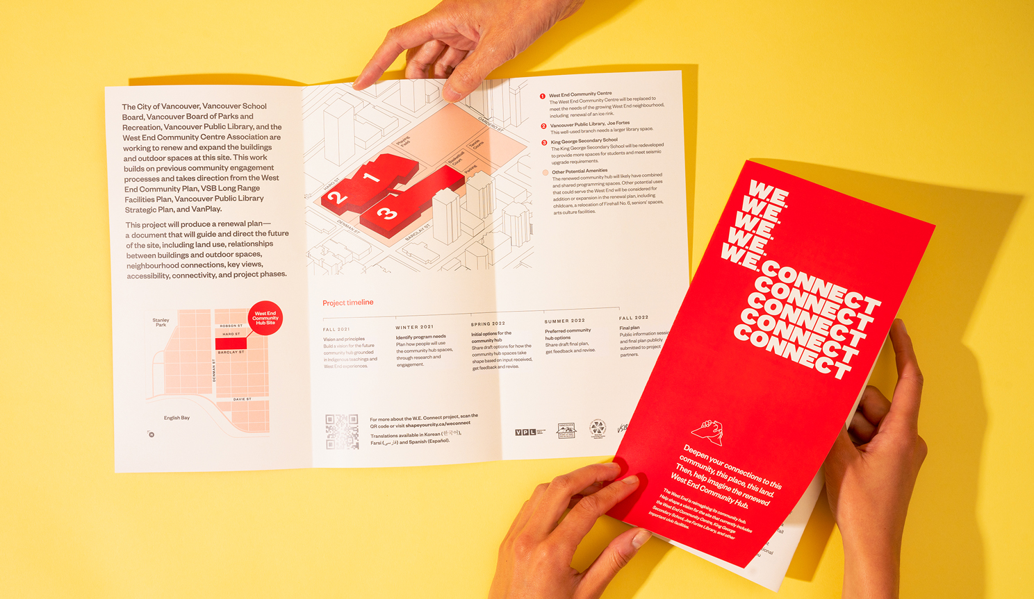
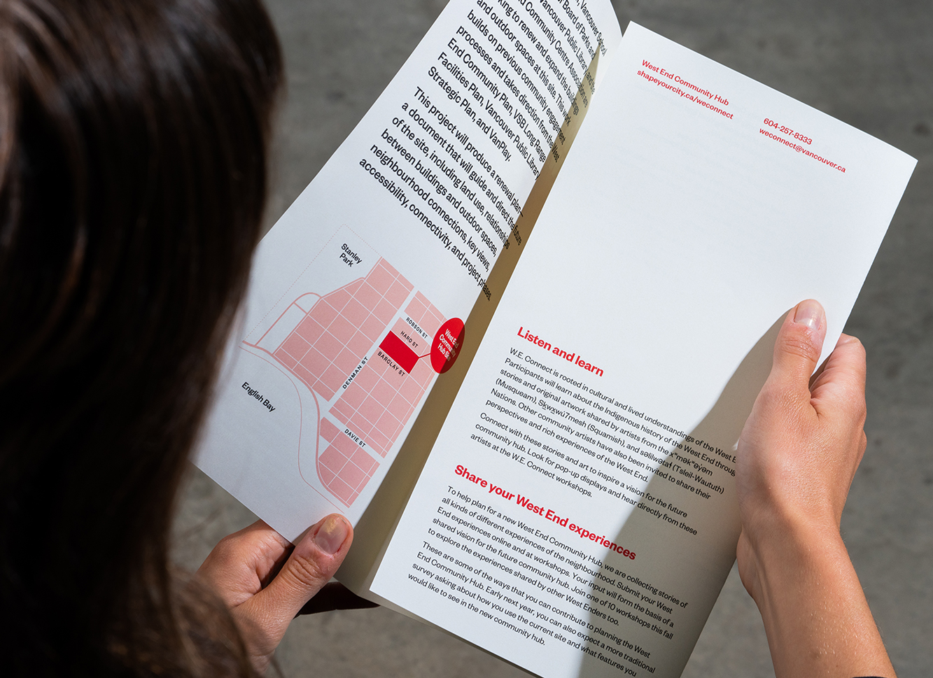
Given the scope of the renewal project, there’s naturally a huge amount of information to share with the community. The identity system had to be flexible to accommodate that, providing a platform for key information—the project overview, timeline, and how to get involved—to be skimmable and easy to digest.
The bold wordmark draws people in, while creating a grid structure for plenty of copy, illustrations, and artwork to allay key messages.
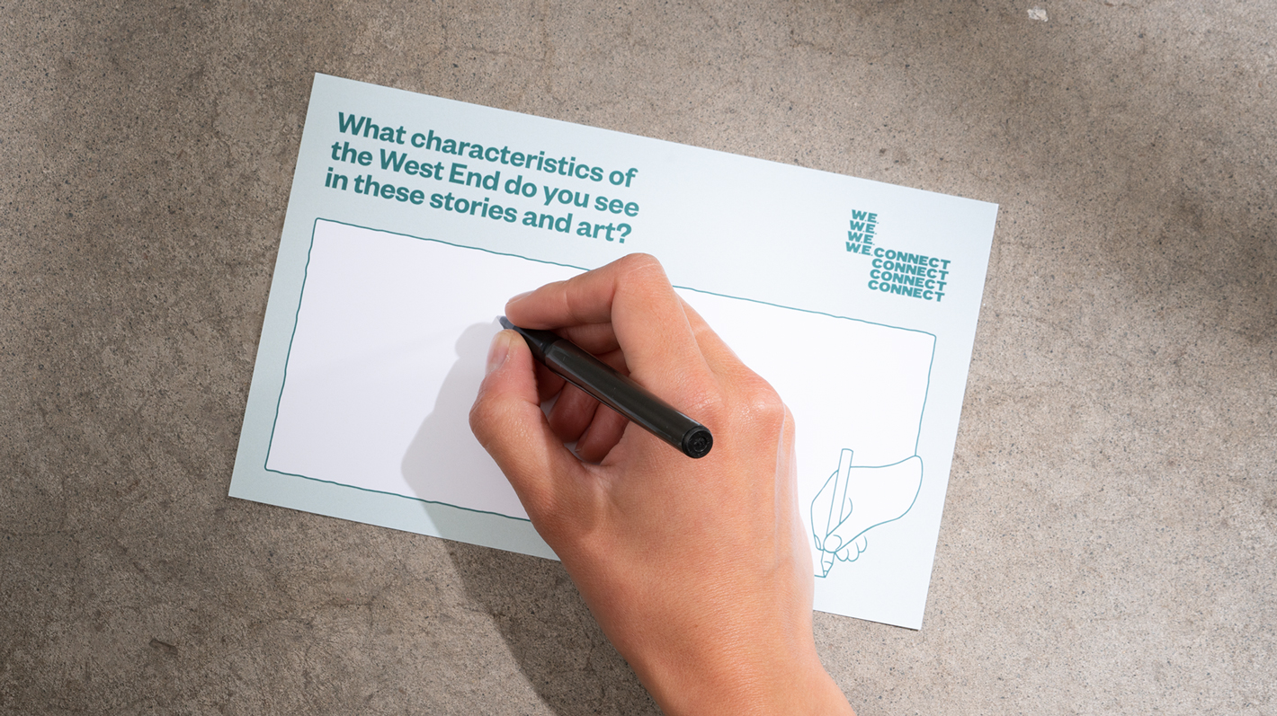
Hand drawn illustrations
Constrained by the lack of photography available for the project, we created hand drawn illustrations to give the identity a human element. These were inspired by old instruction manuals and convey the notion of building something together as a community.
These illustrations are used alongside architectural massing diagrams and maps to help viewers anchor the project’s geographic location.
Indigenous Knowledge Keepers
The renewal project is heavily focused on strengthening connections to Coast Salish peoples. To incorporate that into the visual identity, three Coast Salish artists, Cory Douglas (Sḵwx̱wú7mesh/Squamish), Chrystal Sparrow (xwməθkwəy̓ əm/Musqueam), Angela George (Sḵwx̱wú7mesh/Squamish), created artworks that depict their Nation’s connections to the West End.
Two local artists, Afuwa and Ken Boesem, also created artworks that speak to their experiences and reflect the area’s diversity and culture. Together, the visual identity and artworks helped people better understand Indigenous perspectives and shared histories of the West End, informing the overall project story arc.
Through workshops, online surveys, and pop-up events, over 700 people helped to imagine the renewed West End Community Hub, concluding with a clear vision and principles for the project.
Clients
City of Vancouver
Vancouver Board of Parks and Recreation
Vancouver Public Library
Vancouver School District
West End Community Centre Association
First published
September 2021
Credits
Creative Lead: Bonnie Retief
Designer: Natalie Hopson
Illustrator: Pamella Pinard
Other Projects
-
David Lloyd George Elementary School
Read more -
Henry Hudson Elementary School
Read more -
Hollyburn Country Club Renewal
Read more -
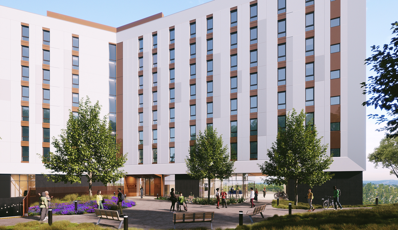
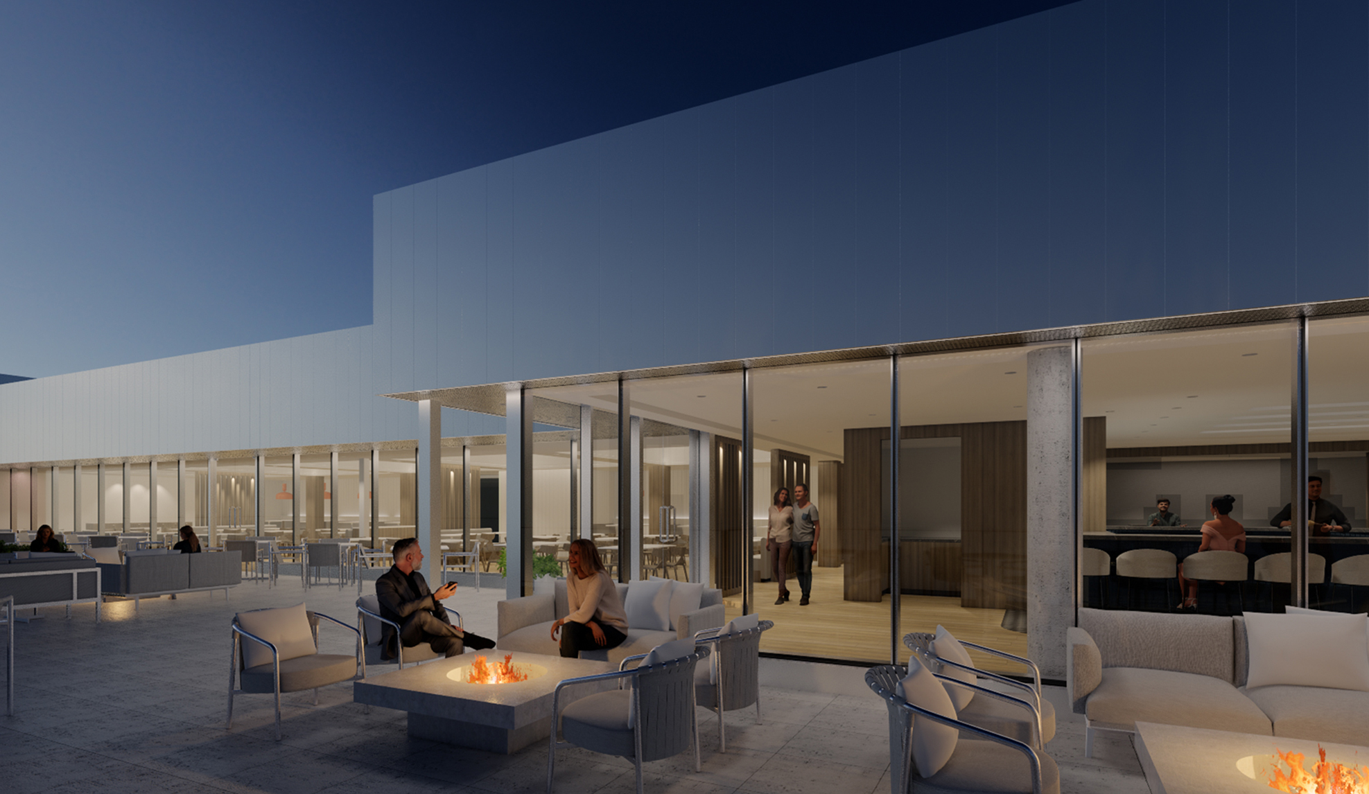
Vancouver Island University Student Housing
Read more -
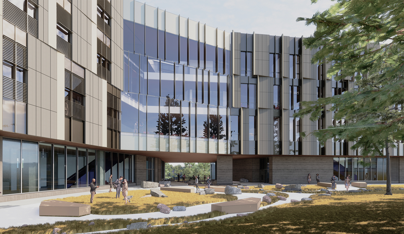
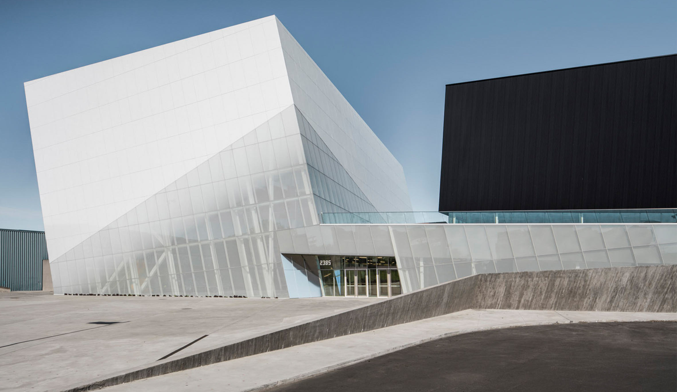
x̌el sic snpax̌nwixʷtn
Read more -
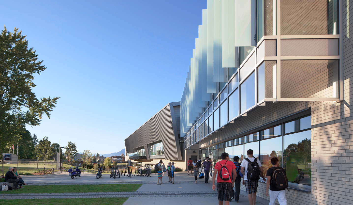
Hillcrest Centre
Read more -
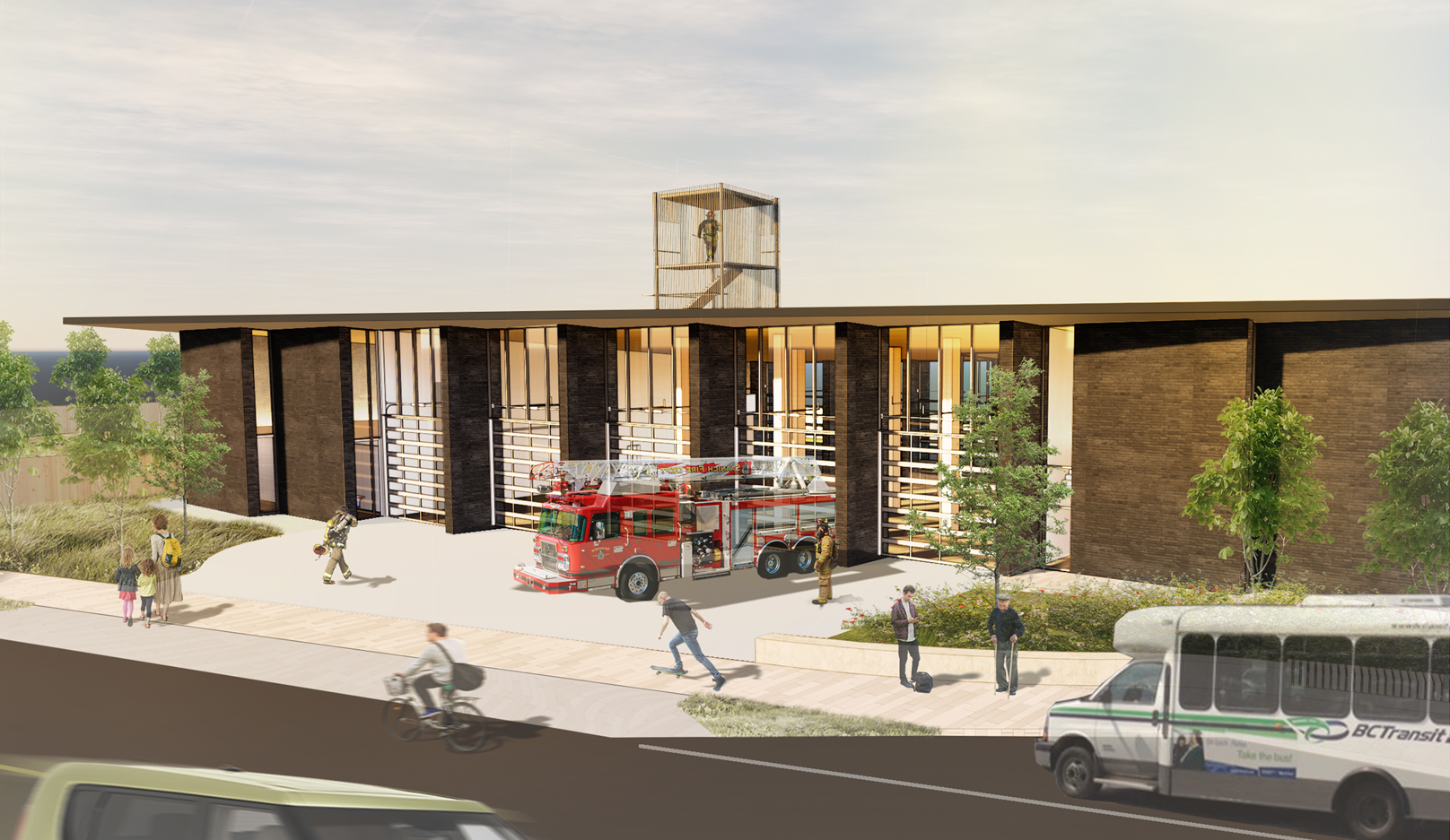
Saanich Fire Station 2
Read more -
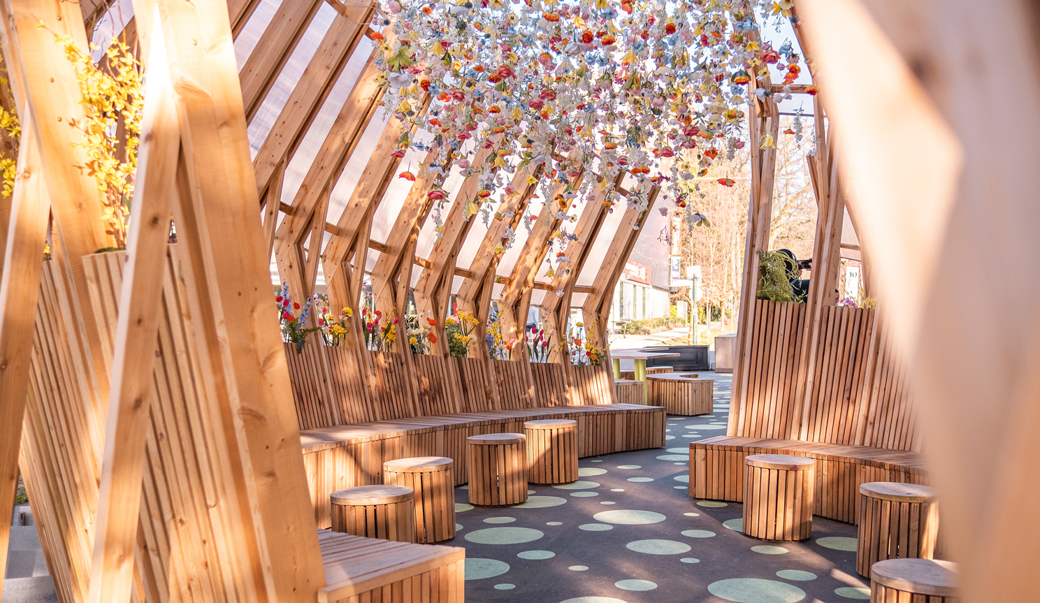
South Granville Plaza West
Read more -
Saint Laurent Sports Complex
Read more -
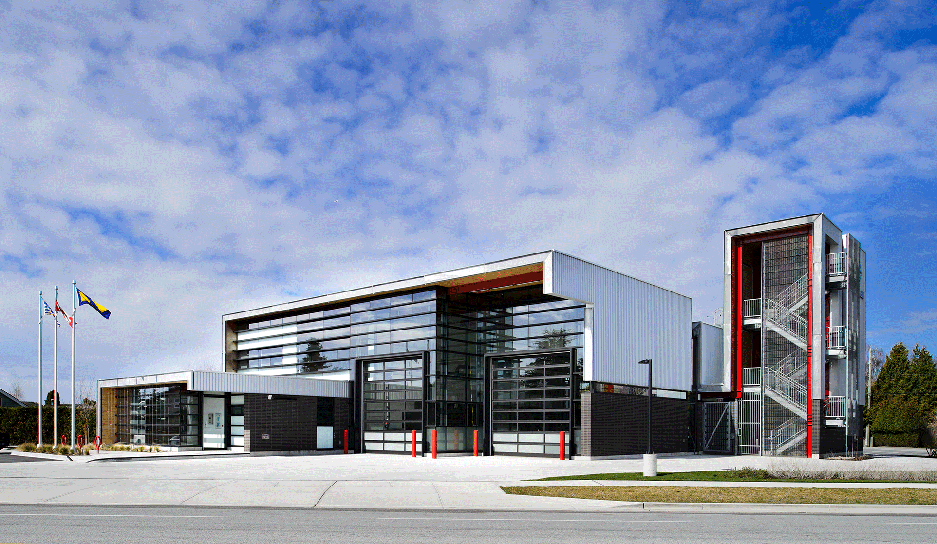
Steveston Fire Hall No. 2
Read more