Clayton Community Centre wayfinding
Location
Surrey, BC
Too often wayfinding and signage is an afterthought in a new building. It’s designed during construction and signs are bolted on at the last minute.
Our ambition for the Clayton Community Centre was to flip that practice, bringing wayfinding into the earliest stages of the design process. The ambition? To design best-in-class, inclusive wayfinding that seamlessly integrates with the architectural design concept.
Wayfinding that works
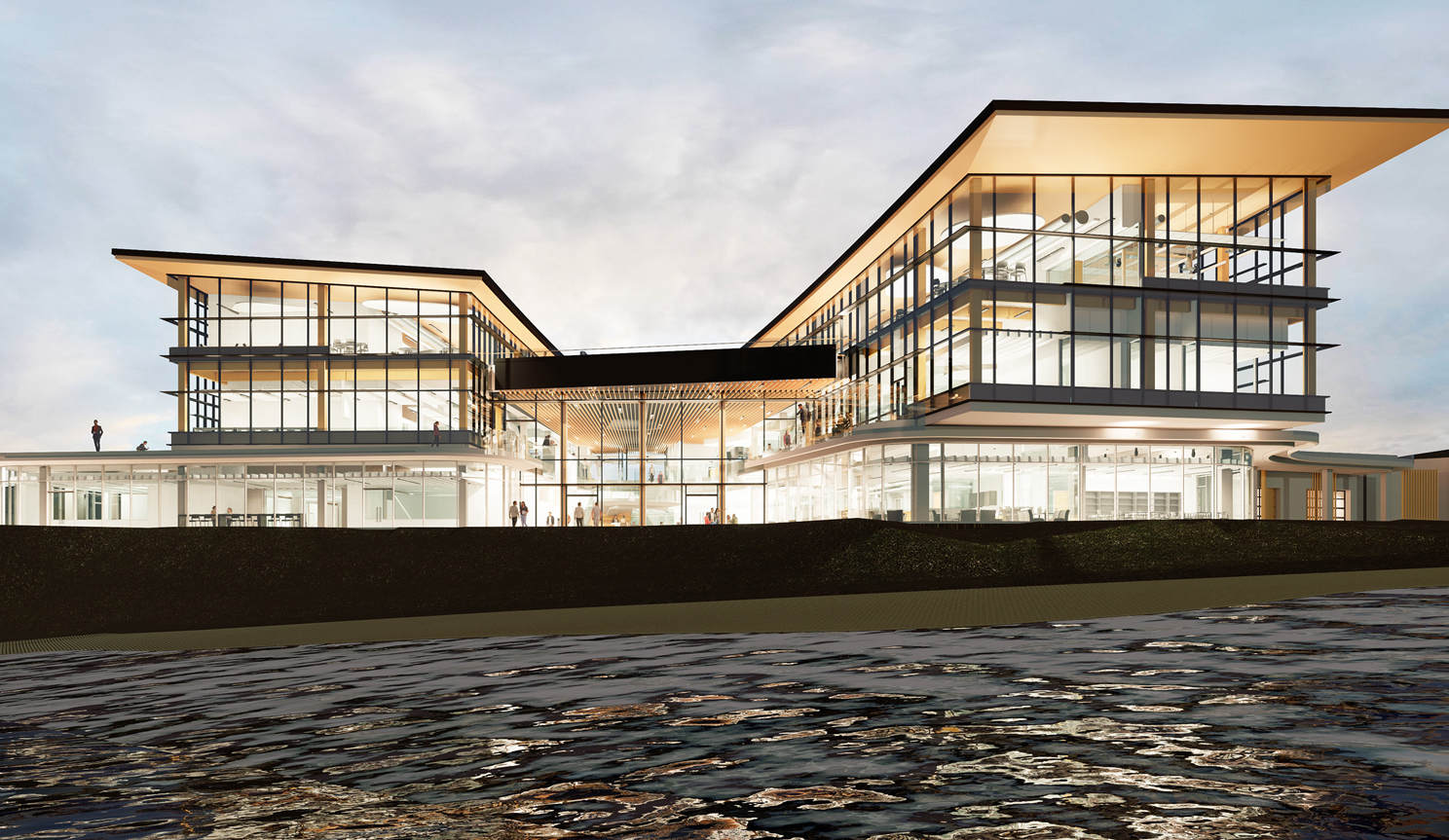
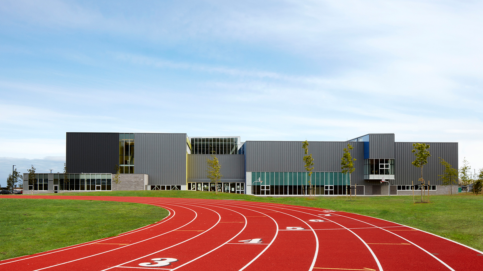
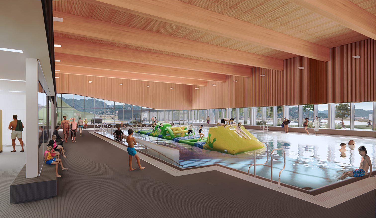
Clayton Community Centre opened in 2020 in Surrey, British Columbia, one of Canada’s most diverse, dynamic, and fast-growing cities. It serves a range of cultures, socio-economic backgrounds, and generations – and brings recreation, library, arts, and parks services together in one seamlessly integrated building (7,060 sqm / 76,000 sq ft).
The Clayton wayfinding system originated in the schematic design phase, with architects and environmental graphic designers exploring what the building’s design concept – ‘a forest for everyone’ – could mean for wayfinding.
During the concept development stage, the designers also worked closely with the signage vendor, testing concepts and materials to ensure the intent would be achieved.
Disciplines
Areas of impact
Integrated and inclusive
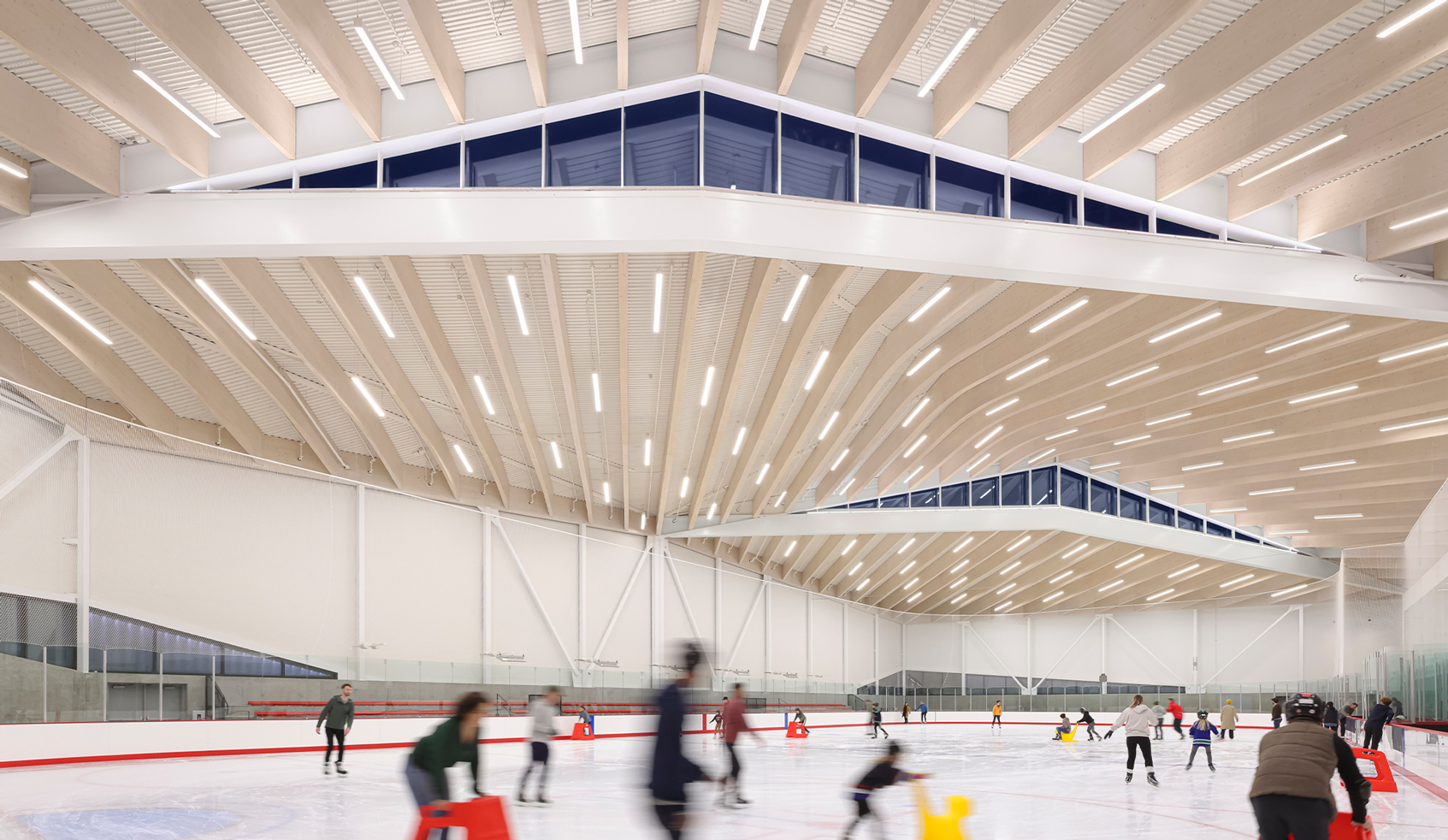
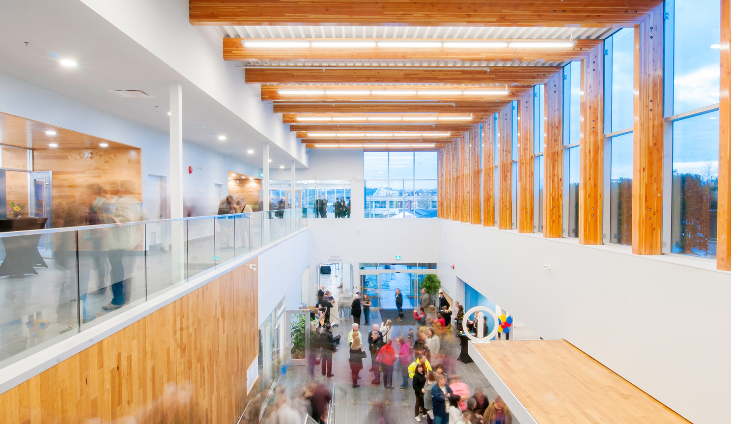
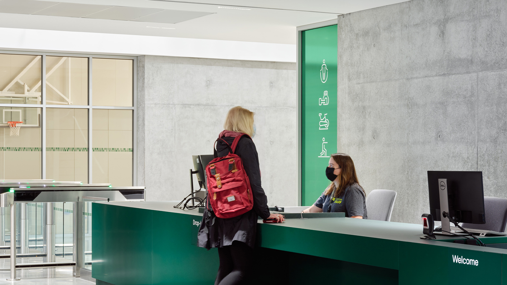
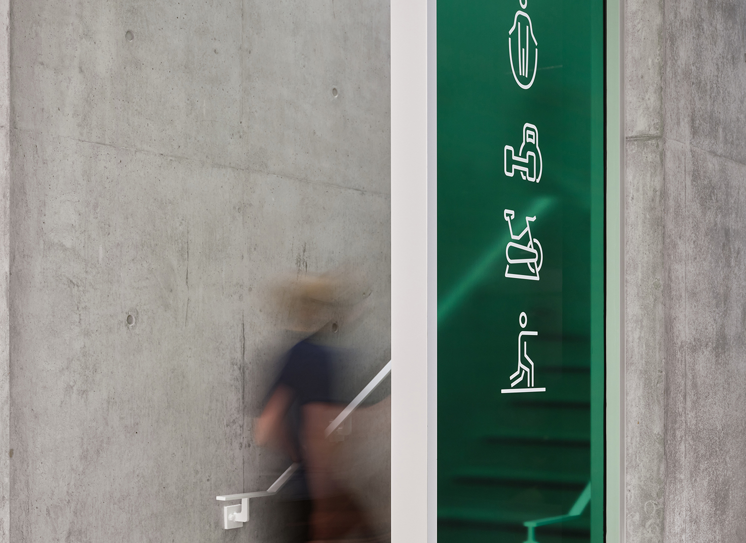
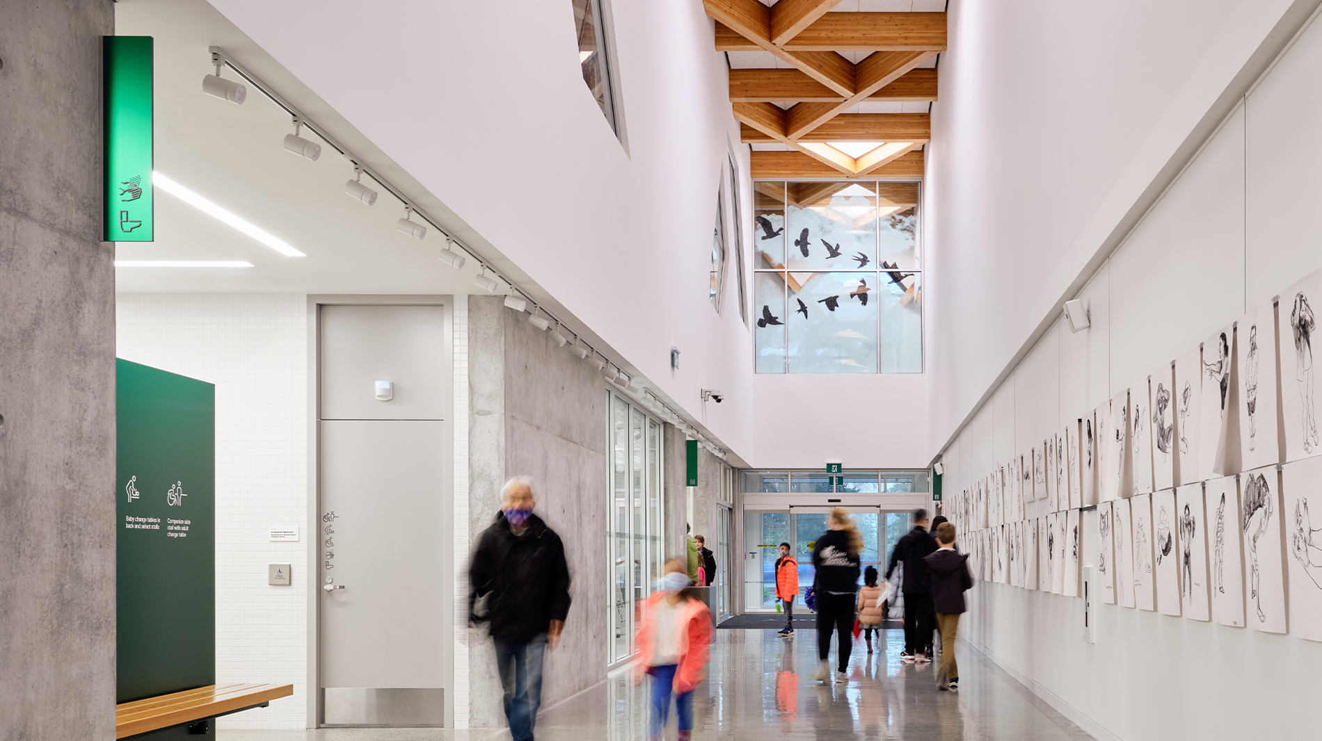
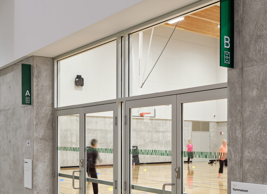
The collaboration of architects and environmental graphic designers led to a calm, neutral space, where splashes of forest green demarcate important points of interest (reception desk, for example) and draw the eye to signs guiding you through the space. The pictograms are designed to complement the typeface and the angles of the building’s intricate timber-grid roof structure, the ‘forest canopy’.
Inclusive principles underpin every design decision. The visual contrast between the forest green and its neutral surroundings is 40% for improved navigation and depth perception. Custom pictograms communicate a range of spaces and activities, without the need for any language. Room signage features tactile raised letters and braille, and is set at the same height throughout the facility so it’s easy to find at a touch.
Doorway entries are designed to have a 40%+ contrast to surrounding walls for accessibility purposes. The walls (white) and openings (grey) create a vertical banding expression which ties into the concept of the tree forest (the trunks of the trees).
Everyone is welcome
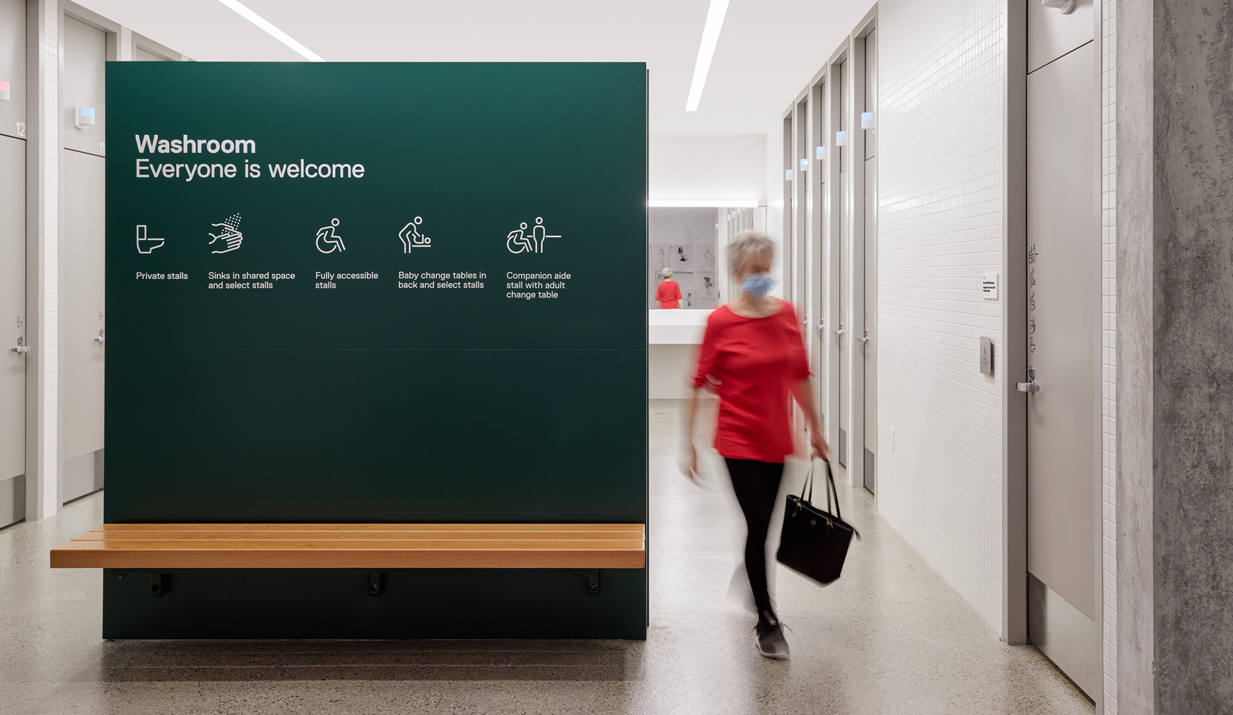
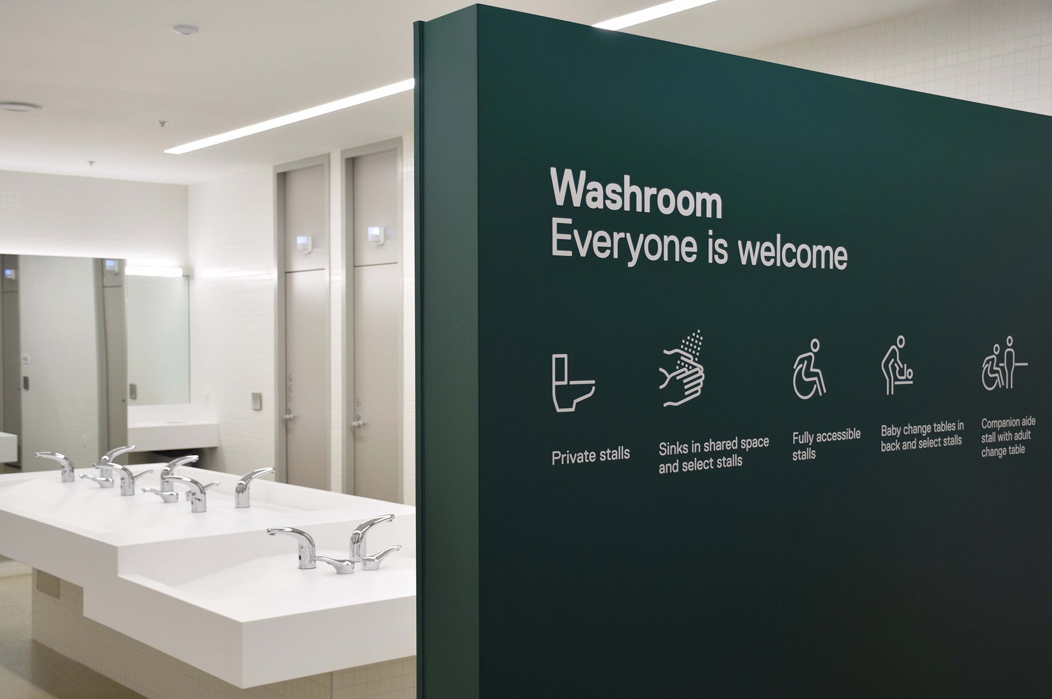
Universal washrooms are still new in most public Canadian facilities. At Clayton Community Centre, the entryway to the universal washrooms is a barrier-free wall that provides both privacy and a prominent place for welcoming signage.
The signage details the different functions of the space including toilet stalls, accessible stalls, baby change facilities, hand wash facilities, and adult change facilities. This allows someone to become familiar with the space before entering. Pictograms and text are provided to ensure even those whose first language isn’t English may understand. Doors are equipped with lights which indicate if a stall is occupied or available.
Other subtle, thoughtful details live throughout the building. By making ‘Reception’ and ‘Welcome’ signs magnetic, staff are empowered to reposition them across the front of the metal reception desk as needs change. The graphic language of safety strips and privacy screens picks up on the vertical green rectangular fins that identify rooms in a corridor. Translucent tinted substrate allows pictograms to be viewed from two sides. And every sign is highly durable and easy to maintain – important in a well-loved public space.
Wayfinding for all
Wayfinding and signage at Clayton Community Centre is a clear indicator that inclusive design can bring equity to underrepresented groups of people. Intuitive wayfinding, strong design, and a clear visual language help users navigate confidently, reduce anxieties that can arise in a new space, and increase people’s sense of belonging.
The result is a more inclusive environment where patrons and staff of Clayton Community Centre feel comfortable and thrive.

