PEXSISEN Elementary & Centre Mountain Lellum Middle School signage
Location
Langford, BC
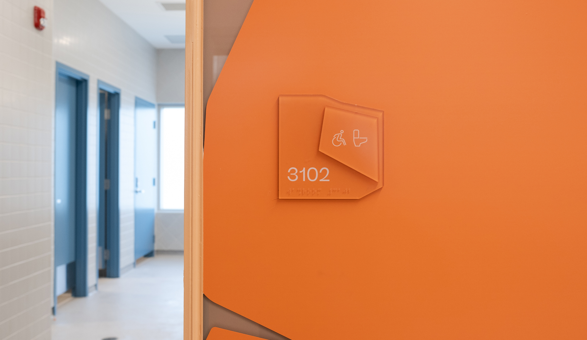
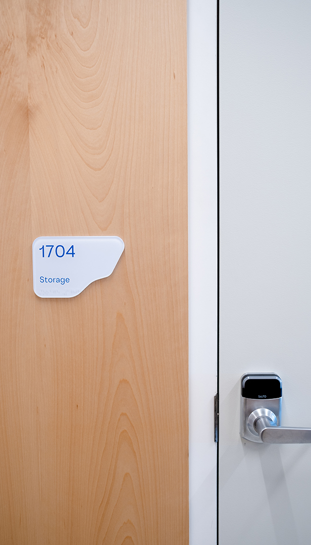
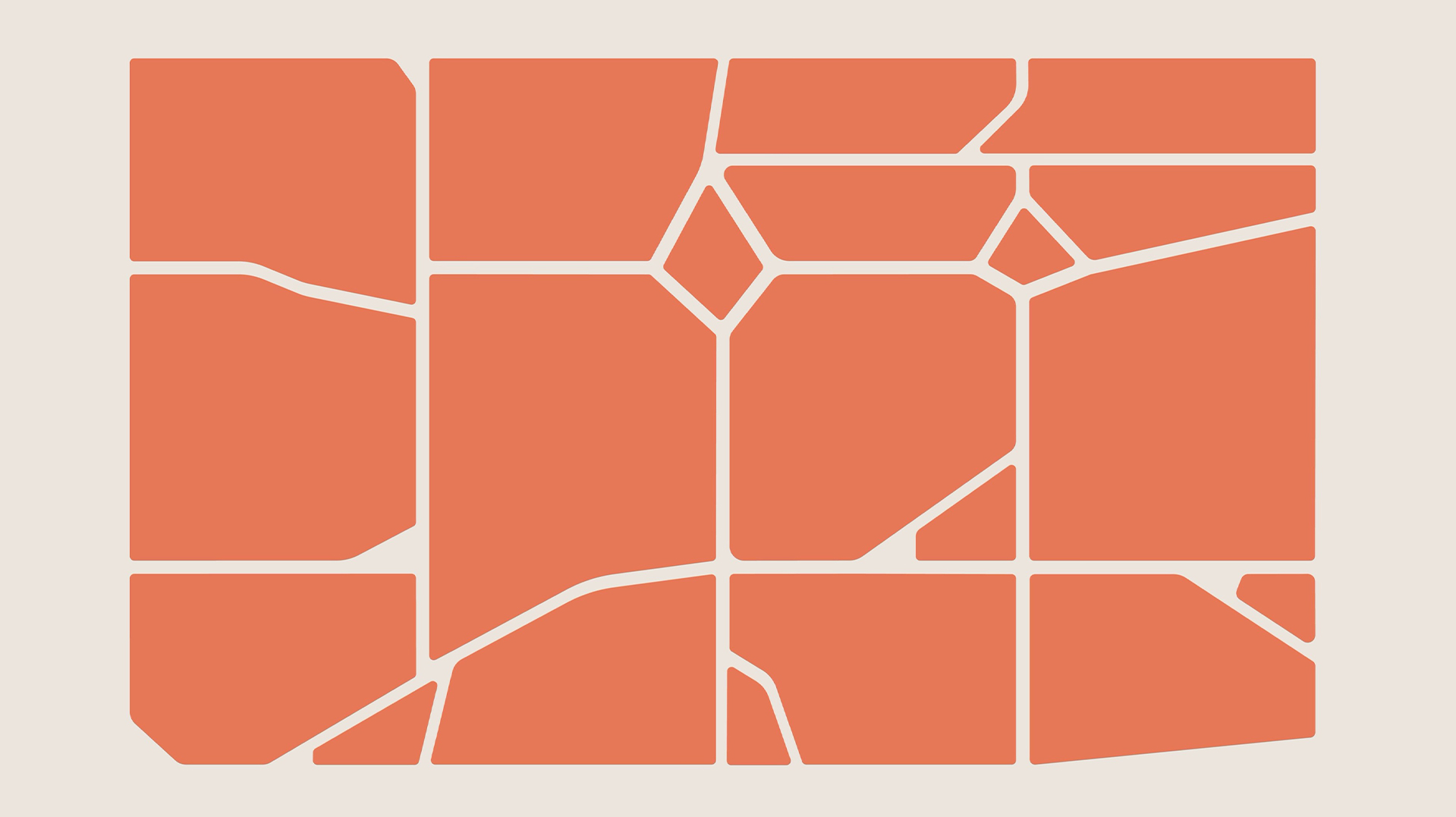
From the beginning, the idea of transitions and growing up was a central concept in the design of PEXSISEN Elementary & Centre Mountain Lellum Middle School, which share a site in the rapidly growing community of West Langford. Situated within a landscape marked by striking rock formations and a steep sloping hill, a design language that invokes jagged edges as an extension of the land’s character also began to emerge. Signage for the schools brought these two concepts together.
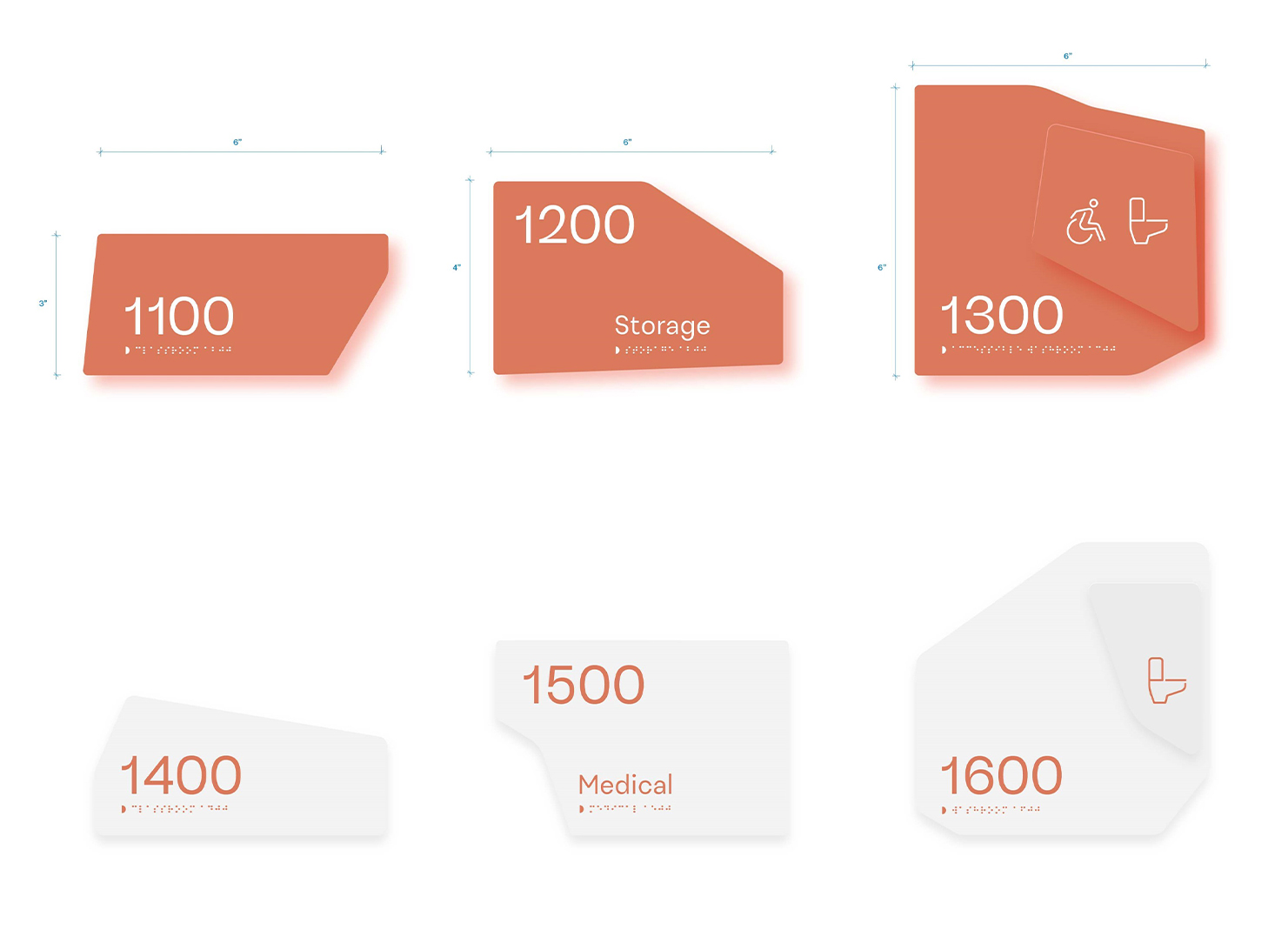
As a place of play, the elementary school’s signs take the form of rounded pebble-like shapes that reinforce the space as a nurturing and guided environment. As the children move to middle school, more individual freedom of expression develops, along with a stronger sense of self. This transition is translated into signs with rock-like formations, with more definition and sharper edges.
Disciplines

Thoughtful design decisions show how best practices in accessibility and sustainability don’t have to limit creativity. Across both schools, signs vary in shape room to room for a unique identification system that creates understated moments of surprise. This variety is the outcome of a fabrication process that prioritized the maximum use of materials to minimize waste. On transparent glazing, sign shapes appear as graphics that offer characterful moments to the interiors – a creative accent that also fulfills code requirements for visibility strips.
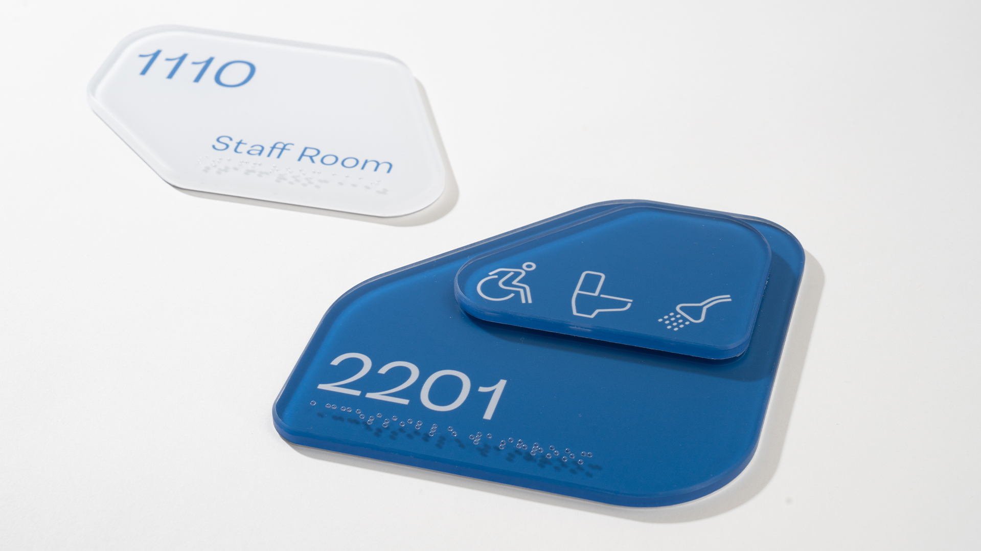
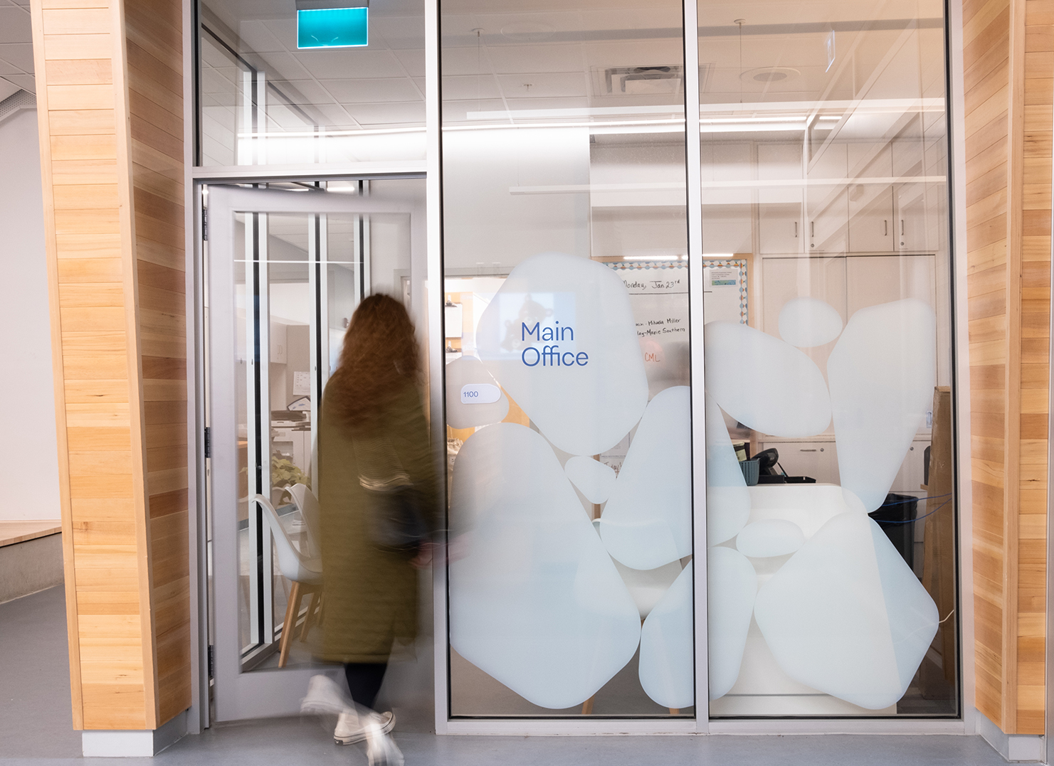
Both signage systems embrace colour palettes that complement and broaden the interior strategy. The signage typography strategy emerged from looking at forms and letters with a youthful, airy feeling that would also contrast well with more dense shapes and rock structures.
Other Projects
-
Rogers Elementary School
Read more -
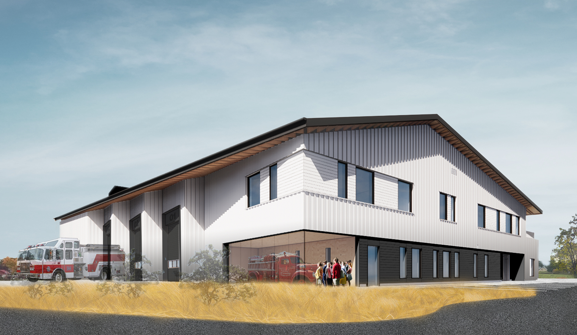
Vancouver Fire Hall No. 15
Read more -
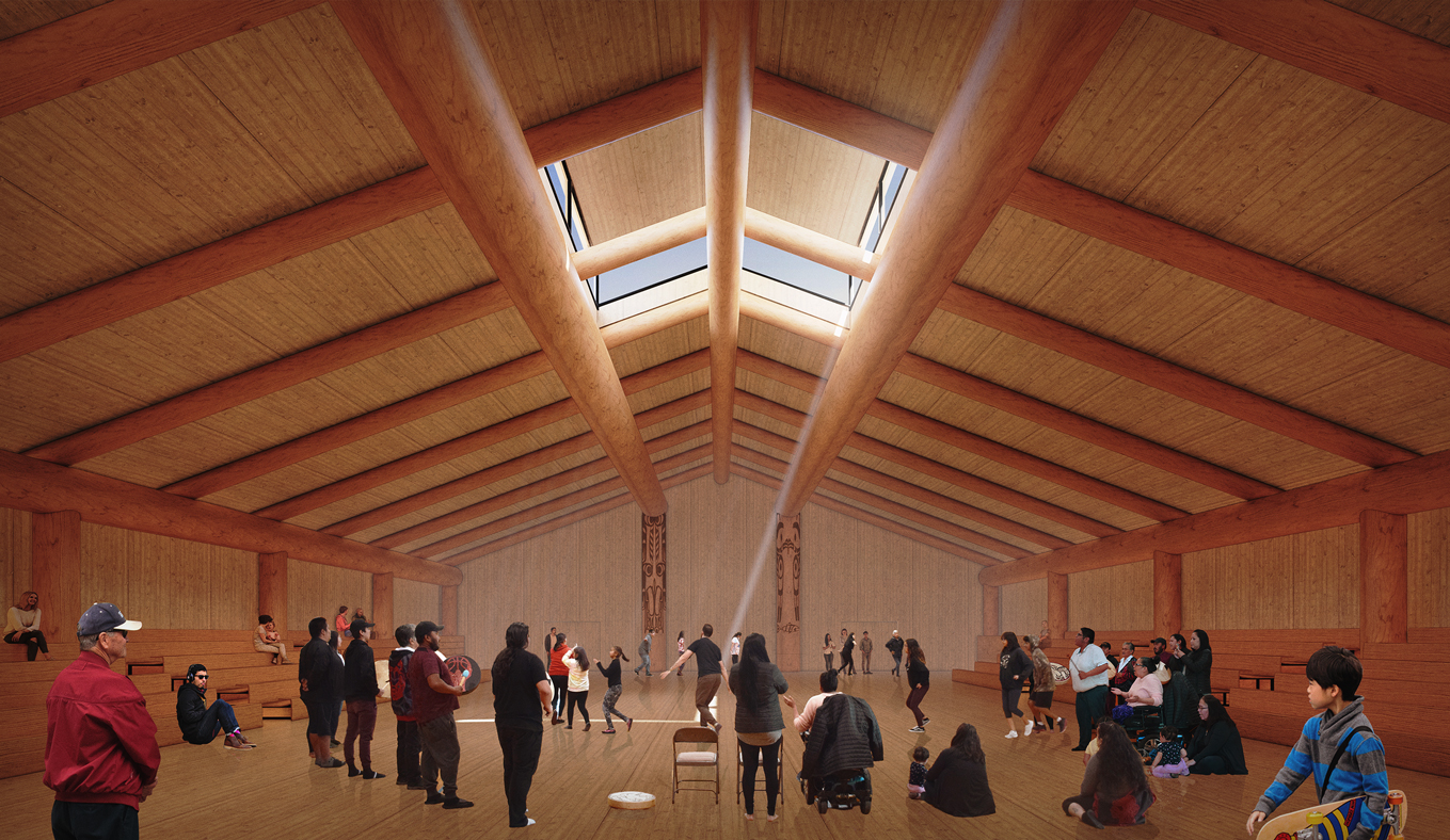
Gitxaała Longhouse and Cultural Centre
Read more -
Cowichan Bay Fire Hall
Read more -
Royal Bay Secondary School
Read more -
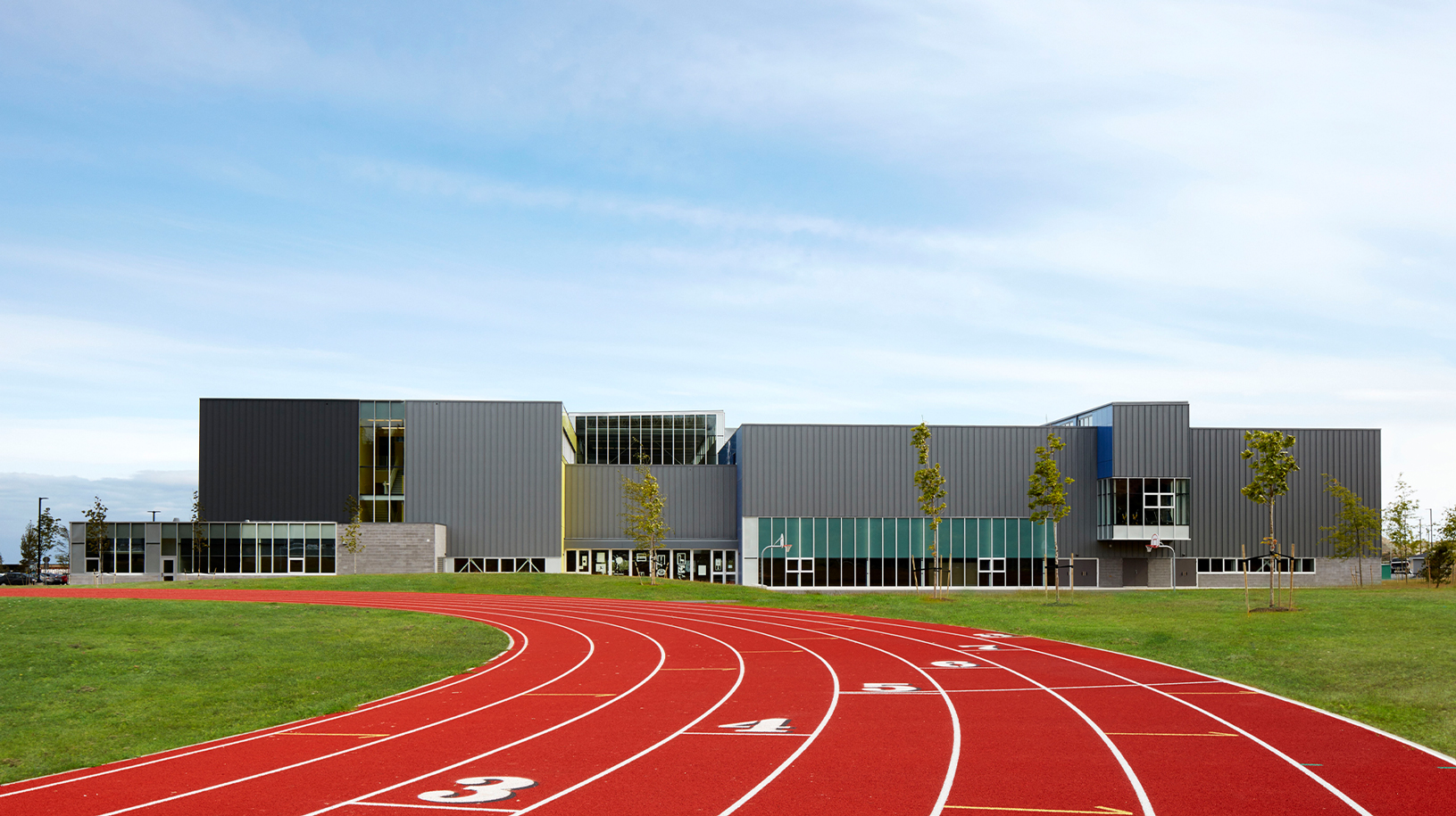
Walnut Grove Community Centre
Read more -
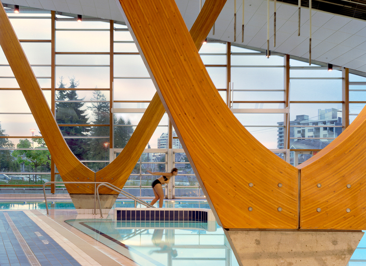
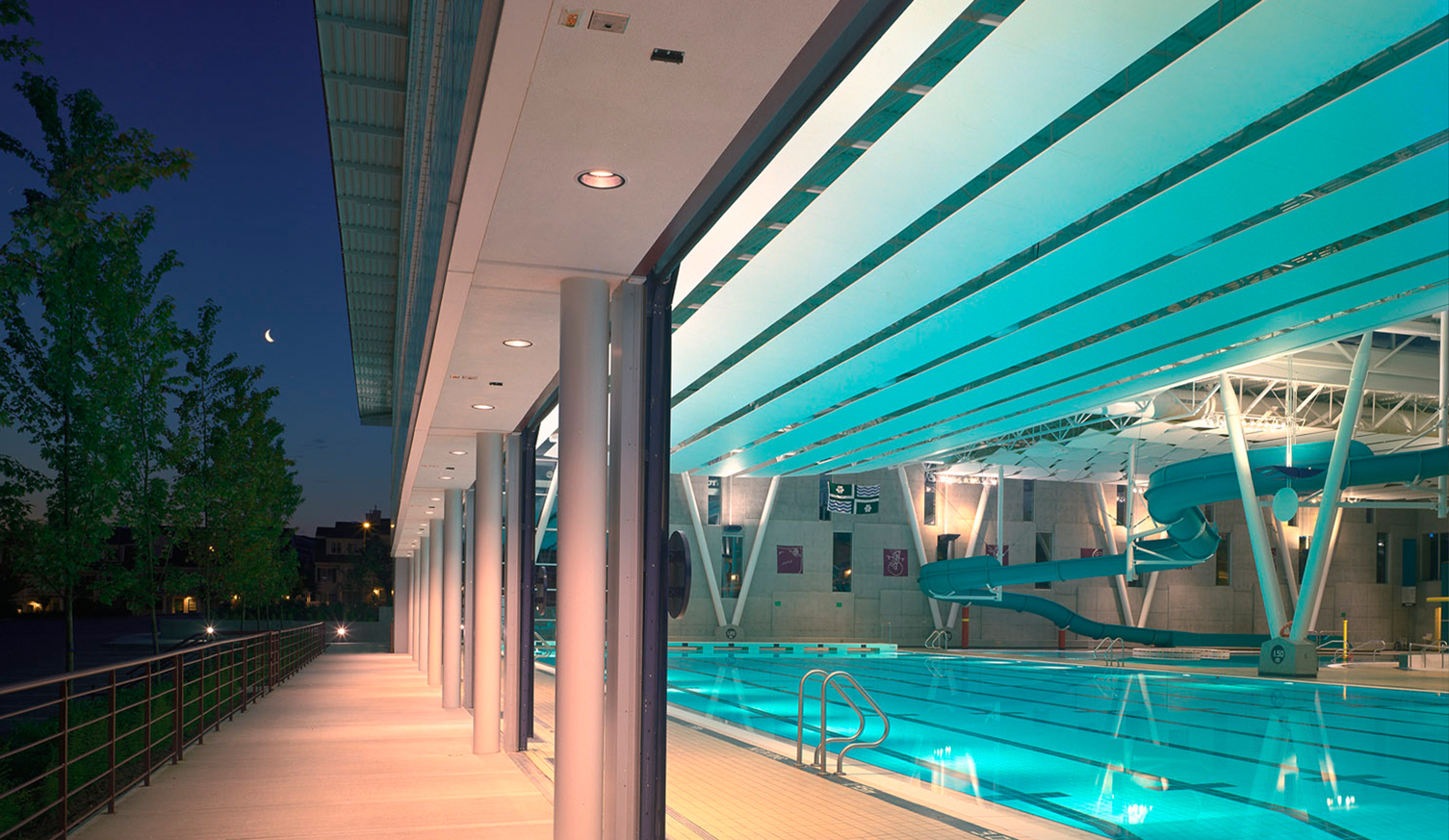
West Vancouver Aquatic Centre and Community Centre
Read more -
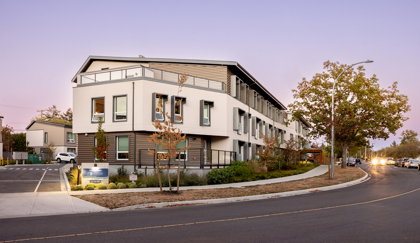
Townley Place
Read more -
The Sixth Estate
Read more -
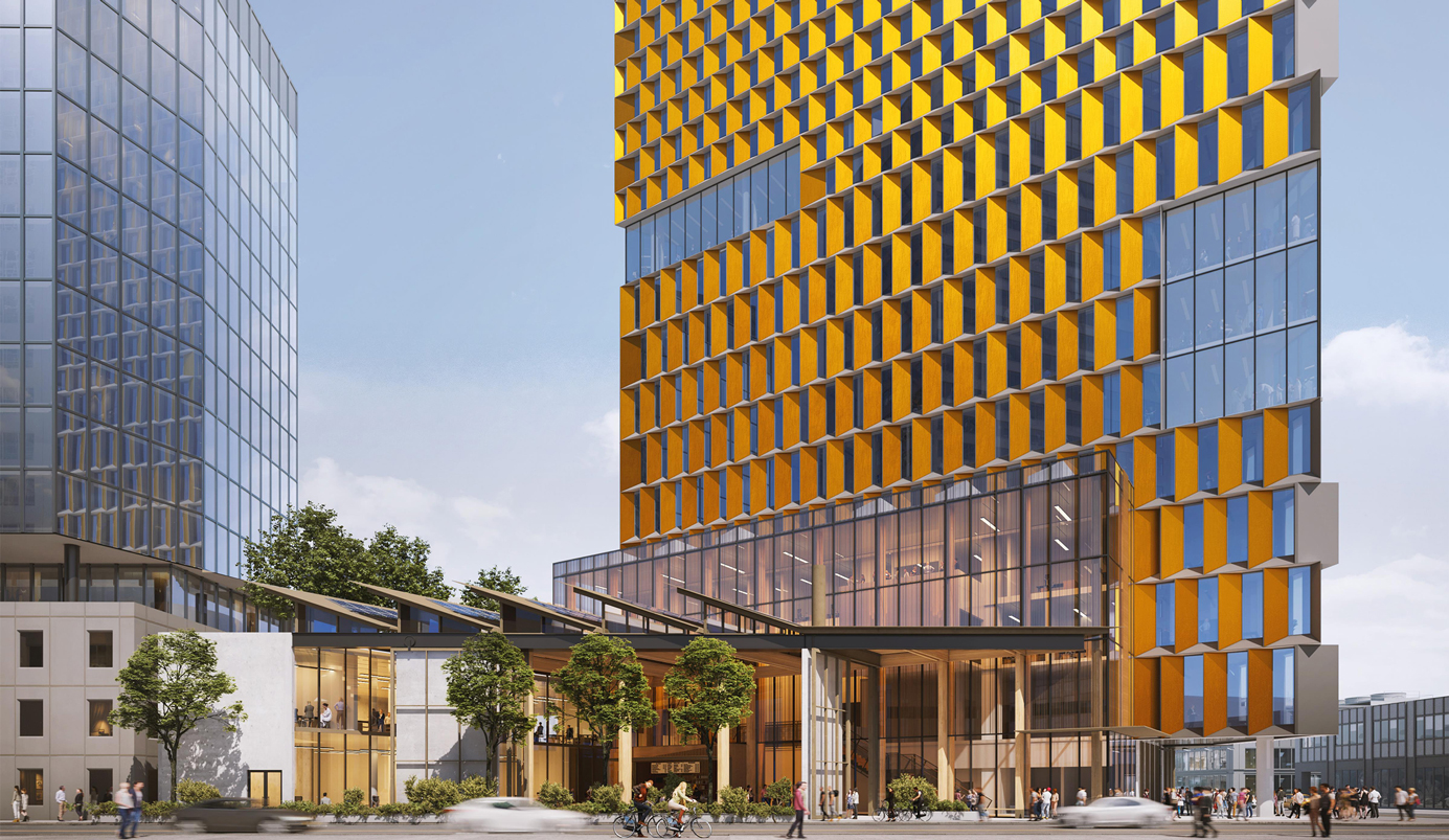
UBC Okanagan Downtown Campus
Read more