City of Burnaby Interior Signage Style Guide
Location
Burnaby, BC
The City of Burnaby has long been a leader in its commitment to accessibility and inclusion. With a host of new state-of-the-art civic facilities currently on site, they invited hcma to develop an interior signage style guide to inform inclusive wayfinding across all of their public buildings—both existing and into the future.
Critically, the goal was to create a guide that would allow for flexible, on-brand signage that was inclusive and welcoming for all guests, and could be adapted across facilities.
Disciplines
Areas of impact
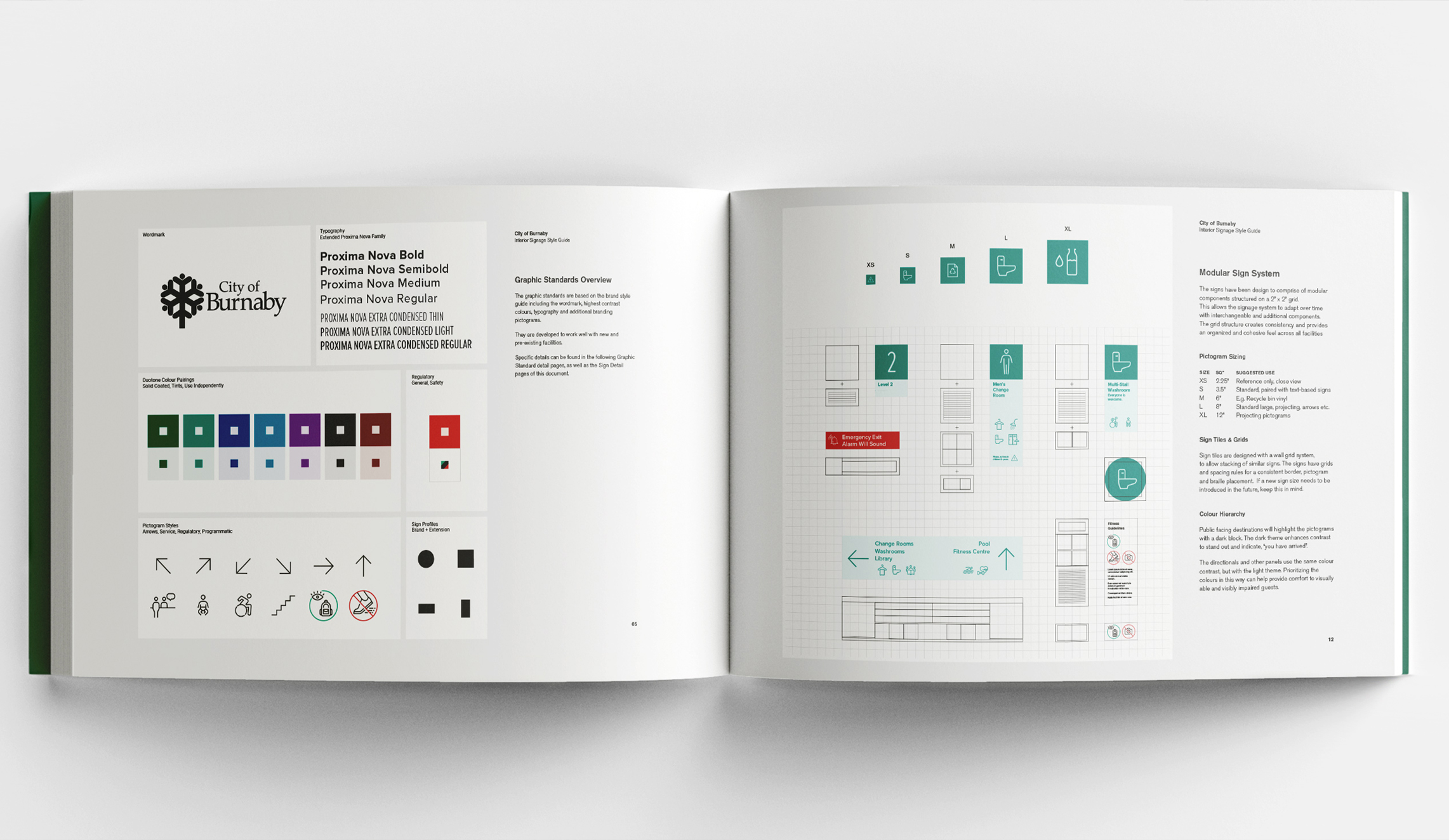
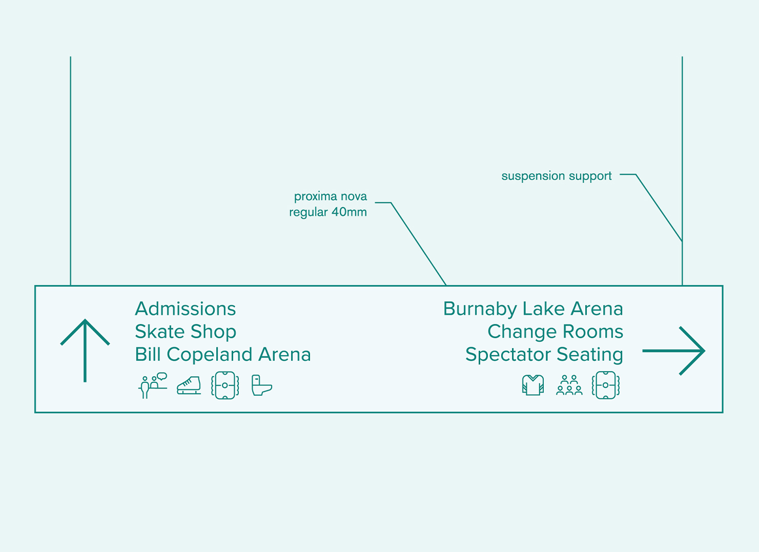
Inclusive modular signage
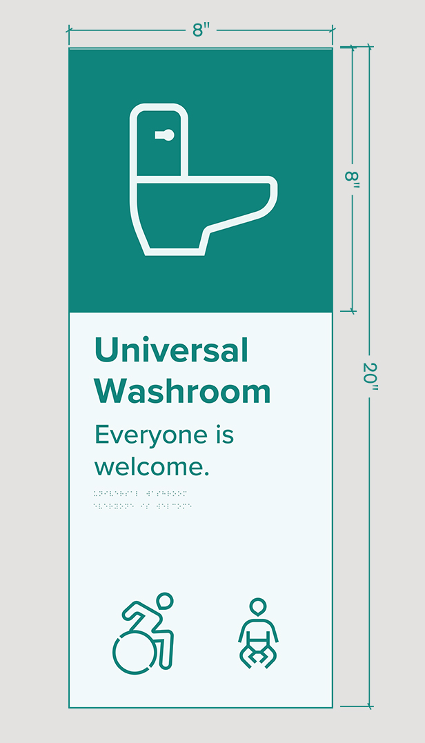
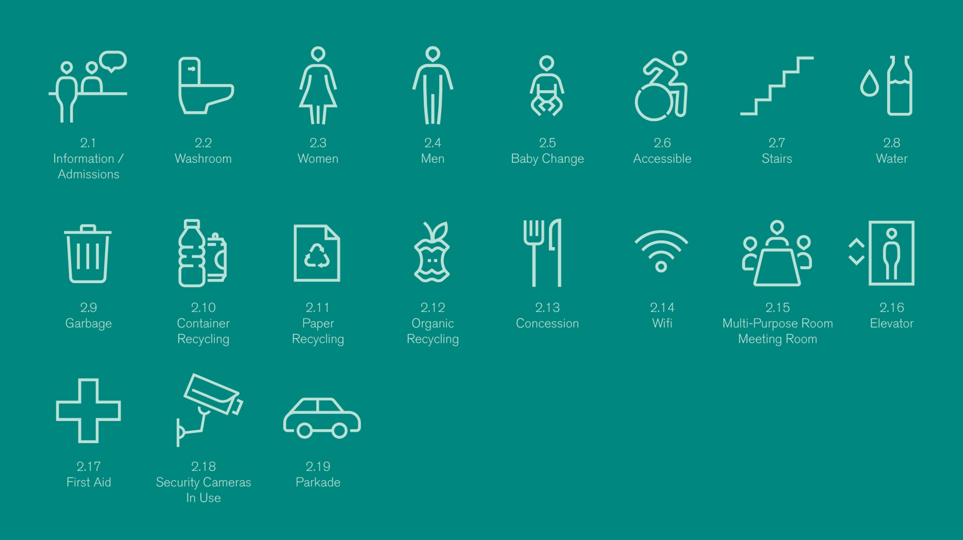
To address the language barrier for people with low English literacy skills, we created pictograms paired with simple arrows to show directions. The pictograms, which reference the City of Burnaby’s logo as a motif, focus on function-first identification, allowing us to visually describe each amenity without having to depict how an able-bodied person would use it—or making references to gender.
Working in tandem with the client and the hcma Impact team, we established a considered set of language to pair with each pictogram, providing clarity for all, no matter their ability, gender, or culture.
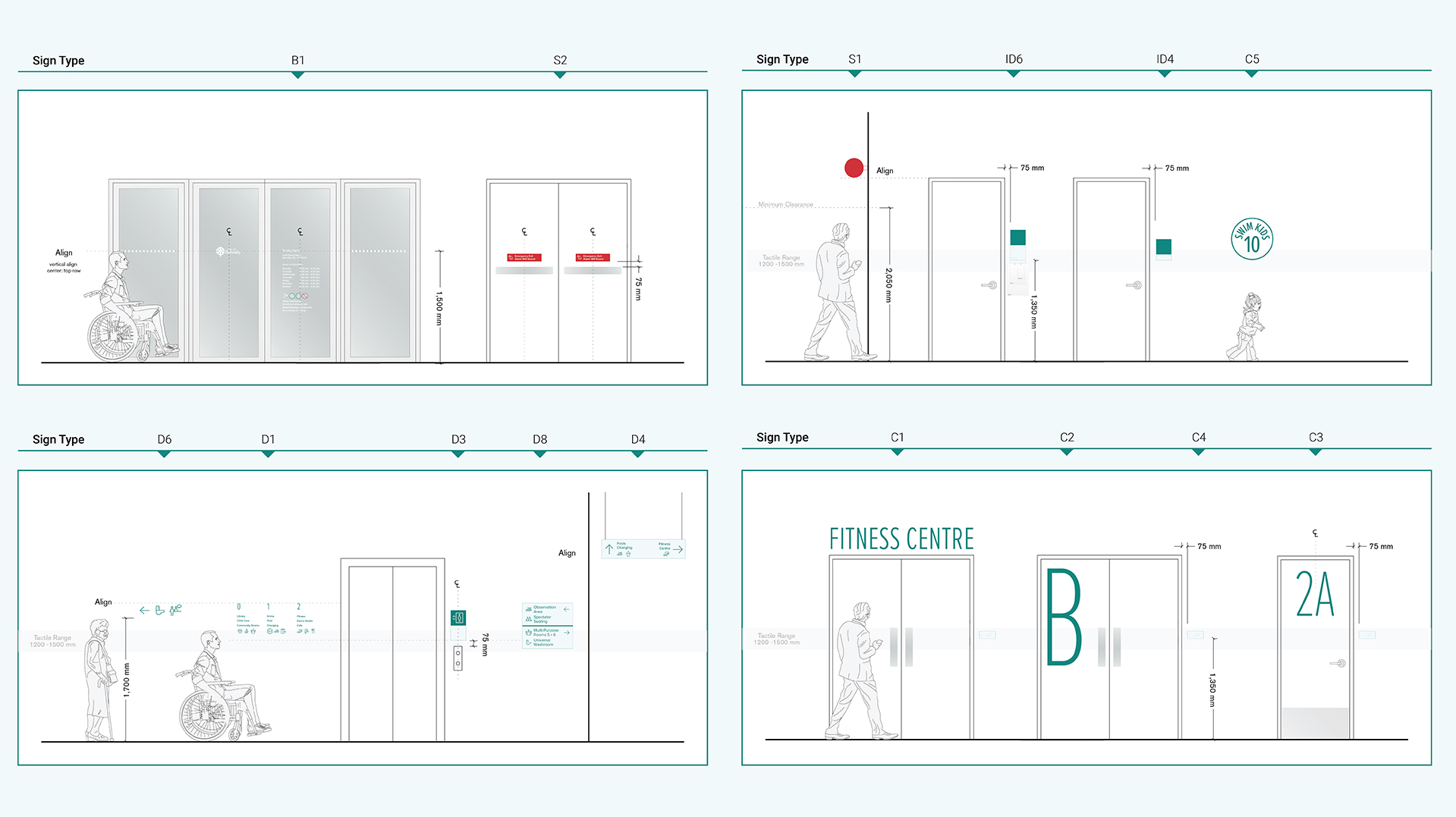
To aid visually impaired users, we proposed tactile signage be positioned at mounting heights within a defined range, using the ‘Rick Hansen Universal Design Recommendations’ for reference. The signage colours pull from the City’s existing brand standards, but are refined for strong contrast for legibility.
For operational flexibility, all signage systems are composed of modular components. Facilities can add or replace signage over time, while still being consistent and attractive across each of the City’s public buildings.
Flexible, real world application
To ensure each facility’s signage works within its context and complements the building, we offered a range of colours, material selections, and the ability to apply custom, site-specific details. Patterns and textures can be used to help with orientation, for example, adding character to complement each site’s unique interior design.
The result is a guide that provides the City with a clear, cohesive visual system to welcome a wide demographic of new and returning visitors, with enough adaptability to address diverse needs across the community.
The new signage system is already being put into place in the City’s upcoming facilities. To find out more, visit our Rosemary Brown Recreation Centre and Burnaby Lake Aquatic and Arena Facility project pages.
Other Projects
-
Duchess Park Secondary School
Read more -

Sḵwx̱wú7mesh Úxwumixw Land Development Strategies
Read more -
Killarney Community Pool
Read more -
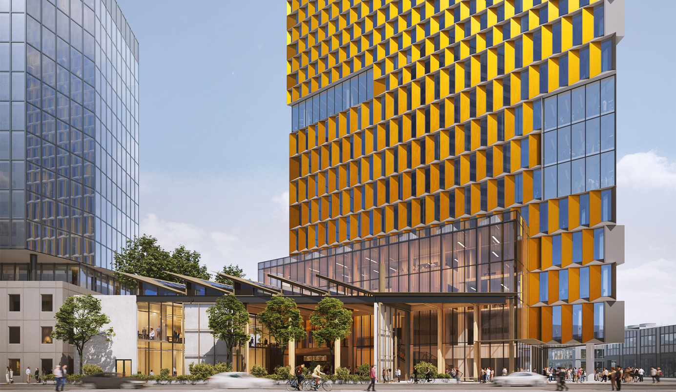
UBC Okanagan Downtown Campus
Read more -
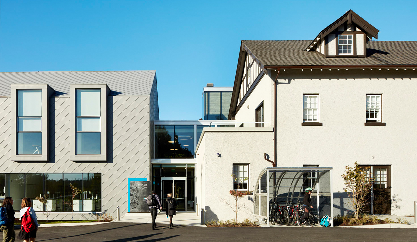
Royal Roads University Sherman Jen Building
Read more -
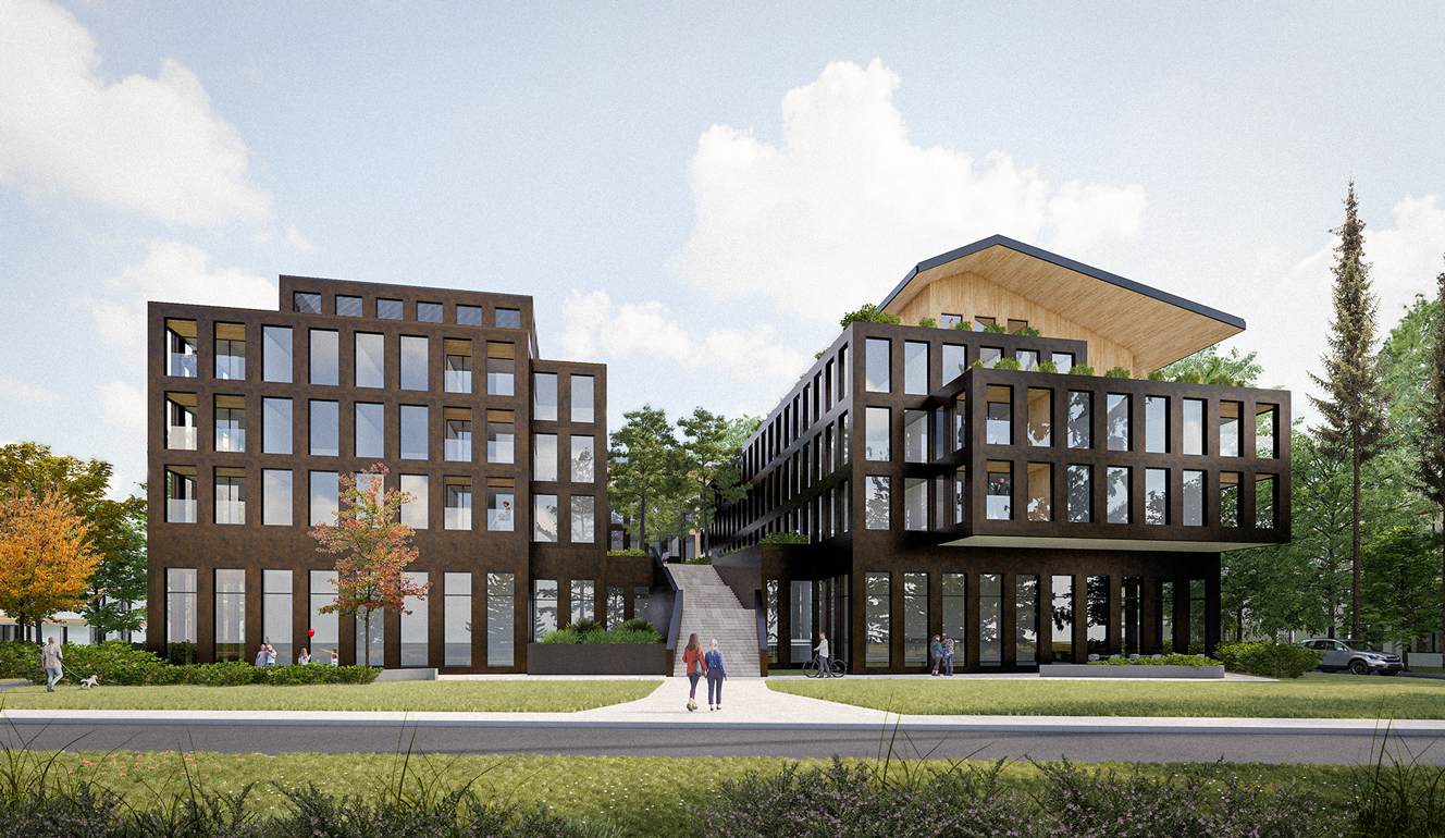
McNamee Place
Read more -
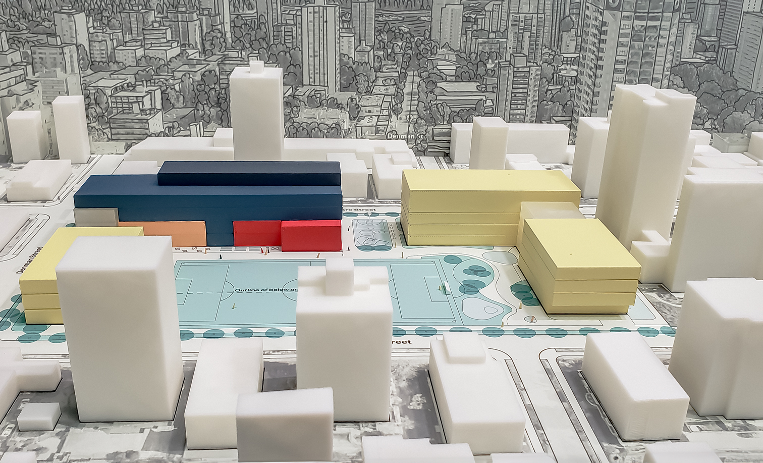
West End Community Hub Renewal Plan
Read more -

Skwxwú7mesh Úxwumixw brand development
Read more -

North Park Passive House
Read more -
Dockside Green Site Wide Rezoning
Read more