Rosemary Brown Recreation Centre wayfinding
Location
Burnaby, BC
Ice arenas are typically designed for performance sports—a competing ground for league hockey, figure skating, and spectator events.
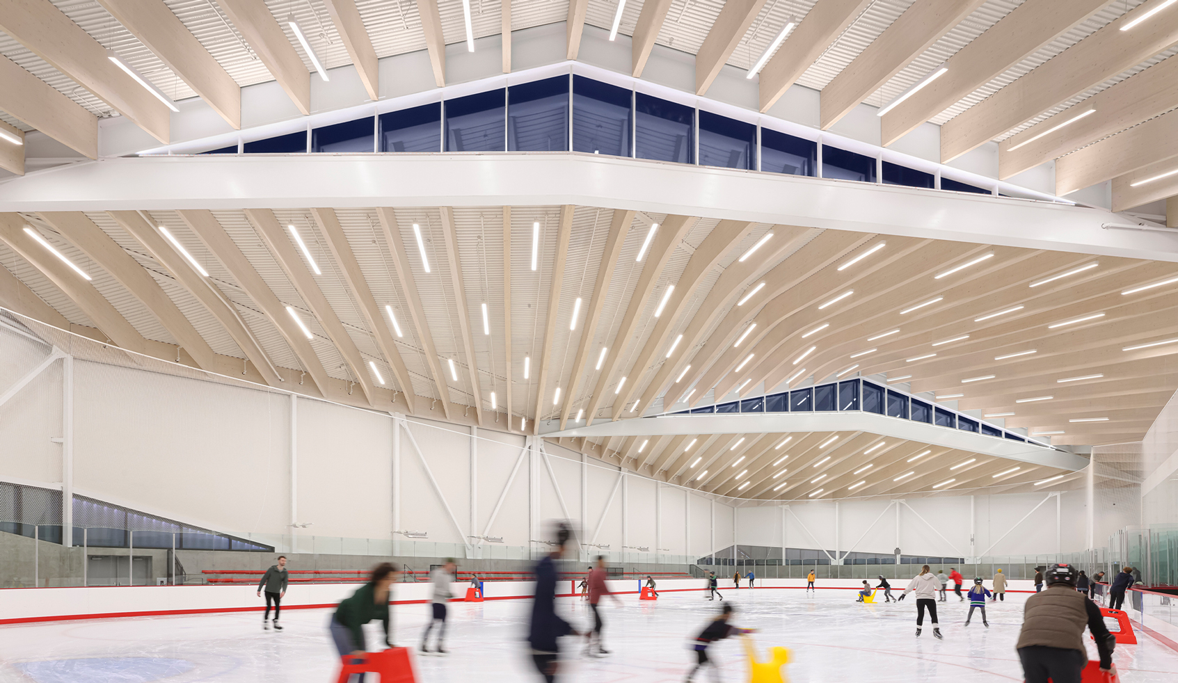
The City of Burnaby’s upcoming, state-of-the-art Rosemary Brown Recreation Centre elevates the best qualities of these facilities, but with a community-first approach. When complete, visitors can take advantage of two NHL-sized ice rinks, a spectator area, a kid’s play zone, and an abundance of gathering spaces for celebrations and meetings.
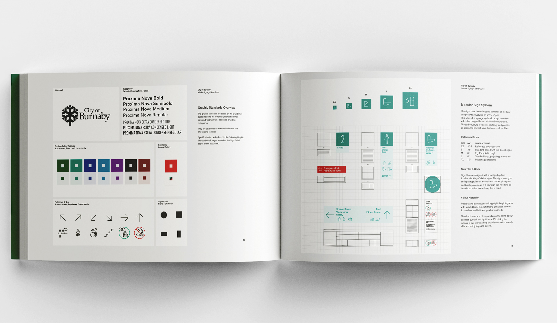
To ensure the facility meets the highest standards for inclusivity and accessibility, the City of Burnaby appointed hcma to deliver the facility’s wayfinding and signage—informed by their recent Inclusive Signage Guide.
Disciplines

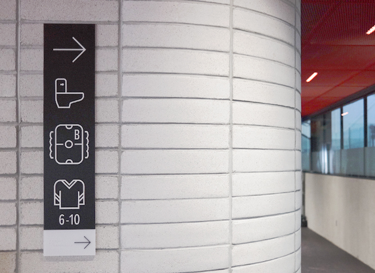
Facility specific signage
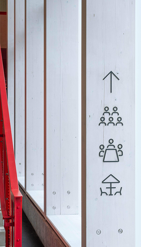
The arena is intentionally designed for intuitive navigation. With clear sight lines and instinctive programming, there was no need for comprehensive directional signage. Instead, large pictograms and clear program headers help visitors navigate the building’s open-plan circulation with ease.
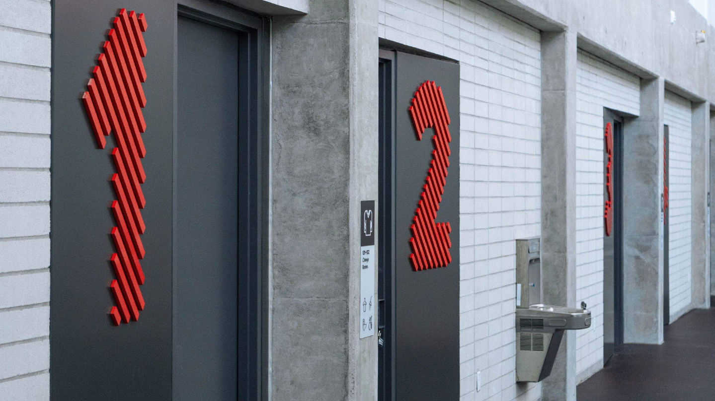
Inspired by the arena’s architectural finishes, the signage adopts the materiality of the space, using hot-rolled steel for over-sized change room numbers and program headers. Facility-specific pictograms for the skate shop, team change rooms, and patio icons expand on the already established Burnaby set, while a black and grey substrate complements the building’s greyscale and signature red mesh material palette.

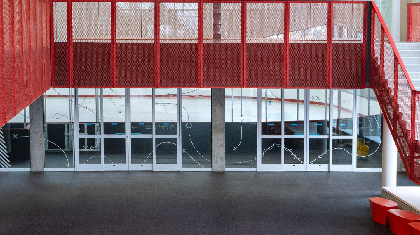
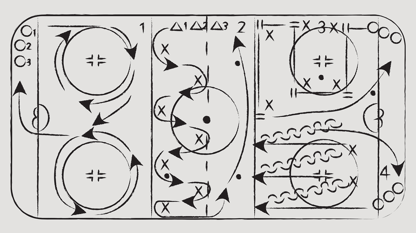
Rituals and play
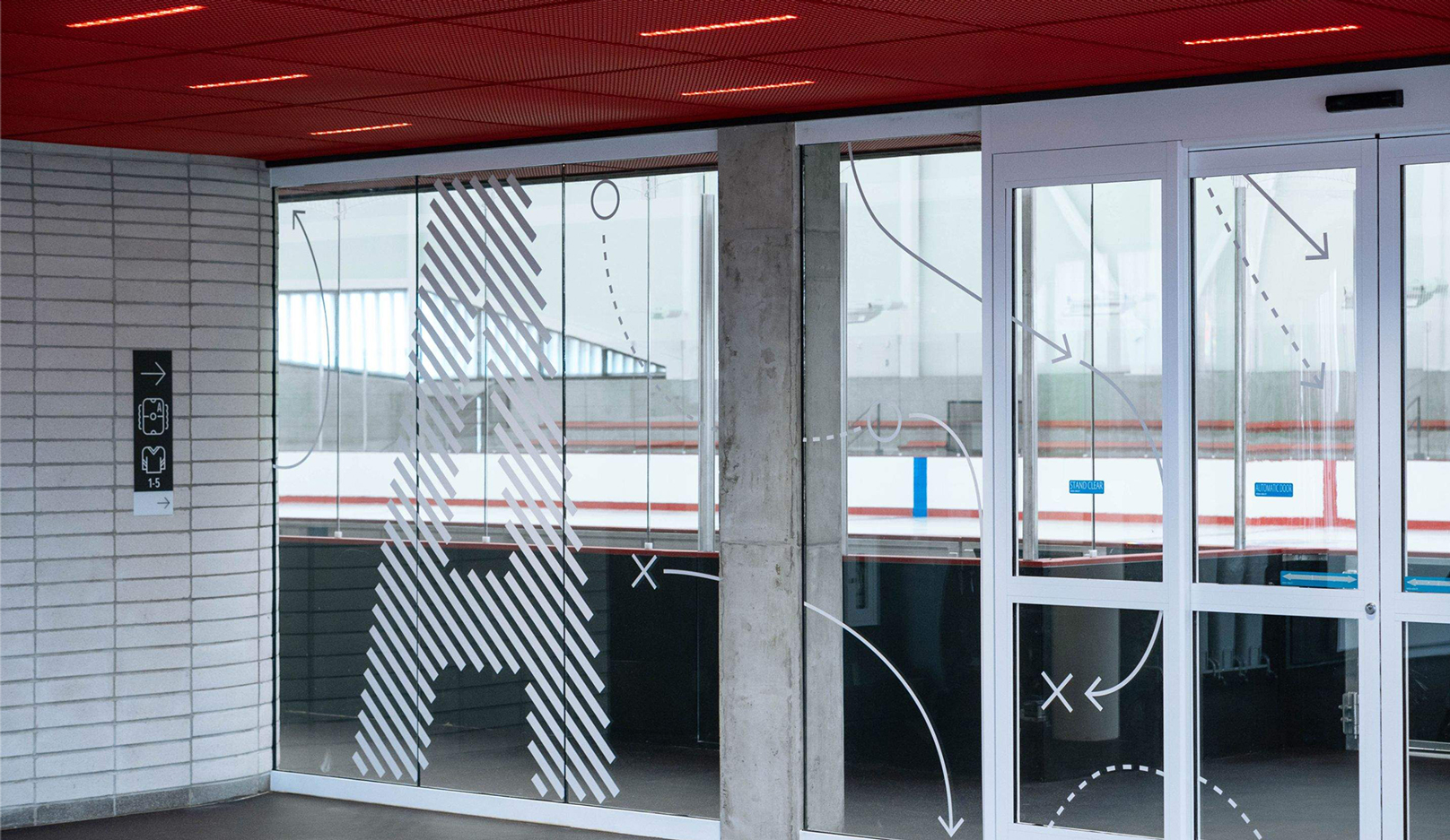
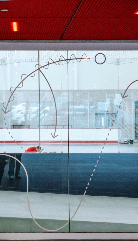
To understand the practices typical in an ice arena, we studied the visual language of hockey drills and the notations made by coaches, along with the pre game rituals of tying skate laces and wrapping hockey sticks.
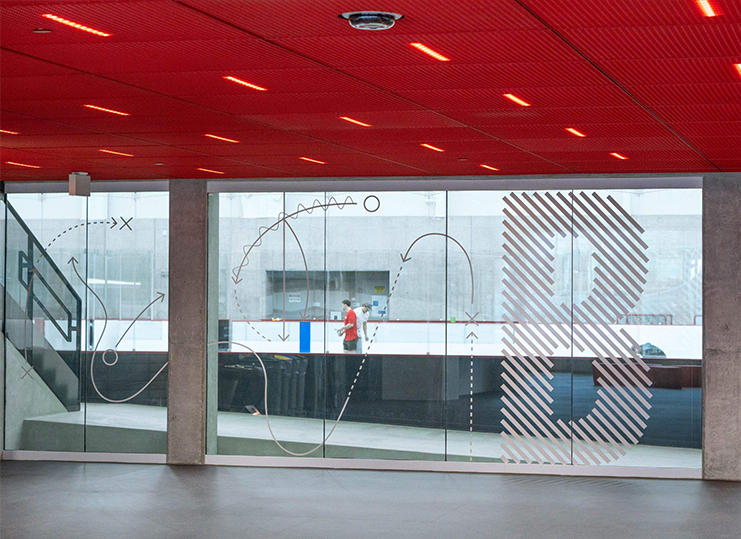
Inspired by these activities, and the written language used by figure skaters, we created an angled line motif for the facility. Feature supergraphics on the internal glazing visually separate the circulation space from the arenas, while giant rink labels ‘A’ and ‘B’ appear almost part of the structure, helping alleviate any disorientation that could come from the twin arenas.
An ice arena for all
In line with the Inclusive Signage Guide, all signage follows principles set out by the Rick Hansen Universal Design Recommendations. Tactile signage is positioned at set mounting heights within a defined range, using colours from the City’s brand identity, but refined for strong contrast and legibility.
The result is a signage and wayfinding system that welcomes a wide demographic of new and returning visitors, while celebrating the rituals and play of ice sports.