Passive House Canada brand identity
Location
Canadian market
How do you make sustainable design principles so commonplace that they become standard practice and are adopted into the building code? How do you help a non-profit organization assume a leadership role in the design and building industry across Canada? A brand strategy, name and visual identity are a good place to start.
Disciplines
Our name and brand was surrounded by confusion, lacked clarity and had little emotional connection with key audiences. We chose hcma for their professional background, the capacity of their personnel to understand our market, and an enthusiasm for the challenge presented. Our experience with them throughout was excellent, demonstrating insight, innovative thinking, prompt service and great branding.
Rob Bernhardt, CEO, Passive House Canada
Design Challenge
Through our relationship developed via Passive House certified architectural projects, we were offered the opportunity to engage our Communications Design team to develop a strategy, name and visual identity that would help erase misconceptions and raise awareness of the Passive House standard in design and construction industry across Canada.
Client
The Canadian Passive House Institute is a non-profit organization that advocates for the use of the Passive House Standard in construction. They provide members with education, training, tools and access to an expanding network of practitioners so they can deliver low energy buildings with confidence. They sought a new name and identity to support increased public awareness and membership growth.
Design Response
Using our in-house brand capabilities, we drew upon our marketplace understanding and professional expertise with the Passive House building standard to embark on a brand audit, marketplace analysis, and research project that resulted in a new brand essence, positioning strategy, and name. As a result, CanPHI West evolved into Passive House Canada.
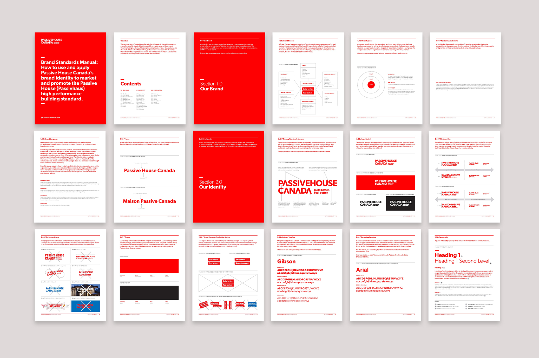
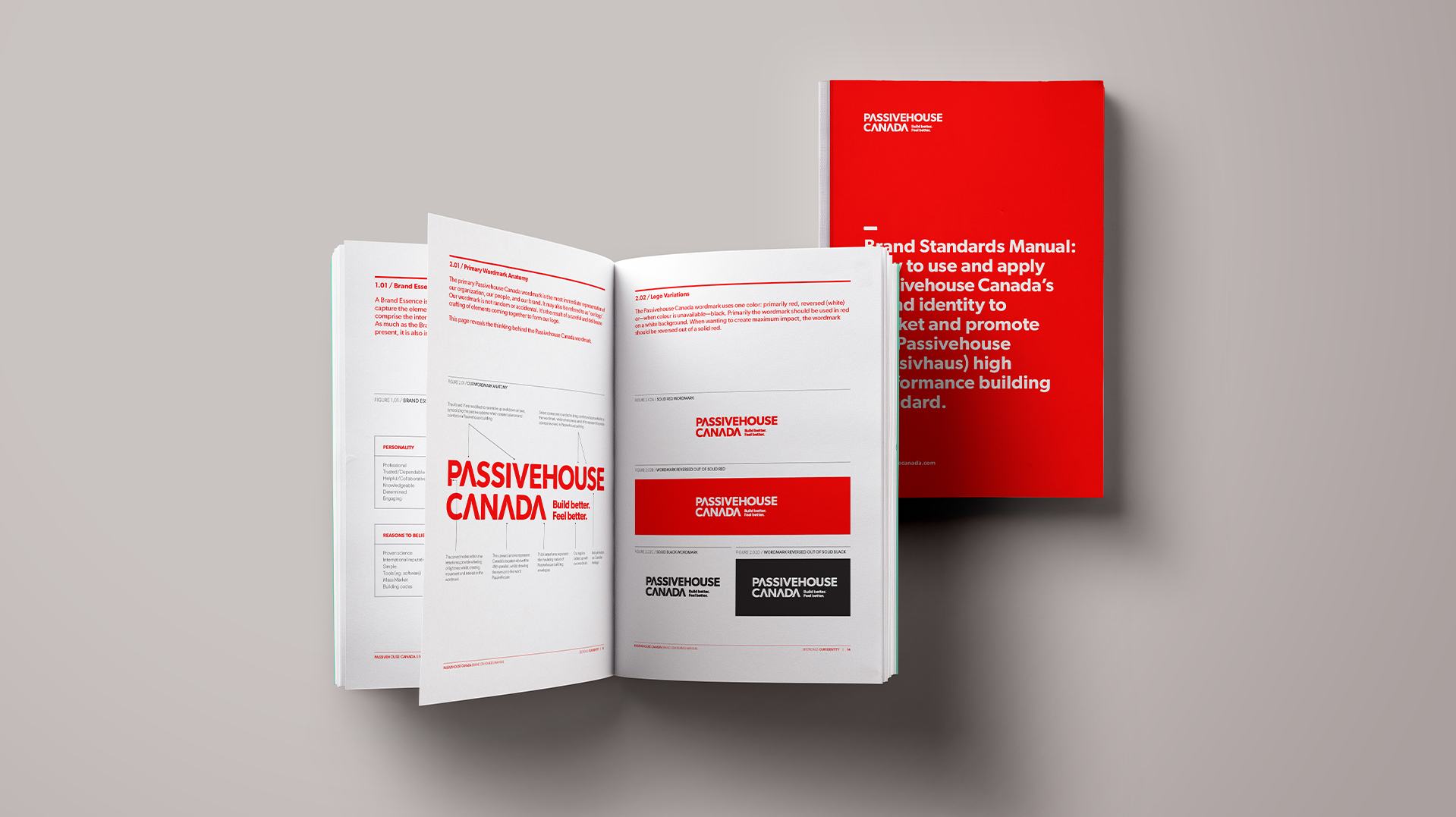
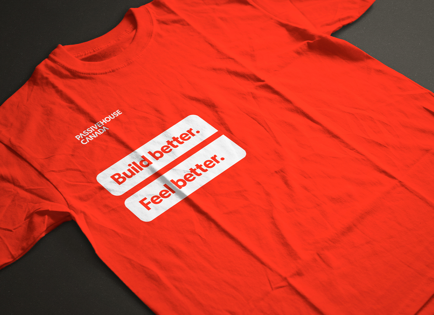
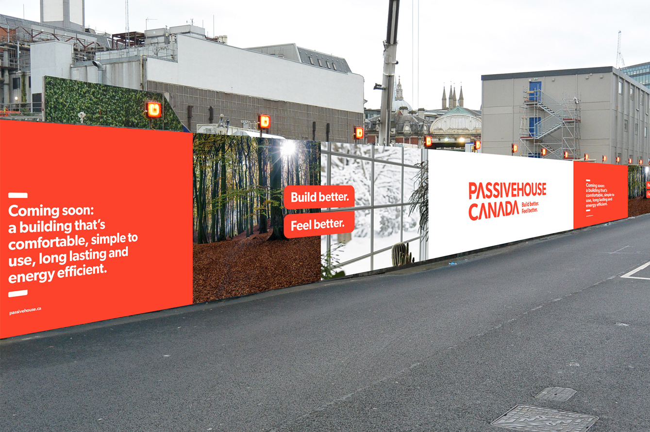
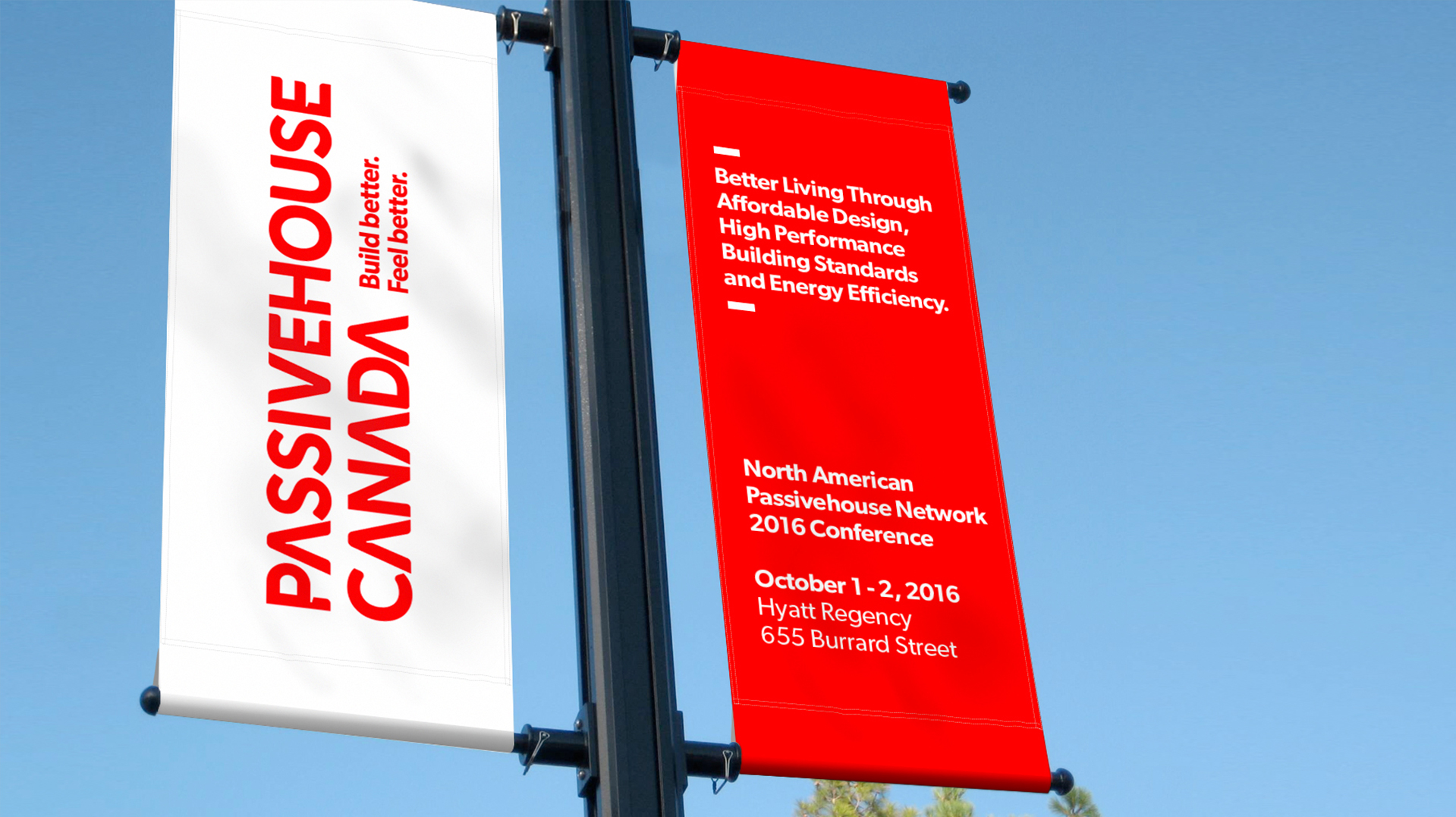
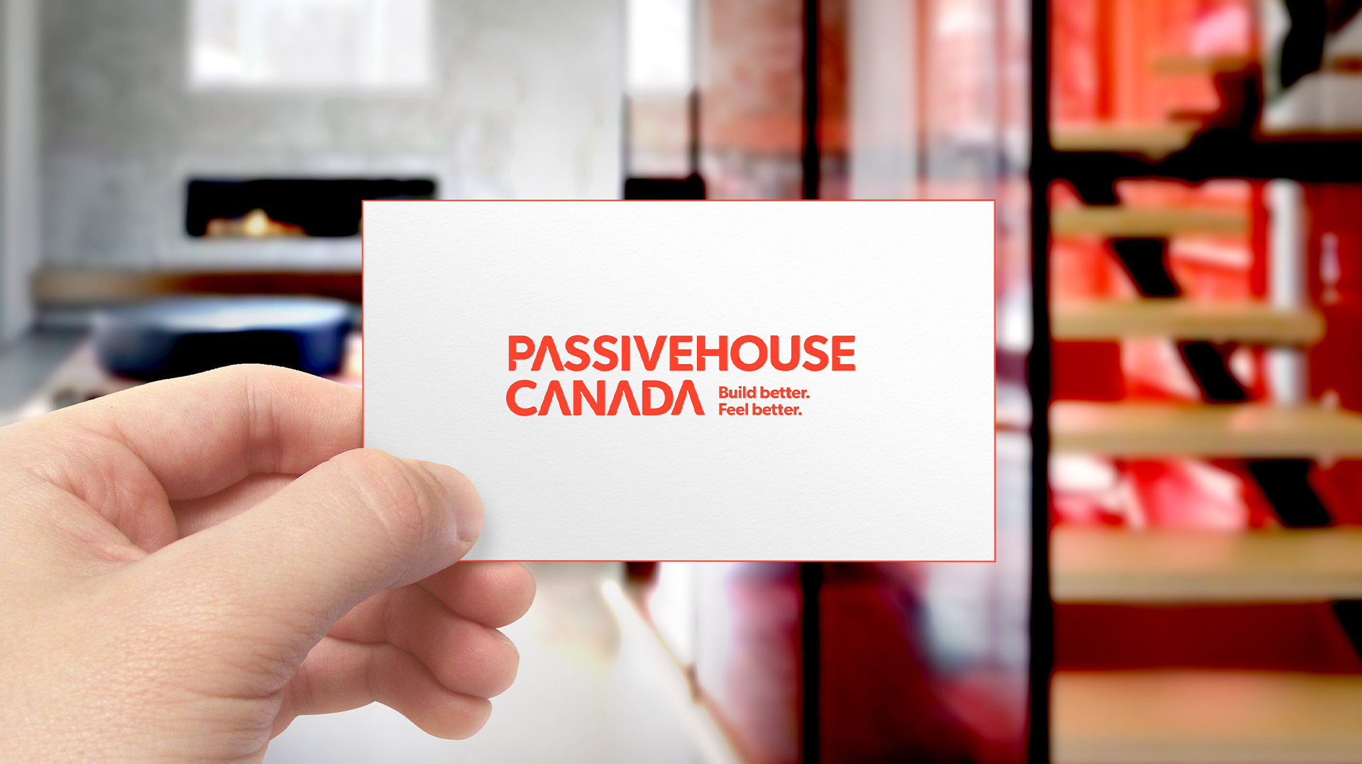
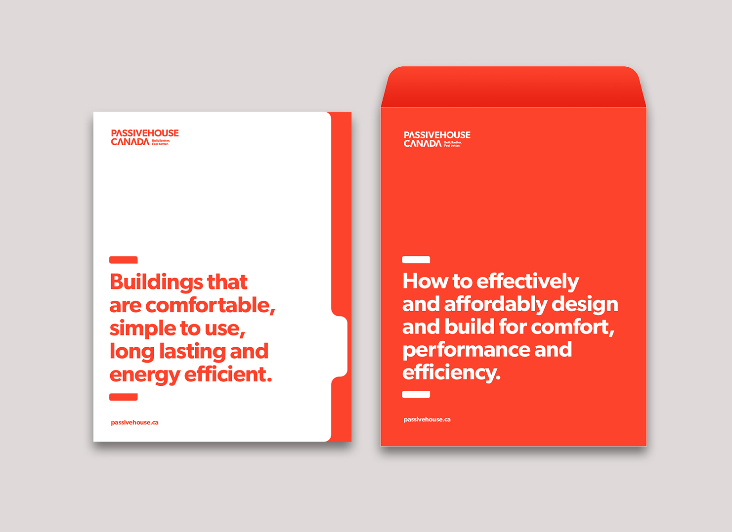
Our design team created a new identity system, including logo, tagline, and messaging. We also developed brand guidelines with look and feel recommendations for how to apply the new brand to collateral, stationary and a new website. The new Passive House identity system was delivered to the client as a comprehensive brand manual with guidelines and templates for application in print and online.